Monday 10 December 2012

5 Amazing Search Boxes For Blogger


First of all if you want to download these search boxes for your website or if you want to see the demo then please visit this page.

Here are some fresh new search boxes for blogger and it's also easy to add these boxes.

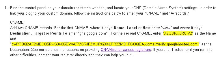
  • Go To Blogger > Template > Edit HTML
  • Search for ]]></b:skin> and just above it paste following css:

/*-----Search One Starts-----*/
input{
font-family: cursive;
}

form.search1 {
background: url(https://blogger.googleusercontent.com/img/b/R29vZ2xl/AVvXsEivF8CSxrNrPmcKiMtVNjm8qsUWpxs4ucmqwCw9jcvsdaBu6cvbfUnxZiC2_1zVhOUlHBlRV2QVoVrsrxvbyk1W_qRpYJDetC1MW68JNlWaOqM8WysSCPiRVYjr9lVfYnJpKLRCiPBKi94/s1600/1.png);
width: 320px;
height: 38px;
}
.text1 {
background: transparent;
width: 275px;
height: 38px;
border: 0px;
outline: 0px;
padding: 5px;
font-size: 20px;
}
.submit1 {
background: transparent;
border: 0px;
height: 38px;
position: relative;
width: 41px;
top: -12;
cursor: pointer;
}
/*-----Search One Ends-----*/
/*-----Search Two Starts-----*/
form.search2 {
background: url(https://blogger.googleusercontent.com/img/b/R29vZ2xl/AVvXsEj0Lw5Foy_jFFJvgNgB6XmHHNSt9LKNe6otKTREqmVK88rlg_OVU24yL384kANiM5l7xlyJV_UMTvS-38GTt9MclL0cVYGkP-zfs9JI2gnxBp162lXyx1m8L5MF8PmwAkVyk_q6JSQ6aU0/s1600/2.png);
width: 320px;
height: 38px;
}
.text2 {
background: transparent;
width: 270px;
height: 38px;
border: 0px;
outline: 0px;
padding: 5px;
font-size: 20px;
}
.submit2 {
background: transparent;
border: 0px;
height: 38px;
position: relative;
width: 45px;
top: -12;
cursor: pointer;
}
/*-----Search Two Ends-----*/
/*-----Search Three Starts-----*/
form.search3 {
background: url(https://blogger.googleusercontent.com/img/b/R29vZ2xl/AVvXsEiNkPhpEOEI4UG63nZOsW3ZOsvCMuL0wryAyuGHluhwc1LaKbYAEhk3BOl-DSD5UmccqgkXx0f2hVLpo2W1_F1flBRJWTBagMsshPmOkEDnHm7PZuOKK-pIel2tilYTyzFmwWDaClfA0pA/s1600/3.png);
width: 320px;
height: 38px;
}
.text3 {
background: transparent;
width: 260px;
height: 38px;
border: 0px;
outline: 0px;
padding: 5px;
font-size: 20px;
}
.submit3 {
background: transparent;
border: 0px;
height: 38px;
position: relative;
width: 50px;
top: -12;
cursor: pointer;
left: 5px;
}
/*-----Search Three Ends-----*/

/*-----Search Four Starts-----*/
form.search4 {
background: url(https://blogger.googleusercontent.com/img/b/R29vZ2xl/AVvXsEiMFD1UNnuMZNmPLrym_DHzXbazVDBW6gFsLhkLTpJCohr9ADB27YjCsb5kwxS5OSIRoJO0aFPJ0PXze5v32G6ZmmjYlIpYy7UrKHfiFRM9NEz-iNHRmeFXdGrWBYW_8Jb8nvJvc1jzhWQ/s1600/4.png);
width: 334px;
height: 49px;
}
.text4 {
background: transparent;
width: 290px;
height: 38px;
border: 0px;
outline: 0px;
padding: 10px 0 0 10px;
font-size: 20px;
}
.submit4 {
background: transparent;
border: 0px;
height: 38px;
position: relative;
width: 40px;
top: -12;
cursor: pointer;
}
/*-----Search Four Ends-----*/

/*-----Search Five Starts-----*/
form.search5 {
background: url(https://blogger.googleusercontent.com/img/b/R29vZ2xl/AVvXsEiS7nuPxbEtbeXaBckBD8xFS-3p7mfpjAyrqcvbZRBtFqmLJfBUasLOLqq7a1nhz-yn6peeyugiXty9yWN9ajGSdS9w7NtUW_ahZr5Mv_RlfwcYAvVcWWoEJiTWvCTpvmbPW9-BDqoc_zA/s1600/5.png);
width: 320px;
height: 32px;
}
.text5 {
background: transparent;
width: 290px;
height: 32px;
border: 0px;
outline: 0px;
padding: 10px;
font-size: 15px;
border-radius: 18px 0 0 20px;
-webkit-border-radius: 18px 0 0 20px;
-moz-border-radius: 18px 0 0 20px;
-o-border-radius: 18px 0 0 20px;
}
.submit5 {
background: transparent;
border: 0px;
height: 23px;
position: relative;
width: 25px;
top: -5px;
left: -3px;
cursor: pointer;
border-radius: 100%;
-webkit-border-radius: 100%;
-moz-border-radius: 100%;
-o-border-radius: 100%;
}

  • Go To Blogger > Layout > Add A Widget > HTML/JavaScript > And paste following code: 

<form class="search1" action="/search" style="method="get">
<input class="text1" type="text" name="q" value="Search Here" onclick="value=''" />
<input class="submit1" type="submit" value="" />
</form>

Now replace search1, text1 and submit1 one with your preferred search box. For example if you want 3rd search box then make this code like this:

<form class="search2" action="/search" style="method="get">
<input class="text2" type="text" name="q" value="Search Here" onclick="value=''" />
<input class="submit2" type="submit" value="" />
</form>
You can view all five designs and demo of this searchbox at this link.

Monday 3 December 2012

Pledge To Support A Free And Open Internet


So today here at BWidgets.com this post is not about any Blogger widgets or tutorials but today we're requesting your support for a free and open internet.

Join Google and billions of peoples around the world and pledge your support for a free and open internet.


Here is a short quote from #freeandopen project:

The Internet has connected more than two billion people around the world. Some governments want to use a closed-door meeting in December to increase censorship and regulate the Internet. Join together to keep the Internet free and open.

You can add your voice and get more info about this at google.com/takeaction.

A free and open world depends on a free and open Internet. Governments alone, working behind closed doors, should not direct its future. The billions of people around the globe who use the Internet should have a voice. 

Wednesday 28 November 2012

How To Setup Custom Domain On Blogger


Congratulations, You're reading this article probably because you bought a new domain for your blog. Using a custom domain is the best investment you can do. So in this tutorial we'll explain how to setup your custom domain on blogger.

Go To Blogger > Settings > Publishing > Click on Add a custom domain


Click on Switch to advanced settings


Now click on settings instructions


Now choose your domain type. We will use top-level domain


Now after above step this below part will appear...now you have to copy highlighted part from it. Please note that these two codes are different for every blog. So grab your own code from that page.


Now go to your domain provider (for example BigRock). And locate your DNS (Domain Name System) settings. Now choose CNAME records.

Add two CNAME records. In Host, Label or Name enter www and in Destination, Target or Points enter ghs.google.com just like showns below:


In second CNAME enter first yellow code as Host Name and second long yellow code as Destination, Target or Points.

Now again Go To Blogger > Settings > Publishing > Click on Add a custom domain > Click on Switch to advanced settings > Enter your domain and click on save.

It's done....After this we will setup A-Records for Naked Domain Redirection (Using your domain without www. )

Monday 26 November 2012

CSS3 Credit Card Form


Earlier today i found this amazing CSS3 Credit Card Form. This form has been developed purely in CSS3 and does not include any images. In this article i'am sharing one Visa style form with you but there are more credit card forms and they all can be found here.

Let's get started with HTML:

<section class="credit-card visa gr-visa">
<div class="logo">Visa</div>
<form>
<h2>Payment Details</h2>
<ul class="inputs">
<li>
<label>Card Number</label>
<input type="text" name="card_number" pattern="[0-9]{13,16}" value="9842 9472 9457 9472" onclick="value=''" class="full gr-input" required />
</li>
<li class="expire last">
<label>Expiration</label>
<input type="text" name="expire_month" value="December (12)" onclick="value=''" size="10" class="month gr-input" required />
<input type="text" name="expire_year" value="2014" onclick="value=''" size="10" class="year gr-input" required />
<div class="clearfix"></div>
</li>
<li class="cvc-code last">
<label>CVC Code</label>
<input type="text" name="cvc_code" value="174" onclick="value=''" size="10" class="gr-input" required />
</li>
<div class="clearfix"></div>
</ul>
</form>
<div class="watermark">Visa</div>
</section>

After adding our html we'll add CSS coding:

/* === Basic reset === */
* { margin: 0; padding: 0; outline: none; box-sizing:border-box; }
a>img { border: none; }
header, footer, article, section, nav, aside { display: block; }
/* === General === */
body {
    font-family:Arial;
    font-size: 14px;
    background:#ddd;
}
.clearfix {
    clear:both;
}
/* === Credit Card === */
.credit-card {
    display:block;
    position:relative;
    width:93.75%;   /* This is 300px on 320px wide screen */
    max-width:500px;    /* Just to make sure that it doesnt get crazy on bg screens */
    min-width:300px;    /* And make sure that it contains at least some size */
    margin:30px auto;
    padding:20px;
    overflow:hidden;
    border-radius:6px;
    z-index:1;
}
.credit-card .inputs {
    list-style:none;
    margin-top:30px;
}
.credit-card .inputs li {
    margin-bottom:30px;
}
.credit-card .inputs li.last {
    margin-bottom:10px;
}
.credit-card .inputs li.expire {
    float:left;
    width:70%;
    margin-right:5%;
}
.credit-card .inputs li.expire input{
    float:left;
    width:35%;
}
.credit-card .inputs li.expire input.month{
    width:60%;
    margin-right:5%;
}
.credit-card .inputs li.cvc-code {
    float:left;
    width:25%;
}
.credit-card .inputs li.cvc-code input {
    width:100%;
}
.credit-card .watermark {
    position:absolute;
    z-index:10;
}
.credit-card form {
    position:relative;
    z-index:50;
}
.credit-card .logo {
    position:absolute;
    top:15px;
    right:20px;
    text-transform:uppercase;
    font-weight:bold;
}
/* === Visa === */
.visa {
    color:#fff;
    box-shadow: 0px 0px 4px rgba(0,0,0,0.8), inset 0px 1px 3px rgba(255,255,255,0.3), inset 0px 0px 2px rgba(255,255,255,0.2);
}
.visa h2 {
    text-shadow:1px 1px 2px rgba(17,121,173,0.8);
}
.visa .logo {
    color:rgba(255,255,255,0.9);
    font-size:2em;
    font-style:italic;
    text-shadow:0px 0px 3px rgba(17,123,173,0.9);
}
.visa .logo:after {
    content:' ';
    position:absolute;
    left:0px;
    top:5px;
    width: 0;
    height: 0;
    border-top: 10px solid orange;
    border-left: 10px solid transparent;
}
.visa .watermark {
    bottom:-100px;
    left:-50px;
    color:rgba(255,255,255,0.06);
    font-size:20em;
    font-weight:bold;
    font-style:italic;
}
/* === Forms === */
label {
    display:block;
    margin-bottom:8px;
    color:rgba(255,255,255,0.6);
    text-transform:uppercase;
    font-size:1.1em;
    font-weight:bold;
    text-shadow:0px 1px 2px rgba(17,123,173,0.6);
}
input {
    display:block;
    padding:12px 10px;
    color:#999;
    font-size:1.2em;
    font-weight:bold;
    text-shadow:1px  1px 1px #fff;
    border:1px solid rgba(16,103,133,0.6);
    box-shadow:0px 0px 3px rgba(255,255,255,0.5), inset 0px 1px 4px rgba(0,0,0,0.2);
    border-radius:3px;
}
input.full {
    width:100%;
}

/* === Gradients === */
.gr-visa {
    background: #1db1cf; /* Old browsers */
    background: -moz-linear-gradient(top,  #1db1cf 0%, #1078ab 100%); /* FF3.6+ */
    background: -webkit-gradient(linear, left top, left bottom, color-stop(0%,#1db1cf), color-stop(100%,#1078ab)); /* Chrome,Safari4+ */
    background: -webkit-linear-gradient(top,  #1db1cf 0%,#1078ab 100%); /* Chrome10+,Safari5.1+ */
    background: -o-linear-gradient(top,  #1db1cf 0%,#1078ab 100%); /* Opera 11.10+ */
    background: -ms-linear-gradient(top,  #1db1cf 0%,#1078ab 100%); /* IE10+ */
    background: linear-gradient(to bottom,  #1db1cf 0%,#1078ab 100%); /* W3C */
    filter: progid:DXImageTransform.Microsoft.gradient( startColorstr='#1db1cf', endColorstr='#1078ab',GradientType=0 ); /* IE6-9 */
}
.gr-input {
    background: #d3d3d3; /* Old browsers */
    background: -moz-linear-gradient(top,  #d3d3d3 0%, #d9d9d9 38%, #e5e5e5 82%, #e7e7e7 100%); /* FF3.6+ */
    background: -webkit-gradient(linear, left top, left bottom, color-stop(0%,#d3d3d3), color-stop(38%,#d9d9d9), color-stop(82%,#e5e5e5), color-stop(100%,#e7e7e7)); /* Chrome,Safari4+ */
    background: -webkit-linear-gradient(top,  #d3d3d3 0%,#d9d9d9 38%,#e5e5e5 82%,#e7e7e7 100%); /* Chrome10+,Safari5.1+ */
    background: -o-linear-gradient(top,  #d3d3d3 0%,#d9d9d9 38%,#e5e5e5 82%,#e7e7e7 100%); /* Opera 11.10+ */
    background: -ms-linear-gradient(top,  #d3d3d3 0%,#d9d9d9 38%,#e5e5e5 82%,#e7e7e7 100%); /* IE10+ */
    background: linear-gradient(to bottom,  #d3d3d3 0%,#d9d9d9 38%,#e5e5e5 82%,#e7e7e7 100%); /* W3C */
    filter: progid:DXImageTransform.Microsoft.gradient( startColorstr='#d3d3d3', endColorstr='#e7e7e7',GradientType=0 ); /* IE6-9 */
}

That's It....Don't forget to leave a comment!!!

Saturday 24 November 2012

Resizing Web Page Elements With CSS3


Just a simple trick I wanted to show you guys. You can resize web elements with the CSS3 property resize: both. For images make sure it has width and height set to 100%.

Here is an example for you. First let's start with basic markup:


<div class="post">
BWidgets: Visit BWidgets.com for more!
<br><br>
Try resizing me or my media friend below.
</div>
<div class="post photo">
<img src="https://blogger.googleusercontent.com/img/b/R29vZ2xl/AVvXsEhdnaYZS3oYX3BuVH5nd3Q80LXSvfIrIMfrA9K1dQfncaF2gnguilf-8MXMoMFWLHTiCSSf6xR_aA-Yy6YGQW7v9tUbIPd5SO587NJpCzzEIETVTBqmGBAY5ByJIWkKtfVXiV72gLdTttU/s1600/Google+++Style+Subscription+Box+Widget+For+Blogger.jpg">
</div>

Now we'll put our CSS code in it:

body {
  width: 240px;
  height: 200px;
  margin: 0px auto;
  padding: 40px 0 0;
  background-color: #fff;
  font-family: Verdana, sans-serif;
  font-size: 11px;
}
.post {
  margin: 0px 0px 40px;
  padding: 15px;
  position: relative;
  background-color: #fff;
  -webkit-box-shadow: 0 1px 3px rgba(100, 100, 100, 0.4), 0 0 40px rgba(100, 100, 100, 0.1) inset;
  -moz-box-shadow: 0 1px 3px rgba(100, 100, 100, 0.4), 0 0 40px rgba(100, 100, 100, 0.1) inset;
  box-shadow: 0 1px 3px rgba(100, 100, 100, 0.4), 0 0 40px rgba(100, 100, 100, 0.1) inset;
  overflow: hidden;
  resize: both;
}
.photo img {
  width: 100%; height: 100%;
}
Now see it in action... :)

Wednesday 21 November 2012

HTML 5 Shattering Text Effect


So today we're gonna do this amazing HTML 5 Shattering Text Effect with JavaScript and this script doesn't contains jquery or mootolls only JavaScript. Let's get started with basic HTML markup:

<canvas id="canvas"></canvas>

After adding above html we will add some css to make it better:

body {
margin: 0;
padding: 0;
overflow: hidden;
}
#canvas {
background: black;
}

Now finally it's time for us to add some JavaScript:

window.requestAnimFrame = (function(){
return  window.requestAnimationFrame       ||
window.webkitRequestAnimationFrame ||
window.mozRequestAnimationFrame    ||
window.oRequestAnimationFrame      ||
window.msRequestAnimationFrame     ||
function( callback ){
window.setTimeout(callback, 1000 / 60);
};
})();
var canvas = document.getElementById("canvas"),
ctx = canvas.getContext("2d"),
keyword = "BWidgets.com",
imageData,
density = 3,
mouse = {},
hovered = false,
colors = ["0,120,232", "8,200,255", "30,140,255"],
minDist = 20,
bounceFactor = 0.7;
var W = window.innerWidth,
H = window.innerHeight;
canvas.width = W;
canvas.height = H;
document.addEventListener("mousemove", function(e) {
mouse.x = e.pageX;
mouse.y = e.pageY;
}, false);
// Particle Object
var Particle = function() {
this.w = Math.random() * 10.5;
this.h = Math.random() * 10.5;
this.x = -W;
this.y = -H;
this.free = false;
this.vy = -5 + parseInt(Math.random() * 10) / 2;
this.vx = -4 + parseInt(Math.random() * 8);
// Color
this.a = Math.random();
this.color = colors[parseInt(Math.random()*colors.length)];
this.setPosition = function(x, y) {
this.x = x;
this.y = y;
};
this.draw = function() {
ctx.fillStyle = "rgba("+this.color+","+this.a+")";
ctx.fillRect(this.x, this.y,  this.w,  this.h);
}
};
var particles = [];
// Draw the text
function drawText() {
ctx.clearRect(0, 0, W, H);
ctx.fillStyle = "#000000";
ctx.font = "100px 'Arial', sans-serif";
ctx.textAlign = "center";
ctx.fillText(keyword, W/2, H/2);
}
// Clear the canvas
function clear() {
ctx.clearRect(0, 0, W, H);
}
// Get pixel positions
function positionParticles() {
// Get the data
imageData = ctx.getImageData(0, 0, W, W);
data = imageData.data;
// Iterate each row and column
for (var i = 0; i < imageData.height; i += density) {
for (var j = 0; j < imageData.width; j += density) {
// Get the color of the pixel
var color = data[((j * ( imageData.width * 4)) + (i * 4)) - 1];
// If the color is black, draw pixels
if (color == 255) {
particles.push(new Particle());
particles[particles.length - 1].setPosition(i, j);
}
}
}
}
drawText();
positionParticles();

// Update
function update() {
clear();
for(i = 0; i < particles.length; i++) {
var p = particles[i];
if(mouse.x > p.x && mouse.x < p.x + p.w && mouse.y > p.y && mouse.y < p.y + p.h)
hovered = true;
if(hovered == true) {
var dist = Math.sqrt((p.x - mouse.x)*(p.x - mouse.x) + (p.y - mouse.y)*(p.y - mouse.y));
if(dist <= minDist)
p.free = true;
if(p.free == true) {
p.y += p.vy;
p.vy += 0.15;
p.x += p.vx;
// Collision Detection
if(p.y + p.h > H) {
p.y = H - p.h;
p.vy *= -bounceFactor;
// Friction applied when on the floor
if(p.vx > 0)
p.vx -= 0.1;
else
p.vx += 0.1;
}
if(p.x + p.w > W) {
p.x = W - p.w;
p.vx *= -bounceFactor;
}
if(p.x < 0) {
p.x = 0;
p.vx *= -0.5;
}
}
}
ctx.globalCompositeOperation = "lighter";
p.draw();
}
}

(function animloop(){
requestAnimFrame(animloop);
update();
})();

That's It......

Tuesday 20 November 2012

Removing Extra Copies Of Windows XP


It's to easy to get rid of extra copies of xp on your pc and all credits of this article goes to EHow.Com. Here we go:

Instructions:


1. Determine if your second copy of Windows XP is just left over from an over-written installation, or if it is in fact a complete second copy of Windows. You can determine this by checking to see if there are two Windows folders on two different drives on your computer. If your computer only has a single Windows folder, then skip ahead to Step 5.

2. Restart your computer and, when prompted, boot the XP installation that you wish to keep on your computer.


3. Locate the Windows folder for the second Windows XP installation. This will be the one located on the drive that does not contain your current Windows XP's "My Documents" folder. If your My Documents folder is located on the C:\ drive, for instance, the Windows folder for the second installation will be on a different drive.

4. Delete the Windows folder for the second Windows XP installation. This will completely remove all files related to the second Windows XP installation from your computer.

5. Right-click your "My Computer" icon and select the "Properties" option. This will bring up a new dialog box. Select the "Advanced" tab, then locate the "Startup and Recovery" section of the new tab.

6. Click the "Settings" button under the "Startup and Recovery" section. This will bring up yet another new dialog box.

7. Click the "Edit" button. This will open a new instance of the Notepad program, and will show several lines of code. Locate the line that reads "[operating systems]". Just beneath this line will be the lines that tell your computer to offer the choice to boot to one of the Windows XP operating systems on your computer.

8. Locate the line that corresponds to the Windows XP installation you do not want to keep, then delete it. If you are having trouble figuring out what installation you want to delete, the operating systems appear in the boot order in the same order they appear on the Operating System Select screen. So if the operating system you wish to delete was second in line on the "choose your operating system" screen, it will be the second option in Notepad.

9. Save the "Boot.ini" once you have deleted the line, then restart your computer. You will no longer be given the option to boot to the removed Windows XP operating system upon restart.

You can read original article at this link.

Friday 16 November 2012

Adding Online Visitors Widget To Blogger


Adding online visitors widget to your blog or website is a really cool way to show-off your site's visitors and it's also a great way to find more stats of your site. Now the question is which widget will be good for your site but don't worry cuz whos.amung.us is the most trusted and used online visitor counter in the world.

Installing this widget on your website is very easy. There is no registration and they are completely free! Simply copy the html code from their site and paste it into your blog.

You can get your widget code from this page. After copying your widget code follow this simple step:

  • Go To Blogger > Layout > Add A Widget > HTML/JavaScript > Paste html code that you copied in above step and it's done.
I hope this will help you...Don't forget to leave a comment!!!

Wednesday 14 November 2012

Gmail Logo With CSS3


So today i'am sharing a post from hongkiat.com which is about creating Gmail logo with CSS3. First of all go and create a new html document on your computer and then paste following HTML markup on it:

<!DOCTYPE HTML PUBLIC "-//W3C//DTD XHTML 1.0 Strict//EN" "http://www.w3.org/TR/xhtml1/DTD/xhtml1-strict.dtd">
<html>
<head>
<title>Gmail Logo with CSS3</title>
<style type="text/css">
Paste CSS3 here
</style>
</head>
<body>
<span class='gmail-logo'>
<span class='gmail-box'> </span>
</span>
<!-- sample usage, remove this comment
<a href='mailto:your@mail.com' class='gmail-logo'>
<span class='gmail-box'> </span>
</a>
 -->
<!--
Cheers and Regards
Hongkiat Lim < http://www.hongkiat.com
Indam < http://www.indaam.com
-->
</body>
</html>

As you can see in above code that i left a blank field for our CSS3 code so just replace below CSS with "Paste CSS3 here":

<!--
body{
/* min-height:1600px;
padding:200px 0;
*/}
/*
Css Logo created by Indam < http://www.indaam.com
Publish for http://hongkiat.com */
.gmail-logo, .gmail-logo *, .gmail-logo *:before, .gmail-logo *:after{
/* content:''; Bug in Opera */
/* add this, for : can using many tag */
margin:0;
padding:0;
background:transparent;
border:0;
outline:0;
display:block;
font:normal normal 0/0 serif;
}
.gmail-logo{
margin:110px auto;
background:rgb(201, 44, 25);
width:600px;
height:400px;
border-top:4px solid rgb(201, 44, 25);
border-bottom:4px solid rgb(201, 44, 25);
border-radius:10px;
-moz-border-radius:10px;
-webkit-border-radius:10px;
}
.gmail-logo .gmail-box{
overflow:hidden;
float:left;
width:440px;
height:400px;
margin:0 0 0 80px;
background:white;
border-radius:5px;
-moz-border-radius:5px;
-webkit-border-radius:5px;
}
.gmail-logo .gmail-box:before{
position:relative;
content:'';
z-index:1;
background:white;
float:left;
width:320px;
height:320px;
border:100px solid rgb(201, 44, 25);
margin:-310px 0 0 -40px;
border-radius:10px;
-moz-border-radius:10px;
-webkit-border-radius:10px;
-moz-transform:rotate(45deg);
-webkit-transform:rotate(45deg);
-o-transform:rotate(45deg);
}
.gmail-logo .gmail-box:after{
content:'';
float:left;
width:360px;
height:360px;
border:2px solid rgb(201, 44, 25);
margin:10px 0 0 40px;
-o-transform:rotate(45deg);
-webkit-transform:rotate(45deg);
-moz-transform:rotate(45deg);
}
.gmail-logo:after{
content:'';
position:relative;
z-index:2;
content:'';
float:left;
margin-top:-404px;
width:600px;
height:408px;
display:block;
background:
-moz-linear-gradient(top, rgba(255, 255, 255, 0.3) 0%,
/* rgba(255, 255, 255, 0.3) 30%, */
rgba(255, 255, 255, 0.1) 100%);
background:-o-linear-gradient(top, rgba(255, 255, 255, 0.3) 0%,
/* rgba(255, 255, 255, 0.2) 30%, */
rgba(255, 255, 255, 0.1) 100%);
background:-webkit-gradient(
linear, left top, left bottom, color-stop(0%,
rgba(255, 255, 255, 0.3)),
/* color-stop(30%, rgba(255, 255, 255, 0.2)), */
color-stop(100%, rgba(255, 255, 255, 0.1)));
}
.gmail-logo:hover{
background:#313131;
border-color:#313131;
}
.gmail-logo:hover .gmail-box:before{
border-color:#313131;
/* margin-top:-305px; */
}
.gmail-logo:hover .gmail-box:after{
/* margin-top:-5px; */
border-color:#313131;
border-bottom-color:#fff;
border-right-color:#fff;
}
-->

That's It...... :)

Monday 12 November 2012

Stylish CSS3 Login Form


Finally we're posting another form on BWidgets and probably it's our first form since i bought a top level domain for my blog. It's CSS3 based and it contain some amazing CSS3 animations and probably IE will hate this form. Tomorrow is Diwali in India so Happy Diwali to all visitors around the world.

Let's start it with basic HTML markup:

<form name="login-form" class="login-form" action="" method="post">
<div class="header">
<h1>Login Form</h1>
<span>Fill out the form below to login to my super awesome imaginary control panel.</span>
</div>
<div class="content">
<input name="username" type="text" class="input username" placeholder="Username" />
<div class="user-icon"></div>
<input name="password" type="password" class="input password" placeholder="Password" />
<div class="pass-icon"></div> </div>
<div class="footer">
<input type="submit" name="submit" value="Login" class="button" />
<input type="submit" name="submit" value="Register" class="register" />
</div>
</form>
<div class="gradient"></div>

Well this was pretty simple and now it's time for final CSS3 touch:


@import url(http://fonts.googleapis.com/css?family=Bree+Serif);
/*******************
SELECTION STYLING
*******************/
::selection {
color: #fff;
background: #f676b2; /* Safari */
}
::-moz-selection {
color: #fff;
background: #f676b2; /* Firefox */
}
/*******************
BODY STYLING
*******************/


/* Download Button (Demo Only) */
.download {
display: block;
position: absolute;
float: right;
right: 25px;
bottom: 25px;
padding: 5px;
font-weight: bold;
font-size: 11px;
text-align: right;
text-decoration: none;
color: rgba(0,0,0,0.5);
text-shadow: 1px 1px 0 rgba(256,256,256,0.5);
}
.download:hover {
color: rgba(0,0,0,0.75);
text-shadow: 1px 1px 0 rgba(256,256,256,0.5);
}
.download:focus {
bottom: 24px;
}
/*
.gradient {
width: 600px;
height: 600px;
position: fixed;
left: 50%;
top: 50%;
margin-left: -300px;
margin-top: -300px;
background: url(https://blogger.googleusercontent.com/img/b/R29vZ2xl/AVvXsEi1gmAvvc2Uln1HXAHm70fCv9EgwZImEeShx6PUsuu3Ofuayg3RLA55tqTBM1QPQOfZ3Py_DzBVqLGgUZ1LmbP8jRyDBQTgzGPpGGIYuJ-zP5j7773K0s2brdg3wkZF73GsCkT-ony3fmw/s1600/gradient.png) no-repeat;
}
*/
.gradient {
/* Center Positioning */
width: 600px;
height: 600px;
position: fixed;
left: 50%;
top: 50%;
margin-left: -300px;
margin-top: -300px;
z-index: -2;
/* Fallback */
background-image: url(https://blogger.googleusercontent.com/img/b/R29vZ2xl/AVvXsEi1gmAvvc2Uln1HXAHm70fCv9EgwZImEeShx6PUsuu3Ofuayg3RLA55tqTBM1QPQOfZ3Py_DzBVqLGgUZ1LmbP8jRyDBQTgzGPpGGIYuJ-zP5j7773K0s2brdg3wkZF73GsCkT-ony3fmw/s1600/gradient.png);
background-repeat: no-repeat;
/* CSS3 Gradient */
background-image: -webkit-gradient(radial, 0% 0%, 0% 100%, from(rgba(213,246,255,1)), to(rgba(213,246,255,0)));
background-image: -webkit-radial-gradient(50% 50%, 40% 40%, rgba(213,246,255,1), rgba(213,246,255,0));
background-image: -moz-radial-gradient(50% 50%, 50% 50%, rgba(213,246,255,1), rgba(213,246,255,0));
background-image: -ms-radial-gradient(50% 50%, 50% 50%, rgba(213,246,255,1), rgba(213,246,255,0));
background-image: -o-radial-gradient(50% 50%, 50% 50%, rgba(213,246,255,1), rgba(213,246,255,0));
}
/*******************
LOGIN FORM
*******************/
.login-form {
width: 300px;
margin: 0 auto;
position: relative;
background: #f3f3f3;
border: 1px solid #fff;
border-radius: 5px;
box-shadow: 0 1px 3px rgba(0,0,0,0.5);
-moz-box-shadow: 0 1px 3px rgba(0,0,0,0.5);
-webkit-box-shadow: 0 1px 3px rgba(0,0,0,0.5);
}
/*******************
HEADER
*******************/
.login-form .header {
padding: 40px 30px 30px 30px;
}
.login-form .header h1 {
font-family: 'Bree Serif', serif;
font-weight: 300;
font-size: 28px;
line-height:34px;
color: #414848;
text-shadow: 1px 1px 0 rgba(256,256,256,1.0);
margin-bottom: 10px;
}
.login-form .header span {
font-size: 11px;
line-height: 16px;
color: #678889;
text-shadow: 1px 1px 0 rgba(256,256,256,1.0);
}
/*******************
CONTENT
*******************/
.login-form .content {
padding: 0 30px 25px 30px;
}
/* Input field */
.login-form .content .input {
width: 188px;
padding: 15px 25px;
font-family: "HelveticaNeue-Light", "Helvetica Neue Light", "Helvetica Neue", Helvetica, Arial, "Lucida Grande", sans-serif;
font-weight: 400;
font-size: 14px;
color: #9d9e9e;
text-shadow: 1px 1px 0 rgba(256,256,256,1.0);
background: #fff;
border: 1px solid #fff;
border-radius: 5px;
box-shadow: inset 0 1px 3px rgba(0,0,0,0.50);
-moz-box-shadow: inset 0 1px 3px rgba(0,0,0,0.50);
-webkit-box-shadow: inset 0 1px 3px rgba(0,0,0,0.50);
}
/* Second input field */
.login-form .content .password, .login-form .content .pass-icon {
margin-top: 25px;
}
.login-form .content .input:hover {
background: #dfe9ec;
color: #414848;
}
.login-form .content .input:focus {
background: #dfe9ec;
color: #414848;
box-shadow: inset 0 1px 2px rgba(0,0,0,0.25);
-moz-box-shadow: inset 0 1px 2px rgba(0,0,0,0.25);
-webkit-box-shadow: inset 0 1px 2px rgba(0,0,0,0.25);
}
.user-icon, .pass-icon {
width: 46px;
height: 47px;
display: block;
position: absolute;
left: 0px;
padding-right: 2px;
z-index: -1;
-moz-border-radius-topleft: 5px;
-moz-border-radius-bottomleft: 5px;
-webkit-border-top-left-radius: 5px;
-webkit-border-bottom-left-radius: 5px;
}
.user-icon {
top:153px; /* Positioning fix for slide-in, got lazy to think up of simpler method. */
background: rgba(65,72,72,0.75) url(https://blogger.googleusercontent.com/img/b/R29vZ2xl/AVvXsEgQzrCjwkUi3UhnSF1KopzvjotalnA-D9hKBUH6QP834pxpzRODegWxLxM-q1yWEe_9VYuwflD23deVSuv0iXq4mDSixlfsctidmCk7fVbd5L1jps_9HRgXWwgndtvDsZ6YJ7XN3Iu_a6o/s1600/user-icon.png) no-repeat center; }
.pass-icon {
top:201px;
background: rgba(65,72,72,0.75) url(https://blogger.googleusercontent.com/img/b/R29vZ2xl/AVvXsEheANatJhfXqIQ0wZaJJ_Wn7RvJII7OJh0Hz1pgl6oi330FsbVnxZta7V1MT5iw4KRDimKprGv-wejSbGi3o0VRpIfnvcYtQuAUH-KmmBAY9op7Mxt8ZsCqtckKHHFhpGwzmM5gi1w7oTc/s1600/pass-icon.png) no-repeat center;
}
.content input:focus + div{
left: -46px;
}
/* Animation */
.input, .user-icon, .pass-icon, .button, .register {
transition: all 0.5s ease;
-moz-transition: all 0.5s ease;
-webkit-transition: all 0.5s ease;
-o-transition: all 0.5s ease;
-ms-transition: all 0.5s ease;
}
/*******************
FOOTER
*******************/
.login-form .footer {
padding: 25px 30px 40px 30px;
overflow: auto;
background: #d4dedf;
border-top: 1px solid #fff;
box-shadow: inset 0 1px 0 rgba(0,0,0,0.15);
-moz-box-shadow: inset 0 1px 0 rgba(0,0,0,0.15);
-webkit-box-shadow: inset 0 1px 0 rgba(0,0,0,0.15);
}
/* Login button */
.login-form .footer .button {
float:right;
padding: 11px 25px;
font-family: 'Bree Serif', serif;
font-weight: 300;
font-size: 18px;
color: #fff;
text-shadow: 0px 1px 0 rgba(0,0,0,0.25);
background: #56c2e1;
border: 1px solid #46b3d3;
border-radius: 5px;
cursor: pointer;
box-shadow: inset 0 0 2px rgba(256,256,256,0.75);
-moz-box-shadow: inset 0 0 2px rgba(256,256,256,0.75);
-webkit-box-shadow: inset 0 0 2px rgba(256,256,256,0.75);
}
.login-form .footer .button:hover {
background: #3f9db8;
border: 1px solid rgba(256,256,256,0.75);
box-shadow: inset 0 1px 3px rgba(0,0,0,0.5);
-moz-box-shadow: inset 0 1px 3px rgba(0,0,0,0.5);
-webkit-box-shadow: inset 0 1px 3px rgba(0,0,0,0.5);
}
.login-form .footer .button:focus {
position: relative;
bottom: -1px;
background: #56c2e1;
box-shadow: inset 0 1px 6px rgba(256,256,256,0.75);
-moz-box-shadow: inset 0 1px 6px rgba(256,256,256,0.75);
-webkit-box-shadow: inset 0 1px 6px rgba(256,256,256,0.75);
}
/* Register button */
.login-form .footer .register {
display: block;
float: right;
padding: 10px;
margin-right: 20px;
background: none;
border: none;
cursor: pointer;
font-family: 'Bree Serif', serif;
font-weight: 300;
font-size: 18px;
color: #414848;
text-shadow: 0px 1px 0 rgba(256,256,256,0.5);
}
.login-form .footer .register:hover {
color: #3f9db8;
}
.login-form .footer .register:focus {
position: relative;
bottom: -1px;
}

That's It!!!

Popular Posts

 
Powered by Blogger.