Friday, 10 August 2012

Cool Round CSS3 Badge


As you can see in above pic these round css3 badges are totally awesome and it's too easy to make :


<div id="RC3B">
HD
</div>
<style>
div#RC3B {background:black;
height:60px;
width:60px;
-moz-border-radius:64px;
-webkit-border-radius:64px;
padding:32px;
text-align:center;
color:white;background:#f656ac;
border:4px solid white;-webkit-box-shadow: 0 0 1px rgb(0,0,0);
-moz-box-shadow: 0 0 1px rgb(255,0,0);
box-shadow: 0 0 1px rgb(255,0,0);font-size:50px; font-weight:bold;text-shadow: 0px 2px 2px #1F1F1F;
-webkit-transform: rotate(-19deg);
-moz-transform: scale(0) rotate(-19deg);
-ms-transform: scale(0) rotate(-19deg);
transform: scale(0) rotate(-19deg);
rotate(-19deg);
-ms-transform: scale(0) rotate(-19deg);
transform: scale(0) rotate(-19deg);
</style>


Now just replace HD with your text and paste it on your site or blog.

URL Encoder

Thursday, 9 August 2012

Recent Posts Slider For Blogger


Amazing recent posts slider for blog which shows recent posts of your blog in a cool way. I made it more easy to add this widget by creating a widget generator so now you don't have to do any editing on your blog.

Amazing jQuery Color Picker


Let me guess maybe you created a from with a color field and thought about adding some cool color pickers then searched it on google and you found us.....WOW google really works just kidding.....In this post i'am gonna post about this color picker you can see above in pic.....you can use this on your blogger,wordpress or any html supported thing such as a simple html document.
  • On Blogger : Go to Blogger > Template > Edit HTML  > Post Below Script Above  </head>  Tag
  • On Other : Just post below script above </head>
  • Post below script :
<script src="
http://widcraft.googlecode.com/svn/jquery.js" type="text/javascript"></script>
<script src="http://widcraft.googlecode.com/svn/ColorPicker.js" type="text/javascript"></script>

Done with all scripting now time to learn how add this color box in your pages
<input id="mycolor" name="mycolor" type="text" value="#ffcc00" class="iColorPicker" />
Important: each input field need to have unique ID
That's It.....Comment For Any Help/Suggestion/Request/

Tuesday, 7 August 2012

Setup Feed On Your Blogger


In this quick post, I'm not gonna teach you how to create feed for your blogger, but how to setup correctly in blogger. After doing this your visitors can check your feed out in this url : http://yourblog.blogspot.com/feeds/posts/default

It's too simple we just have to put your feed url in blogger settings. It's necessary to setup feed otherwise some widgets will not work in your blog.
  • Grab your feed url (Example : feeds.feedburner.com/WidgetCraft
  • Go To Blogger > Settings > Other > Post Feed Redirect URL
  • Paste your feed url and click on save.
That's IT!

Tip : You can also get feed url by adding 'Subscribe By Email' Widget on your blog.

Sunday, 5 August 2012

Get A Free Short Domain For Your Blog


Not in any specific favorable order;

Website: http://www.dot.tk/
Short Domain: yourdomain.tk

Website: http://www.freedomain.co.nr/
Short Domain: yourdomain.co.nr

Website: http://www.nic.cz.cc/
Short Domain: yourdomain.cz.cc.
--
Website: http://www.co.cc/
Short Domain: yourdomain.co.cc/.
--
Website: http://www.com.co.in/home.html
Short Domain: yourdomain.com.co.in
--
Website: http://www.c-o.in/myred/home.php
Short Domain:
yourname.c-o.in
yourname.c-o.cc
yourname.coz.in
yourname.cq.bz
--
Website: http://www.unonic.com/
Short Domain:
yourdomain.net.tf
yourdomain.eu.tf
yourdomain.us.tf
yourdomain.int.tf
yourdomain.ca.tf
yourdomain.de.tf
yourdomain.at.tf
yourdomain.ch.tf
yourdomain.edu.tf
yourdomain.ru.tf
yourdomain.pl.tf
yourdomain.cz.tf
yourdomain.bg.tf
yourdomain.sg.tf
--
Website: http://www.smartdots.com/
Short Domain:
yourdomain.eu.tc
yourdomain.us.tc
yourdomain.int.tc
yourdomain.de.tc
yourdomain.at.tc
yourdomain.pro.tc
yourdomain.de.tc
yourdomain.co.at.tc
yourdomain.es.tc
yourdomain.ru.tc
yourdomain.ua.tc
yourdomain.se.tc
yourdomain.dk.tc
yourdomain.be.tc
yourdomain.pl.tc
yourdomain.bg.tc
yourdomain.cz.tc
yourdomain.mx.tc
yourdomain.br.tc
yourdomain.hk.tc
yourdomain.kr.tc
yourdomain.th.tc
yourdomain.ph.tc
--
Website: http://www.co.tv/
Short Domain: yourdomain.co.tv
--
Website: http://www.eu.tv
Short Domain: yourdomain.eu.tv
--
Website: http://www.uni.cc/site/home.php
Short Domain: yourdomain.uni.cc
--
Website: http://www.eu.org/
Short Domain: yourdomain.eu.org
--
Website: http://www.yi.org/
Short Domain yourdomain.yi.org
--
Website: http://www.friko.pl/
Short Domain: yourdomain.xorg.pl
--
Website: http://www.da.ru/
Short Domain: yourdomain.da.ru
--
Website: http://www.bee.pl/index.html
Short Domain: yourdomain.bee.pl
--
Website: http://www.za.net/
Short Domain:
yourdomain.za.net
yourdomain.za.org
--
Website: http://www.9hz.com
Shortdomain: yourdomain.nhz.com

Cool HTML5 And CSS3 Menu For Blogger


We all know power of HTML5 and CSS3 , so today i'am posting about a cool HTML5 and CSS3 menu for your blogger and sites. Again wanna remind you that you can all use this menu in wordpress , sites and all type of HTML documents.

  • Go to Blogger > Layout > Add A Gadget > HTML/Javascript 
  • Paste following code in it
<style>
.main-ul li {
    float:left;
     list-style: none;
      position:relative;
       width:25%;
      text-align:center;
   }
.main-ul li a {
                      display:block;
     padding-bottom:20px;
     padding-right:10px;
     padding-top:10px;
     padding-left:10px;
      text-decoration:none;
     position: relative;
      z-index: 100;
     background-color: rgba(164, 164, 164, 0.2);
      -webkit-transition: all 1s;
     -moz-transition: all 1s;
      -o-transition: all 1s;
      transition: all 1s;
   }
.main-ul li a span{
           display:block;
           padding-top:10px;
           font-weight:700;
           font-size: 20px;
           color: rgba(120, 120, 120, 0.9);
           text-transform:uppercase;
           font-family: 'Kotta One', serif;
 }
.main-ul li:hover span{
                   color: #fff;
}
.main-ul li:nth-child(1):hover a{
                background-color: rgba(175,54,55,0.8);
                -moz-transform: rotate(-3deg);
                -webkit-transform: rotate(-3deg);
                -o-transform: rotate(-3deg);
                 transform: rotate(-3deg);
}
.main-ul li:nth-child(2):hover a{
   background-color: rgba(199, 204, 73, 0.8);
   -moz-transform: rotate(-3deg);
   -webkit-transform: rotate(-3deg);
   -o-transform: rotate(-3deg);
   transform: rotate(-3deg);
}
.main-ul li:nth-child(3):hover a{
   background-color: rgba(213, 135, 11, 0.8);
   -moz-transform: rotate(3deg);
   -webkit-transform: rotate(3deg);
   -o-transform: rotate(3deg);
   transform: rotate(3deg);
}
.main-ul li:nth-child(4):hover a{
   background-color: rgba(51, 143, 144, 0.8);
   -moz-transform: rotate(3deg);
   -webkit-transform: rotate(3deg);
   -o-transform: rotate(3deg);
   transform: rotate(3deg);
}
.main-ul li:nth-child(5):hover a{
   background-color: rgba(117,18,98,0.8);
   -moz-transform: rotate(-3deg);
   -webkit-transform: rotate(-3deg);
   -o-transform: rotate(-3deg);
   transform: rotate(-3deg);
}
.main-ul li:nth-child(6):hover a{
   background-color: rgba(33, 136, 215, 0.8);
   -moz-transform: rotate(-3deg);
   -webkit-transform: rotate(-3deg);
   -o-transform: rotate(-3deg);
   transform: rotate(-3deg);
}
.main-ul li:nth-child(7):hover a{
   background-color: rgba(109, 109, 109, 0.8);
   -moz-transform: rotate(3deg);
   -webkit-transform: rotate(3deg);
   -o-transform: rotate(3deg);
   transform: rotate(3deg);
}
.main-ul li:nth-child(8):hover a{
   background-color: rgba(152, 120, 92, 0.8);
   -moz-transform: rotate(3deg);
   -webkit-transform: rotate(3deg);
   -o-transform: rotate(3deg);
   transform: rotate(3deg);
}
</style>
<ul class="main-ul">
         <li><a href="#"><span>Home</span></a></li>
         <li><a href="#"><span>Article</span></a></li>
         <li><a href="#"><span>Blog</span></a></li>
         <li><a href="#"><span>Gallery</span></a></li>
         <li><a href="#"><span>About</span></a></li>
         <li><a href="#"><span>Contact Us</span></a></li>
         <li><a href="http://widcraft.blogpspot.com"><span>Widgets</span></a></li>
         <li><a href="#"><span>Templates</span></a></li>
 </ul>
  • Now just change # with you links and bold text with your titles.....
Need any help or wanna join the dark side then please comment :)

Friday, 3 August 2012

Creating Contact Us Form Using Google Docs


Probably every blog needs some forms like Contact Us , Feedback , Survey and all that , in this post i'll be talking about creating forms for your blogger using google docs. It's simple just follow each step correctly :

  • Click On Create > Form


  • Now create your form using Google Docs editor (It's so simple even Justin Bieber can do this )
  • After creating form click on Save :


  • Now click on More Actions > Embed and copy the embed code

It's done....your form is ready to just paste this embed code where you wanna embed this...(On Posts/Pages) but only problem is that you have to check Google Docs to know if any one submitted form....so now we're going to change notifications settings so if any one will submit the form Google will mail you about that.....
  • Again go to Google Docs > Click on your form

  • Now click on Tools > Notification Rules
  • Fill the form like given in below pic and click on save :

You're 100% done...just like this you can create more forms and embed on your blog :) 

Google SEO Starter Guide : Promote Your Website In The Right Ways


About increasing backlinks with an intention to increase the value of the site :

While most of the links to your site will be gained gradually, as people discover your content through search or other ways and link to it, Google understands that you'd like to let others know about the hard work you've put into your content. Effectively promoting your new content will lead to faster discovery by those who are interested in the same subject.

Promoting your site and having quality links could lead to increasing your site’s reputation.
 As with most points covered in this document, taking these recommendations to an extreme could actually harm the reputation of your site.

Master making announcements via blogs and being recognized online :

A blog post on your own site letting your visitor base know that you added something new is a great way to get the word out about new content or services. Other webmasters who follow your site or RSS feed could pick the story up as well.

Putting effort into the offline promotion of your company or site can also be rewarding. For example, if you have a business site, make sure its URL is listed on your business cards, letterhead, posters, etc. You could also send out recurring newsletters to clients through the mail letting them know about new content on the company's website.

By having your business registered for Google Places, you can promote your site through Google Maps and Web searches.
If you run a local business, adding its information to Google Places will help you reach customers on Google Maps and web search. The Webmaster Help Center has more tips on promoting your local business.

Know about social media sites :
Sites built around user interaction and sharing have made it easier to match interested groups of people up with relevant content


Avoid :
  • Attempting to promote each new, small piece of content you create; go for big, interesting items 
  • Involving your site in schemes where your content is artificially promoted to the top of these services

Reach out to those in your site's related community :
Chances are, there are a number of sites that cover topic areas similar to yours. Opening up communication with these sites is usually beneficial. Hot topics in your niche or community could spark additional ideas for content or building a good community resource.


Avoid :
  • Spamming link requests out to all sites related to your topic area 
  • Purchasing links from another site with the aim of getting PageRank instead of traffic


Google SEO Starter Guide : Guide Mobile Users Accurately


Running desktop and mobile versions of your site :

One of the most common problems for webmasters who run both mobile and desktop versions of a site is that the mobile version of the site appears for users on a desktop computer, or that the desktop version of the site appears when someone accesses it on a mobile device. In dealing with this scenario, here are two viable options:

Redirect mobile users to the correct version :

When a mobile user or crawler (like Googlebot-Mobile) accesses the desktop version of a URL, you can redirect them to the corresponding mobile version of the same page. Google notices the relationship between the two versions of the URL and displays the standard version for searches from desktops and the mobile version for mobile searches.


If you redirect users, please make sure that the content on the corresponding mobile/desktop URL matches as closely as possible. For example, if you run a shopping site and there's an access from a mobile phone to a desktop-version URL, make sure that the user is redirected to the mobile version of the page for the same product, and not to the homepage of the mobile version of the site. We occasionally find sites using this kind of redirect in an attempt to boost their search rankings, but this practice only results in a negative user experience, and so should be avoided at all costs.

On the other hand, when there's an access to a mobile-version URL from a desktop browser or by our web crawler, Googlebot, it's not necessary to redirect them to the desktop-version. For instance, Google doesn't automatically redirect desktop users from their mobile site to their desktop site; instead they include a link on the mobileversion page to the desktop version. These links are especially helpful when a mobile site doesn't provide the full functionality of the desktop version—users can easily navigate to the desktop-version if they prefer.

Switch content based on User-agent :

Some sites have the same URL for both desktop and mobile content, but change their format according to User-agent. In other words, both mobile users and desktop users access the same URL (i.e. no redirects), but the content/format changes slightly according to the User-agent. In this case, the same URL will appear for both mobile search and desktop search, and desktop users can see a desktop version of the content while mobile users can see a mobile version of the content .

However, note that if you fail to configure your site correctly, your site could be considered to be cloaking, which can lead to your site disappearing from our search results. Cloaking refers to an attempt to boost search result rankings by serving different content to Googlebot than to regular users. This causes problems such as less relevant results (pages appear in search results even though their content is actually unrelated to what users see/want), so we take cloaking very seriously.
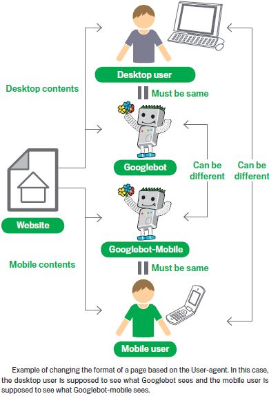

So what does "the page that the user sees" mean if you provide both versions with a URL? As I mentioned in the previous post, Google uses "Googlebot" for web search and "Googlebot-Mobile" for mobile search. To remain within our guidelines, you should serve the same content to Googlebot as a typical desktop user would see, and the same content to Googlebot-Mobile as you would to the browser on a typical mobile device. It's fine if the contents for Googlebot are different from those for Googlebot-Mobile.

One example of how you could be unintentionally detected as cloaking is if your site returns a message like "Please access from mobile phones" to desktop browsers, but then returns a full mobile version to both crawlers (so Googlebot receives the mobile version). In this case, the page which web search users see (e.g. "Please access from mobile phones") is different from the page which Googlebot crawls (e.g. "Welcome to my site"). Again, we detect cloaking because we want to serve users the same relevant content that Googlebot or Googlebot-Mobile crawled.


Popular Posts

 
Powered by Blogger.