Showing posts with label Subscribing Widgets. Show all posts

Monday 11 March 2013

Email Subscription Slider Widget For Blogger


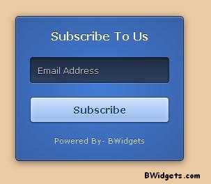
This widget is inspired from Social Subscription Scrolling Slider Widget. It's feed subscription form, which will slide out after scrolling the page little bit. It's based on jQuery, so don't forget to remove jQuery from our code, if your blog already has it.

I created this widget past Saturday for my blog but then I thought that I should share this with you all. As of writing, this widget will appear on our blog as you scroll down a little bit.

Add This To Blogger:

  • Go To Blogger > Layout > Add A Gadget > HTML/JavaScript
  • Paste following code and click on Save:

<!-- Email Subscription Slider Widget For Blogger by BWidgets -->
 <script type="text/javascript" src="http://widcraft.googlecode.com/svn/jquery.min.js"></script>
<script type="text/javascript">$(window).scroll(function(){if($(document).scrollTop()>=$(document).height()/4)$("#bwsocialslide").show("slow");else $("#bwsocialslide").hide("slow");});function closebwsocialslide(){$('#bwsocialslide').remove();}</script>

<style>
#bwsocialslide{
  background:#f3f3f3;
  -moz-box-shadow:inset 0 0 1px #333;
  -webkit-box-shadow:inset 0 0 1px #333;
  box-shadow:inset 0 0 1px #333;
  padding:12px 14px 12px 14px;
  width:250px;
  position:fixed;
  bottom:13px;right:0px;
  display:none;
  z-index:3;
  height:65px;
}
.bw-email{
  padding:5px 0 0 5px;
  float:left;
  font-size:1.4em;
  font-weight:bold;
  margin:0 0 10px 0;
  color:#686B6C;
}
.bw-emailsubmit{
  background:#9B9895;
  cursor:pointer;
  color:#fff;
  border:none;
  padding:3px;
  text-shadow:0 -1px 1px rgba(0,0,0,0.25);
  font:12px sans-serif;
}
.bw-emailsubmit:hover{
  background:#E98313;
}
.textarea{
  padding:2px;
  margin:6px 2px 6px 2px;
  background:#f9f9f9;
  border:1px solid #ccc;
  resize:none;
  box-shadow:inset 1px 1px 1px rgba(0,0,0,0.1);
  -moz-box-shadow:inset 1px 1px 1px rgba(0,0,0,0.1);
  -webkit-box-shadow:inset 1px 1px 1px rgba(0,0,0,0.1);
  font-size:13px;
  width:170px;
  color:#666;
}
</style>

<div style="display: none;" id="bwsocialslide">
<a style="position:absolute;top:14px;right:10px;color:#555;font-size:10px;font-weight:bold;" href="javascript:void(0);" onclick="return closebwsocialslide();">(X)</a>

<div class="bw-email">
Subscribe via Email <form action="http://feedburner.google.com/fb/a/mailverify" id="feedform" method="post" target="popupwindow" onsubmit="window.open('http://feedburner.google.com/fb/a/mailverify?uri=widgetcraft', 'popupwindow', 'scrollbars=yes,width=550,height=520');return true">
<input gtbfieldid="3" class="textarea" name="email" onblur="if (this.value == &quot;&quot;) {this.value = &quot;Enter email address here&quot;;}" onfocus="if (this.value == &quot;Enter email address here&quot;) {this.value = &quot;&quot;;}" value="Enter email address here" type="text" />
<input type="hidden" value="widgetcraft" name="uri"/><input type="hidden" name="loc" value="en_US"/>
<input class="bw-emailsubmit" value="Submit" type="submit" />
</form>
</div>
</div>
<div class='clear'></div>
<!-- Email Subscription Slider Widget For Blogger by BWidgets -->

In above code, replace widgetcraft with your feed id. You are free to share this widget with your fans and friends. Please attribute the credits back to our blog as the only favor in return. Don't forget to leave a comment.

Monday 25 February 2013

3D Subscription Box Widget For Blogger


I created this subscription widget using CSS Facebook login form, which is available to preview or download here. It look's great and sleek. You can also use this widget on your wordpress blog or on a static HTML page.

It's coded with pure CSS, no images were harmed during creation process. Don't remove credits, and you're free to use or share this widget.

Add This Widget To Blogger:

  • Go To Blogger > Layout > Add A Gadget > HTML/JavaScript
  • Paste following code:

<form action="http://feedburner.google.com/fb/a/mailverify" method="post" target="popupwindow" onsubmit="window.open('http://feedburner.google.com/fb/a/mailverify?uri=YOURFEEDID', 'popupwindow', 'scrollbars=yes,width=550,height=520');return true" class="login">
 <h1>Subscribe To Us</h1>
 <input type="hidden" value="YOURFEEDID" name="uri" />
 <input type="email" name="email" class="login-input" placeholder="Email Address" autofocus>
 <input type="hidden" name="loc" value="en_US" />
 <input type="submit" value="Subscribe" class="login-submit">
 <p class="login-help"><a href="http://www.bwidgets.com?src=fbform" rel="nofollow">Powered By: BWidgets</a></p>
</form>

<style>
::-moz-focus-inner {
  padding: 0;
  border: 0;
}

:-moz-placeholder {
  color: #bcc0c8 !important;
}

::-webkit-input-placeholder {
  color: #bcc0c8;
}

:-ms-input-placeholder {
  color: #bcc0c8 !important;
}

.input {
  font: 12px/20px "Lucida Grande", Verdana, sans-serif;
  color: #404040;
  background: #ebc9a2;
}

.input {
  font-family: inherit;
  font-size: 12px;
  -webkit-box-sizing: border-box;
  -moz-box-sizing: border-box;
  box-sizing: border-box;
}

.login {
  padding: 18px 20px;
  width: 200px;
  background: #3f65b7;
  background-clip: padding-box;
  border: 1px solid #172b4e;
  border-bottom-color: #142647;
  border-radius: 5px;
  background-image: -webkit-radial-gradient(cover, #437dd6, #3960a6);
  background-image: -moz-radial-gradient(cover, #437dd6, #3960a6);
  background-image: -o-radial-gradient(cover, #437dd6, #3960a6);
  background-image: radial-gradient(cover, #437dd6, #3960a6);
  -webkit-box-shadow: inset 0 1px rgba(255, 255, 255, 0.3), inset 0 0 1px 1px rgba(255, 255, 255, 0.1), 0 2px 10px rgba(0, 0, 0, 0.5);
  box-shadow: inset 0 1px rgba(255, 255, 255, 0.3), inset 0 0 1px 1px rgba(255, 255, 255, 0.1), 0 2px 10px rgba(0, 0, 0, 0.5);
}
.login > h1 {
  margin-bottom: 20px;
  font-size: 16px;
  font-weight: bold;
  color: white;
  text-align: center;
  text-shadow: 0 -1px rgba(0, 0, 0, 0.4);
}

.login-input {
  display: block;
  width: 90%;
  height: 37px;
  margin-bottom: 20px;
  padding: 0 9px;
  color: white;
  text-shadow: 0 1px black;
  background: #2b3e5d;
  border: 1px solid #15243b;
  border-top-color: #0d1827;
  border-radius: 4px;
  background-image: -webkit-linear-gradient(top, rgba(0, 0, 0, 0.35), rgba(0, 0, 0, 0.2) 20%, rgba(0, 0, 0, 0));
  background-image: -moz-linear-gradient(top, rgba(0, 0, 0, 0.35), rgba(0, 0, 0, 0.2) 20%, rgba(0, 0, 0, 0));
  background-image: -o-linear-gradient(top, rgba(0, 0, 0, 0.35), rgba(0, 0, 0, 0.2) 20%, rgba(0, 0, 0, 0));
  background-image: linear-gradient(to bottom, rgba(0, 0, 0, 0.35), rgba(0, 0, 0, 0.2) 20%, rgba(0, 0, 0, 0));
  -webkit-box-shadow: inset 0 1px 2px rgba(0, 0, 0, 0.3), 0 1px rgba(255, 255, 255, 0.2);
  box-shadow: inset 0 1px 2px rgba(0, 0, 0, 0.3), 0 1px rgba(255, 255, 255, 0.2);
}
.login-input:focus {
  outline: 0;
  background-color: #32486d;
  -webkit-box-shadow: inset 0 1px 2px rgba(0, 0, 0, 0.3), 0 0 4px 1px rgba(255, 255, 255, 0.6);
  box-shadow: inset 0 1px 2px rgba(0, 0, 0, 0.3), 0 0 4px 1px rgba(255, 255, 255, 0.6);
}
.lt-ie9 .login-input {
  line-height: 35px;
}

.login-submit {
  display: block;
  width: 100%;
  height: 37px;
  margin-bottom: 15px;
  font-size: 14px;
  font-weight: bold;
  color: #294779;
  text-align: center;
  text-shadow: 0 1px rgba(255, 255, 255, 0.3);
  background: #adcbfa;
  background-clip: padding-box;
  border: 1px solid #284473;
  border-bottom-color: #223b66;
  border-radius: 4px;
  cursor: pointer;
  background-image: -webkit-linear-gradient(top, #d0e1fe, #96b8ed);
  background-image: -moz-linear-gradient(top, #d0e1fe, #96b8ed);
  background-image: -o-linear-gradient(top, #d0e1fe, #96b8ed);
  background-image: linear-gradient(to bottom, #d0e1fe, #96b8ed);
  -webkit-box-shadow: inset 0 1px rgba(255, 255, 255, 0.5), inset 0 0 7px rgba(255, 255, 255, 0.4), 0 1px 1px rgba(0, 0, 0, 0.15);
  box-shadow: inset 0 1px rgba(255, 255, 255, 0.5), inset 0 0 7px rgba(255, 255, 255, 0.4), 0 1px 1px rgba(0, 0, 0, 0.15);
}
.login-submit:active {
  background: #a4c2f3;
  -webkit-box-shadow: inset 0 1px 5px rgba(0, 0, 0, 0.4), 0 1px rgba(255, 255, 255, 0.1);
  box-shadow: inset 0 1px 5px rgba(0, 0, 0, 0.4), 0 1px rgba(255, 255, 255, 0.1);
}

.login-help {
  text-align: center;
}
.login-help > a {
  font-size: 11px;
  color: #d4deef;
  text-decoration: none;
  text-shadow: 0 -1px rgba(0, 0, 0, 0.4);
}
.login-help > a:hover {
  text-decoration: underline;
}
</style>

Customizations:

In above code replace YOURFEEDID with your FeedBurner feed id. Also, you can change width of this widget by changing width: 200px; with your preferred width.

Don't forget to leave your comments.....

Monday 24 December 2012

3 In 1 Like Box Widget For Blogger - Version 5.0


Previous Versions : Version 1.0 | Version 2.0 | Version 3.0 | Version 4.0


So here is last pop-up social subscribing widget of the year. It's awesome and better than all previous widgets and you can also set appear time and other features of this widget. Happy Holidays.

You can generate this widget using our widget generator :

Tuesday 6 November 2012

WordPress Style Follow Widget For Blogger


Last night, I was surfing around the internet and I found a cool following wordpress feed subscription widget. I tried to convert that widget for blogger and after few minutes, I was totally successful to convert it.

Installing:

  • Go To Blogger > Layout > Add A Gadget > HTML/JavaScript > Paste following code:


<div id="bit" class="loggedout-follow-normal" style="bottom: 0px; ">
<a class="bsub open" href="javascript:void(0)"><span id="bsub-text">Follow</span></a>
<div id="bitsubscribe" class="open">
<h3><label for="loggedout-follow-field">Follow BWidgets</label></h3>
<form action="http://feedburner.google.com/fb/a/mailverify" method="post" onsubmit="window.open('http://feedburner.google.com/fb/a/mailverify?WidgetCraft', 'popupwindow', 'scrollbars=yes,width=550,height=520');return true" target="popupwindow" id="loggedout-follow">
<p>Get every new post delivered to your Inbox.</p>
<p><input type="email" name="email" style="width: 95%; padding: 1px 2px;outline:none" onclick="value=''" value="Enter your email address" onfocus="this.value=(this.value==&quot;Enter your email address&quot;) ? &quot;&quot; : this.value;" onblur="this.value=(this.value==&quot;&quot;) ? &quot;Enter email address&quot; : this.value;" id="loggedout-follow-field"></p>
<input name="uri" type="hidden" value="WidgetCraft" /><input name="loc" type="hidden" value="en_US" />
<p id="bsub-subscribe-button"><input type="submit" value="Subscribe"></p>
</form>
<div id="bsub-credit"><a href="http://www.bwidgets.com?ref=lof" style="text-decoration:none;color: whitesmoke;">Powered by BWidgets</a></div>
</div><!-- #bitsubscribe -->
</div>
<script type="text/javascript" src="http://widcraft.googlecode.com/svn/LoggedOutFollow.js"></script>
<style>
/* ----------------------------------------------------------------------------------------------------------------*/
/* ---------->>> thickbox specific link and font settings <<<------------------------------------------------------*/
/* ----------------------------------------------------------------------------------------------------------------*/
#TB_HideSelect{
z-index:99;
position:fixed;
top: 0;
left: 0;
background-color:#fff;
border:none;
filter:alpha(opacity=0);
-moz-opacity: 0;
opacity: 0;
height:100%;
width:100%;
}
* html #TB_HideSelect { /* ie6 hack */
     position: absolute;
     height: expression(document.body.scrollHeight > document.body.offsetHeight ? document.body.scrollHeight : document.body.offsetHeight + 'px');
}
#TB_iframeContent{
clear:both;
border:none;
margin-bottom:-1px;
_margin-bottom:1px;
}
#bit, #bit * {
*zoom: 1;
}
#bit {
font: normal 13px "Helvetica Neue", sans-serif;
_display: none;
}
.loggedout-follow-shelf {
position: fixed;
right: 40%;
z-index: 999999;
bottom: -300px;
}
.loggedout-follow-normal {
position: fixed;
z-index: 999999;
bottom: -300px;
right: 10px;
}
.loggedout-follow-typekit {
margin-right: 4.5em;
position: fixed;
z-index: 999999;
bottom: -300px;
right: 10px;
}
#bit a.bsub {
display: block;
overflow: hidden;
padding: 0 10px 0 8px;
float: right;
text-decoration: none !important;
line-height: 28px;
font: normal 13px/28px "Helvetica Neue", sans-serif;
color: #CCC;
text-shadow: #444 0px -1px 0px;
letter-spacing: normal;
border: 0;
background-color: #464646;
background-image: -ms-linear-gradient(bottom, #464646, #3f3f3f 5px);
background-image: -moz-linear-gradient(bottom, #3f3f3f, #464646 5px);
background-image: -o-linear-gradient(bottom, #464646, #3f3f3f 5px);
background-image: -webkit-gradient(linear, left bottom, left top, from(#464646), to(#3f3f3f));
background-image: -webkit-linear-gradient(bottom, #3f3f3f, #464646 5px);
background-image: linear-gradient(bottom, #464646, #3f3f3f 5px);
-webkit-box-shadow: 0 -1px 5px rgba(0,0,0,0.20);
-moz-box-shadow: 0 -1px 5px rgba(0,0,0,0.20);
-o-box-shadow: 0 -1px 5px rgba(0,0,0,0.20);
-ms-box-shadow: 0 -1px 5px rgba(0,0,0,0.20);
box-shadow: 0 -1px 5px rgba(0,0,0,0.20);
outline-style: none;
outline-width: 0;
}
#bit a.bsub {
-moz-border-radius: 2px 2px 0 0;
-webkit-border-radius: 2px 2px 0 0;
-o-border-radius: 2px 2px 0 0;
-ms-border-radius: 2px 2px 0 0;
border-radius: 2px 2px0 0 0;
}
#bit a.bsub span {
background: url(https://blogger.googleusercontent.com/img/b/R29vZ2xl/AVvXsEhnDp_P2F_RTiv8YVrBo9TOmNUnOIn5XqHpqBjEkEAxIQylzKnpob5LkOjulWpMgZy9v8wxz3ALZhLi-GvF_oSRETvwQ0cD9u-8PjNXzyZmEuLxZvPZ9-a-fse9k6IEIvizWcYPKcALO6Q/s1600/wpcom-admin-bar-icons.png) 0 -77px no-repeat;
padding-left: 19px;
}
#bit a:hover span, #bit a.bsub.open span {
color: #ffffff !important;
background-position: 0 -117px;
}
#bit a.bsub.open {
background: #333;
}
#bitsubscribe {
background: #464646;
color: #fff;
padding: 15px;
width: 200px;
margin-top: 27px;
-moz-border-radius: 2px 0 0 0;
-webkit-border-radius: 2px 0 0 0;
-o-border-radius: 2px 0 0 0;
-ms-border-radius: 2px 0 0 0;
border-radius: 2px 0 0 0;
*float: right;
*margin-right: -68px;
}
div#bitsubscribe.open {
-webkit-box-shadow: 0 0 8px rgba(0,0,0,0.5);
-moz-box-shadow: 0 0 8px rgba(0,0,0,0.5);
-o-box-shadow: 0 0 8px rgba(0,0,0,0.5);
-ms-box-shadow: 0 0 8px rgba(0,0,0,0.5);
box-shadow: 0 0 8px rgba(0,0,0,0.5);
}
#bitsubscribe div {
overflow: hidden;
}
#bit h3, #bit #bitsubscribe h3 {
margin: 0 0 .5em 0 !important;
font-family: "Helvetica Neue", Helvetica, Arial, sans-serif;
font-weight: 300;
text-shadow: 0 1px 0 #333;
font-size: 20px;
color: #fff;
text-align: left;
}
#bit #bitsubscribe p {
margin: 0 0 1em 0;
*margin: 0 0 0 0;
font: 15px/1.3em "Helvetica Neue", Helvetica, Arial, sans-serif;
font-weight: 300;
text-shadow: 0 1px 0 #333;
color: #fff;
}
#bitsubscribe p a {
margin: 20px 0 0;
color: #fff;
text-decoration: underline;
}
#bit #bitsubscribe p.bit-follow-count {
font-size: 13px;
}
#bitsubscribe input[type=submit] {
padding: 2px 20px;
background: #333; /* Old browsers */
background: -moz-linear-gradient(top, #333 0%, #111 100%); /* FF3.6+ */
background: -webkit-gradient(linear, left top, left bottom, color-stop(0%,#333), color-stop(100%,#111)); /* Chrome,Safari4+ */
background: -webkit-linear-gradient(top, #333 0%,#111 100%); /* Chrome10+,Safari5.1+ */
background: -o-linear-gradient(top, #333 0%,#111 100%); /* Opera11.10+ */
background: -ms-linear-gradient(top, #333 0%,#111 100%); /* IE10+ */
background: linear-gradient(top, #333 0%,#111 100%);
color: #ccc;
text-shadow: 0 1px 0 #000;
border: 1px solid #282828;
-moz-border-radius: 11px;
-webkit-border-radius: 11px;
border-radius: 11px;
-moz-box-shadow: inset 0 1px 0 #444;
-webkit-box-shadow: inset 0 1px 0 #444;
box-shadow: inset 0 1px 0 #444;
text-decoration: none;
-webkit-transition: all 0.25s ease-in-out;
-moz-transition: all 0.25s ease-in-out;
-o-transition: all 0.25s ease-in-out;
transition: all 0.25s ease-in-out;
*margin: 1em 0 1em 0;
}
#bitsubscribe input[type=submit]:hover {
background: #222; /* Old browsers */
background: -moz-linear-gradient(top, #333 0%, #222 100%); /* FF3.6+ */
background: -webkit-gradient(linear, left top, left bottom, color-stop(0%,#333), color-stop(100%,#222)); /* Chrome,Safari4+ */
background: -webkit-linear-gradient(top, #333 0%,#222 100%); /* Chrome10+,Safari5.1+ */
background: -o-linear-gradient(top, #333 0%,#222 100%); /* Opera11.10+ */
background: -ms-linear-gradient(top, #333 0%,#222 100%); /* IE10+ */
background: linear-gradient(top, #333 0%,#222 100%);
color: #fff;
-moz-box-shadow: inset 0 1px 0 #4f4f4f;
-webkit-box-shadow: inset 0 1px 0 #4f4f4f;
box-shadow: inset 0 1px 0 #4f4f4f;
text-decoration: none;
}
#bitsubscribe input[type=submit]:active {
background: #111; /* Old browsers */
background: -moz-linear-gradient(top, #111 0%, #222 100%); /* FF3.6+ */
background: -webkit-gradient(linear, left top, left bottom, color-stop(0%,#111), color-stop(100%,#222)); /* Chrome,Safari4+ */
background: -webkit-linear-gradient(top, #111 0%,#222 100%); /* Chrome10+,Safari5.1+ */
background: -o-linear-gradient(top, #111 0%,#222 100%); /* Opera11.10+ */
background: -ms-linear-gradient(top, #111 0%,#222 100%); /* IE10+ */
background: linear-gradient(top, #111 0%,#222 100%);
color: #aaa;
-moz-box-shadow: inset 0 -1px 0 #333;
-webkit-box-shadow: inset 0 -1px 0 #333;
box-shadow: inset 0 -1px 0 #333;
text-decoration: none;
}
#bitsubscribe input[type=text] {
-moz-border-radius: 3px;
-webkit-border-radius: 3px;
-o-border-radius: 3px;
-ms-border-radius: 3px;
border-radius: 3px;
font: 15px "Helvetica Neue", Helvetica, Arial, sans-serif;
font-weight: 300;
}
#bitsubscribe input[type=text]:focus {
border: 1px solid #000;
}
#bitsubscribe.open {
display: block;
}
#bsub-subscribe-button {
text-align: center;
margin: 0 auto;
}
</style>


Customization:

Now replace BWidgets with your blog's title and also replace WidgetCraft with your feed id.

Tuesday 16 October 2012

Social Subscription Scrolling Slider Widget For Blogger


After searching web finally i found a cool social subscribing widget for blogger. This widget contains like button, follow button and +1 button which will surely help you to build your social blogging network. Well there is nothing in the world like Social Blogging Network but i thought it was cool. Here we go:

  • Go To Blogger > Layout > Add A Gadget > HTML/JavaScript > Paste following code:

<script type="text/javascript" src="http://widcraft.googlecode.com/svn/jquery.min.js"></script>
<script type="text/javascript">$(window).scroll(function(){if($(document).scrollTop()>=$(document).height()/4)$("#mblsocialslide").show("slow");else $("#mblsocialslide").hide("slow");});function closeMBlsocialslide(){$('#mblsocialslide').remove();$.ajax({type:"POST",url:"/facebookpage.php"});}</script>
<style>
#mblsocialslide{background:#f3f3f3;border-radius:9px;-moz-border-radius:9px;-webkit-border-radius:9px;-moz-box-shadow:inset 0 0 3px #333;-webkit-box-shadow:inset 0 0 3px #333;box-shadow:inner 0 0 3px #333;padding:12px 14px 12px 14px;width:300px;position:fixed;bottom:13px;right:2px;display:none;z-index:3;height:65px;}
</style>
<div style="display: none;" id="mblsocialslide">
<a style="position:absolute;top:14px;right:10px;color:#555;font-size:10px;font-weight:bold;" href="javascript:void(0);" onclick="return closeMBlsocialslide();">(X)</a>
<span style="font-family: Tekton Pro; font-size: 20px; margin: 10px 0; text-shadow: 1px 1px 0 #FFFFFF;">Don't forget to join our community!</span><br />
<div style="float:left; margin:15px;"><g:plusone annotation="none"></g:plusone></div>
<div style="float:left; margin:15px;"><iframe src="//www.facebook.com/plugins/like.php?href=https%3A%2F%2Fwww.facebook.com%2FPageUsername&send=false&layout=button_count&width=80&show_faces=false&action=like&colorscheme=light&font=arial&height=21" scrolling="no" frameborder="0" style="border:none; overflow:hidden; width:80px; height:21px;" allowtransparency="true"></iframe></div>
<div style="float:left; margin:15px;"><a href="https://twitter.com/TwitterUsername" class="twitter-follow-button" data-show-count="false" data-size="large" data-show-screen-name="false">Follow Us</a>
<script>!function(d,s,id){var js,fjs=d.getElementsByTagName(s)[0];if(!d.getElementById(id)){js=d.createElement(s);js.id=id;js.src="//platform.twitter.com/widgets.js";fjs.parentNode.insertBefore(js,fjs);}}(document,"script","twitter-wjs");</script></div>
</div>
<div class='clear'></div>

  • Now replace TwitterUsername with your twitter username and PageUsername with your facebook page username and save it.....

Friday 12 October 2012

Google + Style Subscription Box Widget For Blogger


Here is another cool subscription box for Blogger. You can call it a Google + style or a Chrome style but believe me it really doesn't matters what you say because all it matters is what your visitors say. So here is this quick and easy tutorial :

  • Go To Blogger > Layout > Add A Widget > HTML/JavaScript > Paste below code :


<div class="subscribe_outer">
<div class="subscribe_wrapper">
<p>Subscribe Updates, Its FREE!</p>
<div id="btntEmailsub">
<form class="btntEmailform" target="popupwindow" onsubmit="window.open('http://feedburner.google.com/fb/a/mailverify?uri=FeedID', 'popupwindow', 'scrollbars=yes,width=600,height=540');return true" method="post" action="http://feedburner.google.com/fb/a/mailverify">
<input type="hidden" value="FeedID" name="uri">
<input type="hidden" value="en_US" name="loc">
<input class="emailText" type="text" value="Enter your email..." onfocus="if (this.value == " enter="" your="" email...")="" {this.value="" }"="" onblur="if (this.value == " ")="" ;}"="" onclick="value=''"name="email">
<input class="emailButton" type="submit" value="Signup Now!" title="">
</form>
</div>
</div>
</div>
<style>

.subscribe_outer {
    background: url("https://blogger.googleusercontent.com/img/b/R29vZ2xl/AVvXsEhsdaS3WtJlcjEr-V4Wq2q1-FK94jRzpbjfs-9MR7hLsV2Lx9bCxkdborrvrsbWrGgQCS9XNwdK-0i_wTsoJ_ZqL9b2RMVX_xAB5fR3NUAuYLd33G5V1In3PC2XWq80g0vVGpcMpOmqahg/s1600/color-chronicl.gif") repeat scroll 0 0 transparent;
    margin: 0 -10px;
    padding: 5px 0;
}
.subscribe_wrapper {
    background: url("https://blogger.googleusercontent.com/img/b/R29vZ2xl/AVvXsEgIKs4GvaZVkWMWbiCekf2MOgpn69gozRNdjs5GdBwB-T4JAi5jCWH1bM7Psawm3JtoVbdHZ4CV2ZgvdO2e7IaI033613N-IQZDbU1DjAVNdvkAjKSLx0HpN_5B0WXlSgqCJAvSF9846hw/s1600/pattern-chronicl.png") repeat scroll 0 0 #333333;
    color: #CCCCCC;
    font-size: 15px;
    font-weight:bold;
    line-height: 20px;
    padding: 10px 50px 18px 38px;
}
.emailButton {
    background:#249334;
    border: 0 none;
    border-radius: 4px 4px 4px 4px;
    color: #FFFFFF;
    cursor: pointer;
    font-weight: bold;
    padding: 10px 40px;
    text-shadow: 1px 1px 0 rgba(0, 0, 0, 0.4);
    width: 100%;
}
.emailText {
    background: url("https://blogger.googleusercontent.com/img/b/R29vZ2xl/AVvXsEiafC2cve3EYSSS6sb3dX6dtKYNylvH1X6ajtyOWBlEMdX43b2RJbsxd2VZJj-bbJ3Jx_KV3vGLv9i2r-MBNsPegZlS6taDwMTwzurqUIO0pYnZ3AbmVBpg1We8La7zf-Jc_FO_c1LZ9Ok/s1600/email.png") no-repeat scroll 10px center #FFFFFF;
    border: 0 none;
    border-radius: 4px 4px 4px 4px;
    box-shadow: 0 0 3px rgba(0, 0, 0, 0.05) inset;
    color: #444444;
    padding: 10px 40px;
    margin: 0 0 15px;
    outline: none;
    text-decoration: none;
    width: 70%;
}
input, textarea {
    font-family:'Lora',georgia,serif;
}
.subscribe_wrapper {
    color: #CCCCCC;
    font-size: 14px;
    line-height: 20px;
}
.emailButton {
    width: 300px;
}
.emailButton {
    background: -moz-linear-gradient(center top , #30A146 0%, #249334 100%) repeat scroll 0 0 transparent;
    border: 0 none;
    border-radius: 4px 4px 4px 4px;
    color: #FFFFFF;
    cursor: pointer;
    font-weight: bold;
    padding: 10px 40px;
    text-shadow: 1px 1px 0 rgba(0, 0, 0, 0.4);
    width: 100%;
}
</style>

Now in above code change FeedID with your feed id.

For example if your feed url is feeds.feedburner.com/WidgetCraft then WidgetCraft is your FeedID

Wednesday 29 August 2012

Social Subscribing Pop Up Widget For Blogger - Version 3.0


Earlier this month i posted two facebook like box pop up widgets and first one with timer and second with cache . Best part about this one is that this one is created by me and i'am the original creator of this widget and it contain more options like subscribe , tweet and social media links.

This one also contain cache so you can control how often it appear to your users and with our widget generator it's too easy to generate this :


 Like this then please post what we should add or remove in next widget of this series..... :)

Monday 27 August 2012

Amazing Email Subscription Form For Blogger


First of all this widget is created by MBT and i'am just posting it all credits goes to those guys Thanks. It's a great widget with a beautiful form and some round social media icons. I was thinking about to add widget generator to make it easy but it would be little crappy so here we go :
  • Go To Blogger > Layout > Add A Gadget > HTML/Java Script
  • Paste following code :
<style>
.tbisubscribe {
border: 1px solid #D3D3D3;
padding: 8px;
width: 300px;
-webkit-transition: all 0.5s ease-in-out;
-moz-transition: all 0.5s ease-in-out;
-ms-transition: all 0.5s ease-in-out;
-o-transition: all 0.5s ease-in-out;
transition: all 0.5s ease-in-out;
}
.tbisubscribe:hover {
-moz-box-shadow: inset 1px 1px 10px 1px rgba(249, 215, 126, 1);
-webkit-box-shadow: inset 1px 1px 10px 1px rgba(249, 215, 126, 1);
box-shadow: inset 1px 1px 10px 1px rgba(249, 215, 126, 1);
}
.tbimailbox {
border: 1px solid #D3D3D3;
-webkit-border-radius: 4px;
border-radius: 4px;
-moz-box-shadow: 1px 1px 1px 1px rgba(255, 172, 84, 0.4) inset;
-webkit-box-shadow: 1px 1px 1px 1px rgba(0, 0, 0, 0.4) inset;
box-shadow: 1px 1px 1px 1px rgba(0, 0, 0, 0.4) inset;
color: #666;
font: 14px "trebuchet ms", sans-serif;
padding: 7px 15px;
width: 160px;
-webkit-transition: all 0.5s ease-in-out;
-moz-transition: all 0.5s ease-in-out;
-ms-transition: all 0.5s ease-in-out;
-o-transition: all 0.5s ease-in-out;
transition: all 0.5s ease-in-out;
}
.tbimailbox:hover {
-webkit-box-shadow: none;
box-shadow: none;
-webkit-transition: all 0.5s ease-in-out;
-moz-transition: all 0.5s ease-in-out;
-ms-transition: all 0.5s ease-in-out;
-o-transition: all 0.5s ease-in-out;
transition: all 0.5s ease-in-out;
}
.tbisubmit {
font: bold 12px Tahoma, Geneva, sans-serif;
font-style: normal;
color: #ffffff;
background: #ff5714;
border: 0px solid #ffffff;
text-shadow: 0px -1px 1px #222222;
box-shadow: 2px 2px 5px #000000;
-moz-box-shadow: 2px 2px 5px #000000;
-webkit-box-shadow: 2px 2px 5px #000000;
border-radius: 10px 10px 10px 10px;
-moz-border-radius: 10px 10px 10px 10px;
-webkit-border-radius: 10px 10px 10px 10px;
padding: 8px 15px;
cursor: pointer;
margin: 0 auto;
}
.tbisubmit:active {
cursor: pointer;
position: relative;
top: 2px;
}
.tbisubmit::-moz-focus-inner {
border: 0;
padding: 0;
margin: 0;
}
</style>
<link href='http://fonts.googleapis.com/css?family=Oswald' rel='stylesheet' type='text/css' />
<div class='tbisubscribe'>
<div style='color: #666666; font-weight: bold; font: 22px Oswald, cursive; margin: 0px 0px 10px 15px;'>Get Free Updates in your Inbox</div>
<div style='margin: 10px 0 0 6px;'>
<form action='http://feedburner.google.com/fb/a/mailverify' class='emailform'
method='post' onsubmit='window.open(&apos;http://feedburner.google.com/fb/a/mailverify?uri=WidgetCraft&apos;, &apos;popupwindow&apos;, &apos;scrollbars=yes,width=550,height=520&apos;);return true'
style='margin: 0pt;' target='popupwindow'>
<input name='uri' type='hidden' value='WidgetCraft' />
<input name='loc' type='hidden' value='en_US' />
<input class='tbimailbox' name='email' onblur='if (this.value == &quot;&quot;) {this.value = &quot;Enter your email...&quot;;}'
onfocus='if (this.value == &quot;Enter your email...&quot;) {this.value = &quot;&quot;}'
type='text' value='Enter your email...' />
<input alt='' class='tbisubmit' title='' type='submit' value='Subscribe'/>
</form>
</div>
<div style='border: none; color: #666666; font: 22px Oswald, cursive; margin: 25px 0 0 5px;'>Follow us on:</div>
<div style='margin: -32px 0 0 120px;'>
<a href='FACEBOOK URL' target='_blank' title='Join us on Facebook'><img src='https://blogger.googleusercontent.com/img/b/R29vZ2xl/AVvXsEjjOQBWK78WHrl-n5RcW_0h2MuzvRcvbbBZ53rPC6rM86qT1nIJRGkp_FTo68KvoGwoSBllhZxSDNQFDRP8LQzUdpR-U3aOXeO5LCGUEkCMt6t5o-agQnICw1sC3-37539xGJW95JgdkZ8/s1600/facebook500.png' alt='facebook'/></a>
<a href='TWITTER URL' rel='nofollow' target='_blank'
title='Follow us on Twitter'><img src='https://blogger.googleusercontent.com/img/b/R29vZ2xl/AVvXsEjafE92u6GZ5Ta6MSo5mwhdTFAYgspbfGJx2OY2l1NEFlx2MN_von46I_-1p5vVX_NTNQuu41v9zSsQy8D7eZ52phyphenhyphennUZGxMS0XAZqouI76M9oIJn8_FlylA3wsa1Tierdyk9eDtktaCDU/s1600/twitter.png' alt='twitter'/></a>
<a href='GOOGLE+ URL' rel='nofollow' target='_blank'
title='Follow us on Google+'><img src='https://blogger.googleusercontent.com/img/b/R29vZ2xl/AVvXsEjZ1e64hzsiraZskW1n0JynKK38RVAP6wA9JQHtCGxgCtoGaq9QLhpp61BC1dwEFBC5OVl13ceQqQxlCc6nib7WeJZZaaALBs25p2IezECaV6EhzOM-J_g9lmKaygzWIlOJpj2pdLviOZA/s1600/googleplus-revised.png' alt='gplus'/></a>
<a href='PINTEREST URL' rel='nofollow' target='_blank'
title='Follow us on Pinterest'><img src='https://blogger.googleusercontent.com/img/b/R29vZ2xl/AVvXsEj4jnLcmh0E4ra49Oc9vos5DpShVRO6N_sOmMGdOuqTdAkoZwERszxmfbOeucp77Unv6lqYwpTWD2DYAIo7X0-iWRNeSCcaSmhbD3jg-LjLFDO904Ds0uU7SR5W0kz-xjDKCoN9I_Ix3bQ/s1600/pinterest.png' alt='pinterest'/></a>
<a href='RSS URL' rel='nofollow' target='_blank'
title='Subscribe to RSS'><img src='https://blogger.googleusercontent.com/img/b/R29vZ2xl/AVvXsEjiwkwyvOFtEZ99HRWJZ92mDt-ir2yLwr2XdacyFiopsCXuZS5Mxg57B4icPzxg_rQ1ca3ORahWp1Gf4On_UlAuC8ykzfb0w2G_f7om2lamCHHLwIZB_Kne7LduyXeAHK4EAXvCleaedSM/s1600/rss.png' alt='rss'/></a>
</div>
</div>
Now just replace WidgetCraft with your feed id and RSS URL and all social media URLs with your profile URLs

Having any problems then leave a comment.....

Thursday 23 August 2012

Create Free Newsletter For Blogger


Newsletter connects you with your visitors and give them best and new content and share some new features with your visitors. First of all it's a newsletter not some sort of feed widget.


First Part : 


Now we will create our newsletter form :
  • Create a form just like shown in the image below only with one field "Email" and save it.

After completing above step save your form and grab your form url , which will look something like this 

https://docs.google.com/spreadsheet/viewform?formkey=dEkwQ3Q5d1FTMXNFc1JzWDhwOV91ZHc6MQ

Now copy formkey from your form code(not from our code) :

https://docs.google.com/spreadsheet/viewform?formkey=dEkwQ3Q5d1FTMXNFc1JzWDhwOV91ZHc6MQ

Second Part :
  • Go To Blogger > Create New Page > HTML > Paste below script 

<div id="content">
<h1> Subscribe To Our Newsletter! </h1>
<script type="text/javascript">var submitted=false;</script>
<iframe name="hidden_iframe" id="hidden_iframe"
style="display:none;" onload="if(submitted)
{window.location='After Form Is Submitted';}"></iframe>
<form action="https://docs.google.com/spreadsheet/formResponse?formkey=YourFormKey&amp;ifq" method="post"
target="hidden_iframe" onsubmit="submitted=true;">
<p> <label for="usermail" class="iconic mail-alt"> E-mail address : </label> <input type="email" name="entry.0.single" class="ss-q-short" id="entry_0" placeholder="I promise I hate spam as much as you do" required="required"  />
<input type="hidden" name="pageNumber" value="0">
<input type="hidden" name="backupCache" value="">
</p>
<input type="submit" name="submit" value="Subscribe !" />  
</form>
<a href="http://widcraft.blogspot.com/2012/08/create-free-newsletter-for-blogger.html"> Create Free Newsletter </a>                        
</div>
<style>
/** Created And Converted For Blogger By - WidCraft.blogspot.com **/
#container {width:465px; margin:20px auto 0;}
a, a:visited {color:#fff; text-decoration:none; font-size:12px;}
a:hover {text-decoration:underline;}
h1 {
font-family: 'Questrial', Verdana, sans-serif;
text-align:center;
font-size:25px;
padding:0;
margin:0 0 20px 0;
position:relative;
color:#8C8C8C;
}
/** have a nice ampersand **/
h1:after {
font-size:25px;
color:#D6CFCB;
content: '&';
text-align:center;
display:block;
width:100%;
font-family: 'Alice', Verdana, serif;
text-shadow: 0px 1px 0px #fff;
}
/** create the gradient bottom **/
h1:before {
position:absolute;
bottom:15px;
 content: ' ';
 text-align:center;
 display:block;
 height:2px;
 width:100%;
background: -moz-linear-gradient(left,  rgba(255,255,255,0) 0%, rgba(182,180,180,0.7) 42%, rgba(180,178,178,0) 43%, rgba(168,166,166,0) 50%, rgba(180,178,178,0) 57%, rgba(182,180,180,0.7) 58%, rgba(238,237,237,0.3) 90%, rgba(255,255,255,0) 100%); /* FF3.6+ */
background: -webkit-gradient(linear, left top, right top, color-stop(0%,rgba(255,255,255,0)), color-stop(42%,rgba(182,180,180,0.7)), color-stop(43%,rgba(180,178,178,0)), color-stop(50%,rgba(168,166,166,0)), color-stop(57%,rgba(180,178,178,0)), color-stop(58%,rgba(182,180,180,0.7)), color-stop(90%,rgba(238,237,237,0.3)), color-stop(100%,rgba(255,255,255,0))); /* Chrome,Safari4+ */
background: -webkit-linear-gradient(left,  rgba(255,255,255,0) 0%,rgba(182,180,180,0.7) 42%,rgba(180,178,178,0) 43%,rgba(168,166,166,0) 50%,rgba(180,178,178,0) 57%,rgba(182,180,180,0.7) 58%,rgba(238,237,237,0.3) 90%,rgba(255,255,255,0) 100%); /* Chrome10+,Safari5.1+ */
background: -o-linear-gradient(left,  rgba(255,255,255,0) 0%,rgba(182,180,180,0.7) 42%,rgba(180,178,178,0) 43%,rgba(168,166,166,0) 50%,rgba(180,178,178,0) 57%,rgba(182,180,180,0.7) 58%,rgba(238,237,237,0.3) 90%,rgba(255,255,255,0) 100%); /* Opera 11.10+ */
background: -ms-linear-gradient(left,  rgba(255,255,255,0) 0%,rgba(182,180,180,0.7) 42%,rgba(180,178,178,0) 43%,rgba(168,166,166,0) 50%,rgba(180,178,178,0) 57%,rgba(182,180,180,0.7) 58%,rgba(238,237,237,0.3) 90%,rgba(255,255,255,0) 100%); /* IE10+ */
background: linear-gradient(left,  rgba(255,255,255,0) 0%,rgba(182,180,180,0.7) 42%,rgba(180,178,178,0) 43%,rgba(168,166,166,0) 50%,rgba(180,178,178,0) 57%,rgba(182,180,180,0.7) 58%,rgba(238,237,237,0.3) 90%,rgba(255,255,255,0) 100%); /* W3C */
}
/* Here comes to good stuff : content styling */
#content{
position:relative;
width:400px;
min-height:200px;
z-index:100;
padding:30px;
border:1px solid #383838;
/* My stipped background */
background: #D1D1D1; /* Old browsers */
background: -moz-repeating-linear-gradient(-45deg, #EFC1CB , #EFC1CB 30px, #F2F2F2 30px, #F2F2F2 40px, #C2E8F5 40px, #C2E8F5 70px,#F2F2F2 70px, #F2F2F2 80px); /* FF3.6+ */
    background: -webkit-repeating-linear-gradient(-45deg, #EFC1CB , #EFC1CB 30px, #F2F2F2 30px, #F2F2F2 40px, #C2E8F5 40px, #C2E8F5 70px,#F2F2F2 70px, #F2F2F2 80px); /* FF3.6+ */
    background: -o-repeating-linear-gradient(-45deg, #EFC1CB , #EFC1CB 30px, #F2F2F2 30px, #F2F2F2 40px, #C2E8F5 40px, #C2E8F5 70px,#F2F2F2 70px, #F2F2F2 80px); /* FF3.6+ */
    background: repeating-linear-gradient(-45deg, #EFC1CB , #EFC1CB 30px, #F2F2F2 30px, #F2F2F2 40px, #C2E8F5 40px, #C2E8F5 70px,#F2F2F2 70px, #F2F2F2 80px); /* FF3.6+ */
/*border-radius*/
-webkit-border-radius:8px;
   -moz-border-radius:8px;
        border-radius:8px;
/*box-shadow*/
-webkit-box-shadow:0px 1px 6px #3F3F3F;
   -moz-box-shadow:0px 1px 6px #3F3F3F;
        box-shadow:0px 1px 6px #3F3F3F;
}
/** my "fake" background that will hover the stripes **/
#content:after{
background:#F9F9F9;
margin:10px;
position: absolute;
content : " ";
bottom: 0;
left: 0;
right: 0;
top: 0;
z-index: -1;
border:1px #E5E5E5 solid;  
/*border-radius*/
-webkit-border-radius:8px;
   -moz-border-radius:8px;
        border-radius:8px;
}
/*** form styling **/
/** we remove the red glow around required fields since we are already using the red star */
input:required, textarea:required {
    -moz-box-shadow:none;
    -webkit-box-shadow:none;
    -o-box-shadow:none;
    box-shadow:none;
}
/** inputs and textarea**/
input:not([type="submit"]), textarea{
outline:none;
display:block;
width:380px;
padding:4px 8px;
border:1px dashed #DBDBDB;
color:#3F3F3F;
font-family:'Droid Sans',Tahoma,Arial,Verdana sans-serif;
font-size:14px;
/*border-radius*/
-webkit-border-radius:2px;
   -moz-border-radius:2px;
        border-radius:2px;
/*transition*/
-webkit-transition:background 0.2s linear,
       box-shadow 0.6s linear;
   -moz-transition:background 0.2s linear,
       box-shadow 0.6s linear;
     -o-transition:background 0.2s linear,
       box-shadow 0.6s linear;
        transition:background 0.2s linear,
       box-shadow 0.6s linear;
}
input:not([type="submit"]):active,
textarea:active,
input:not([type="submit"]):focus,
textarea:focus{
background:#F7F7F7;
border:dashed 1px #969696;
/*box-shadow*/
-webkit-box-shadow:2px 2px 7px #E8E8E8 inset;
   -moz-box-shadow:2px 2px 7px #E8E8E8 inset;
        box-shadow:2px 2px 7px #E8E8E8 inset;
}
input:not([type="submit"]){
height: 20px;
}
/* placeholder */
::-webkit-input-placeholder  {
color:#BABABA;
font-style:italic;
}
input:-moz-placeholder,
textarea:-moz-placeholder{
color:#BABABA;
font-style:italic;
}
textarea{
min-height:150px;
resize:vertical
}
label{
color:#7F7E7E;
-webkit-transition: color 1s ease;
   -moz-transition: color 1s ease;
     transition: color 1s ease;
}
label:hover{
color:#191919;
}
label:before{
color:#C1BFBD;
-webkit-transition: color 1s ease;
   -moz-transition: color 1s ease;
     transition: color 1s ease;
}
label:hover:before{
color:#969696;
-webkit-transition: color 1s ease;
   -moz-transition: color 1s ease;
     transition: color 1s ease;
}
p{
margin-bottom:20px;
}
.indication{
color:#878787;
font-size:12px;
font-style:italic;
text-align:right;
padding-right:10px;
}
.required{
color:#E5224C;
}
/** Styling the send button **/
input[type=submit]{
margin-left:235px;
cursor:pointer;
background:none;
border:none;
font-family: 'Alice',serif;
color:#767676;
font-size:18px;
padding:10px 4px;
border:1px solid #E0E0E0;
text-shadow: 0px 1px  1px #E8E8E8;
background: rgb(247,247,247);
background: -moz-linear-gradient(top,  rgba(247,247,247,1) 1%, rgba(242,242,242,1) 100%);
background: -webkit-gradient(linear, left top, left bottom, color-stop(1%,rgba(247,247,247,1)), color-stop(100%,rgba(242,242,242,1)));
background: -webkit-linear-gradient(top,  rgba(247,247,247,1) 1%,rgba(242,242,242,1) 100%);
background: -o-linear-gradient(top,  rgba(247,247,247,1) 1%,rgba(242,242,242,1) 100%);
background: -ms-linear-gradient(top,  rgba(247,247,247,1) 1%,rgba(242,242,242,1) 100%);
background: linear-gradient(top,  rgba(247,247,247,1) 1%,rgba(242,242,242,1) 100%);
/*border-radius*/
-webkit-border-radius:5px;
   -moz-border-radius:5px;
        border-radius:5px;
/*box-shadow*/
-webkit-box-shadow:0px 1px 1px #FFF inset,0 0 0px 5px #EAEAEA;
-moz-box-shadow:0px 1px 1px #FFF inset,0 0 0px 5px #EAEAEA;
  box-shadow:0px 1px 1px #FFF inset,0 0 0px 5px #EAEAEA;
/*transition*/
-webkit-transition:all 0.2s linear;
   -moz-transition:all 0.2s linear;
     -o-transition:all 0.2s linear;
        transition:all 0.2s linear;
}
input[type=submit]:hover{
color:#686868;
border-color: #CECECE;
background: rgb(244,244,244);
background: -moz-linear-gradient(top,  rgba(244,244,244,1) 0%, rgba(242,242,242,1) 100%);
background: -webkit-gradient(linear, left top, left bottom, color-stop(0%,rgba(244,244,244,1)), color-stop(100%,rgba(242,242,242,1)));
background: -webkit-linear-gradient(top,  rgba(244,244,244,1) 0%,rgba(242,242,242,1) 100%);
background: -o-linear-gradient(top,  rgba(244,244,244,1) 0%,rgba(242,242,242,1) 100%);
background: -ms-linear-gradient(top,  rgba(244,244,244,1) 0%,rgba(242,242,242,1) 100%);
background: linear-gradient(top,  rgba(244,244,244,1) 0%,rgba(242,242,242,1) 100%);
/*box-shadow*/
-webkit-box-shadow:0px 1px 1px #FFF inset,0 0 0px 5px #E0E0E0;
-moz-box-shadow:0px 1px 1px #FFF inset,0 0 0px 5px #E0E0E0;
box-shadow:0px 1px 1px #FFF inset,0 0 0px 5px #E0E0E0;  
}
input[type=submit]:active,
input[type=submit]:focus{
position:relative;
top:1px;
color:#515151;
background: rgb(234,234,234);
background: -moz-linear-gradient(top,  rgba(234,234,234,1) 0%, rgba(242,242,242,1) 100%);
background: -webkit-gradient(linear, left top, left bottom, color-stop(0%,rgba(234,234,234,1)), color-stop(100%,rgba(242,242,242,1)));
background: -webkit-linear-gradient(top,  rgba(234,234,234,1) 0%,rgba(242,242,242,1) 100%);
background: -o-linear-gradient(top,  rgba(234,234,234,1) 0%,rgba(242,242,242,1) 100%);
background: -ms-linear-gradient(top,  rgba(234,234,234,1) 0%,rgba(242,242,242,1) 100%);
background: linear-gradient(top,  rgba(234,234,234,1) 0%,rgba(242,242,242,1) 100%);
/*box-shadow*/
-webkit-box-shadow:0px -1px 1px #FFF inset,0 0 0px 5px #E0E0E0;
-moz-box-shadow:0px -1px 1px #FFF inset,0 0 0px 5px #E0E0E0;
box-shadow:0px -1px 1px #FFF inset,0 0 0px 5px #E0E0E0;
}
</style>

  • In above script replace  YourFormKey  with your FormKey (From Step One) and replace  After Form Is Submitted with url you want visitor to redirect after subscribing your news letter.
Now when a user will enter his email and click on subscribe his email will be send to your google docs account now whenever you have to send your visitor your monthly/daily/yearly email just go to Google Docs click on your form and copy all email and send your newsletter via your gmail account.

That's the best way to send newsletter to your visitors and it's totally free. If you're copying this article then please give us credits and also tell us..... facing any sort of problems then leave it in comment section below.

Wednesday 15 August 2012

HTML5 Email Subscription Form For Blogger


HTML5 is very powerful and stylish as you can see in above image. This email form is way cooler than any other form in this blog + html form validation . I mean it only submit form if a valid email is filled not any other text. Maybe you should give this a try :

  • Go To Blogger > Layout > Add A Gadget > HTML/JavaScript
  • Just paste code given below
<div id="content">
<h1> Get Free Email Updates  </h1>
<form  action="http://feedburner.google.com/fb/a/mailverify" method="post" target="popupwindow" onsubmit="window.open('http://feedburner.google.com/fb/a/mailverify?uri=Q+WidgetCraft', 'popupwindow', 'scrollbars=yes,width=550,height=520');return true">
<input type="hidden" value="WidgetCraft" name="uri" />
<p> <label for="usermail" class="iconic mail-alt"> E-mail address : </label> <input type="email" name="email" id="usermail" placeholder="I promise I hate spam as much as you do" required="required"  /> </p>
<input type="submit" value="  Subscribe !" />    
</form>                          
</div>  
<style>
/** Created And Converted For Blogger By - WidCraft.blogspot.com **/
#container {width:465px; margin:20px auto 0;}
a, a:visited {color:#fff; text-decoration:none; font-size:12px;}
a:hover {text-decoration:underline;}
h1 {
font-family: 'Questrial', Verdana, sans-serif;
text-align:center;
font-size:25px;
padding:0;
margin:0 0 20px 0;
position:relative;
color:#8C8C8C;
}
/** have a nice ampersand **/
h1:after {
font-size:25px;
color:#D6CFCB;
content: '&';
text-align:center;
display:block;
width:100%;
font-family: 'Alice', Verdana, serif;
text-shadow: 0px 1px 0px #fff;
}
/** create the gradient bottom **/
h1:before {
position:absolute;
bottom:15px;
 content: ' ';
 text-align:center;
 display:block;
 height:2px;
 width:100%;
background: -moz-linear-gradient(left,  rgba(255,255,255,0) 0%, rgba(182,180,180,0.7) 42%, rgba(180,178,178,0) 43%, rgba(168,166,166,0) 50%, rgba(180,178,178,0) 57%, rgba(182,180,180,0.7) 58%, rgba(238,237,237,0.3) 90%, rgba(255,255,255,0) 100%); /* FF3.6+ */
background: -webkit-gradient(linear, left top, right top, color-stop(0%,rgba(255,255,255,0)), color-stop(42%,rgba(182,180,180,0.7)), color-stop(43%,rgba(180,178,178,0)), color-stop(50%,rgba(168,166,166,0)), color-stop(57%,rgba(180,178,178,0)), color-stop(58%,rgba(182,180,180,0.7)), color-stop(90%,rgba(238,237,237,0.3)), color-stop(100%,rgba(255,255,255,0))); /* Chrome,Safari4+ */
background: -webkit-linear-gradient(left,  rgba(255,255,255,0) 0%,rgba(182,180,180,0.7) 42%,rgba(180,178,178,0) 43%,rgba(168,166,166,0) 50%,rgba(180,178,178,0) 57%,rgba(182,180,180,0.7) 58%,rgba(238,237,237,0.3) 90%,rgba(255,255,255,0) 100%); /* Chrome10+,Safari5.1+ */
background: -o-linear-gradient(left,  rgba(255,255,255,0) 0%,rgba(182,180,180,0.7) 42%,rgba(180,178,178,0) 43%,rgba(168,166,166,0) 50%,rgba(180,178,178,0) 57%,rgba(182,180,180,0.7) 58%,rgba(238,237,237,0.3) 90%,rgba(255,255,255,0) 100%); /* Opera 11.10+ */
background: -ms-linear-gradient(left,  rgba(255,255,255,0) 0%,rgba(182,180,180,0.7) 42%,rgba(180,178,178,0) 43%,rgba(168,166,166,0) 50%,rgba(180,178,178,0) 57%,rgba(182,180,180,0.7) 58%,rgba(238,237,237,0.3) 90%,rgba(255,255,255,0) 100%); /* IE10+ */
background: linear-gradient(left,  rgba(255,255,255,0) 0%,rgba(182,180,180,0.7) 42%,rgba(180,178,178,0) 43%,rgba(168,166,166,0) 50%,rgba(180,178,178,0) 57%,rgba(182,180,180,0.7) 58%,rgba(238,237,237,0.3) 90%,rgba(255,255,255,0) 100%); /* W3C */
}
/* Here comes to good stuff : content styling */  
#content{
position:relative;
width:400px;
min-height:200px;
z-index:100;
padding:30px;
border:1px solid #383838;
/* My stipped background */
background: #D1D1D1; /* Old browsers */
background: -moz-repeating-linear-gradient(-45deg, #EFC1CB , #EFC1CB 30px, #F2F2F2 30px, #F2F2F2 40px, #C2E8F5 40px, #C2E8F5 70px,#F2F2F2 70px, #F2F2F2 80px); /* FF3.6+ */
    background: -webkit-repeating-linear-gradient(-45deg, #EFC1CB , #EFC1CB 30px, #F2F2F2 30px, #F2F2F2 40px, #C2E8F5 40px, #C2E8F5 70px,#F2F2F2 70px, #F2F2F2 80px); /* FF3.6+ */
    background: -o-repeating-linear-gradient(-45deg, #EFC1CB , #EFC1CB 30px, #F2F2F2 30px, #F2F2F2 40px, #C2E8F5 40px, #C2E8F5 70px,#F2F2F2 70px, #F2F2F2 80px); /* FF3.6+ */
    background: repeating-linear-gradient(-45deg, #EFC1CB , #EFC1CB 30px, #F2F2F2 30px, #F2F2F2 40px, #C2E8F5 40px, #C2E8F5 70px,#F2F2F2 70px, #F2F2F2 80px); /* FF3.6+ */
/*border-radius*/
-webkit-border-radius:8px;
   -moz-border-radius:8px;
        border-radius:8px;
/*box-shadow*/
-webkit-box-shadow:0px 1px 6px #3F3F3F;
   -moz-box-shadow:0px 1px 6px #3F3F3F;
        box-shadow:0px 1px 6px #3F3F3F;
}
/** my "fake" background that will hover the stripes **/
#content:after{
background:#F9F9F9;
margin:10px;
position: absolute;
content : " ";
bottom: 0;
left: 0;
right: 0;
top: 0;
z-index: -1;
border:1px #E5E5E5 solid;    
/*border-radius*/
-webkit-border-radius:8px;
   -moz-border-radius:8px;
        border-radius:8px;
}
/*** form styling **/
/** we remove the red glow around required fields since we are already using the red star */
input:required, textarea:required {
    -moz-box-shadow:none;
    -webkit-box-shadow:none;
    -o-box-shadow:none;
    box-shadow:none;
}
/** inputs and textarea**/
input:not([type="submit"]), textarea{
outline:none;
display:block;
width:380px;
padding:4px 8px;
border:1px dashed #DBDBDB;
color:#3F3F3F;
font-family:'Droid Sans',Tahoma,Arial,Verdana sans-serif;
font-size:14px;
/*border-radius*/
-webkit-border-radius:2px;
   -moz-border-radius:2px;
        border-radius:2px;
/*transition*/
-webkit-transition:background 0.2s linear,
  box-shadow 0.6s linear;
   -moz-transition:background 0.2s linear,
  box-shadow 0.6s linear;
     -o-transition:background 0.2s linear,
  box-shadow 0.6s linear;
        transition:background 0.2s linear,
  box-shadow 0.6s linear;
}
input:not([type="submit"]):active,
textarea:active,
input:not([type="submit"]):focus,
textarea:focus{
background:#F7F7F7;
border:dashed 1px #969696;
/*box-shadow*/
-webkit-box-shadow:2px 2px 7px #E8E8E8 inset;
   -moz-box-shadow:2px 2px 7px #E8E8E8 inset;
        box-shadow:2px 2px 7px #E8E8E8 inset;
}
input:not([type="submit"]){
height: 20px;
}
/* placeholder */
::-webkit-input-placeholder  {
color:#BABABA;
font-style:italic;
}
input:-moz-placeholder,
textarea:-moz-placeholder{
color:#BABABA;
font-style:italic;
}
textarea{
min-height:150px;
resize:vertical
}
label{
color:#7F7E7E;
-webkit-transition: color 1s ease;
   -moz-transition: color 1s ease;
   transition: color 1s ease;
}
label:hover{
color:#191919;
}
label:before{
color:#C1BFBD;
-webkit-transition: color 1s ease;
   -moz-transition: color 1s ease;
   transition: color 1s ease;
}
label:hover:before{
color:#969696;
-webkit-transition: color 1s ease;
   -moz-transition: color 1s ease;
   transition: color 1s ease;
}
p{
margin-bottom:20px;
}
.indication{
color:#878787;
font-size:12px;
font-style:italic;
text-align:right;
padding-right:10px;
}
.required{
color:#E5224C;
}
/** Styling the send button **/
input[type=submit]{
margin-left:235px;
cursor:pointer;
background:none;
border:none;
font-family: 'Alice',serif;
color:#767676;
font-size:18px;
padding:10px 4px;
border:1px solid #E0E0E0;
text-shadow: 0px 1px  1px #E8E8E8;
background: rgb(247,247,247);
background: -moz-linear-gradient(top,  rgba(247,247,247,1) 1%, rgba(242,242,242,1) 100%);
background: -webkit-gradient(linear, left top, left bottom, color-stop(1%,rgba(247,247,247,1)), color-stop(100%,rgba(242,242,242,1)));
background: -webkit-linear-gradient(top,  rgba(247,247,247,1) 1%,rgba(242,242,242,1) 100%);
background: -o-linear-gradient(top,  rgba(247,247,247,1) 1%,rgba(242,242,242,1) 100%);
background: -ms-linear-gradient(top,  rgba(247,247,247,1) 1%,rgba(242,242,242,1) 100%);
background: linear-gradient(top,  rgba(247,247,247,1) 1%,rgba(242,242,242,1) 100%);
/*border-radius*/
-webkit-border-radius:5px;
   -moz-border-radius:5px;
        border-radius:5px;
/*box-shadow*/
-webkit-box-shadow:0px 1px 1px #FFF inset,0 0 0px 5px #EAEAEA;
-moz-box-shadow:0px 1px 1px #FFF inset,0 0 0px 5px #EAEAEA;
  box-shadow:0px 1px 1px #FFF inset,0 0 0px 5px #EAEAEA;
/*transition*/
-webkit-transition:all 0.2s linear;
   -moz-transition:all 0.2s linear;
     -o-transition:all 0.2s linear;
        transition:all 0.2s linear;
}
input[type=submit]:hover{
color:#686868;
border-color: #CECECE;
background: rgb(244,244,244);
background: -moz-linear-gradient(top,  rgba(244,244,244,1) 0%, rgba(242,242,242,1) 100%);
background: -webkit-gradient(linear, left top, left bottom, color-stop(0%,rgba(244,244,244,1)), color-stop(100%,rgba(242,242,242,1)));
background: -webkit-linear-gradient(top,  rgba(244,244,244,1) 0%,rgba(242,242,242,1) 100%);
background: -o-linear-gradient(top,  rgba(244,244,244,1) 0%,rgba(242,242,242,1) 100%);
background: -ms-linear-gradient(top,  rgba(244,244,244,1) 0%,rgba(242,242,242,1) 100%);
background: linear-gradient(top,  rgba(244,244,244,1) 0%,rgba(242,242,242,1) 100%);
/*box-shadow*/
-webkit-box-shadow:0px 1px 1px #FFF inset,0 0 0px 5px #E0E0E0;
-moz-box-shadow:0px 1px 1px #FFF inset,0 0 0px 5px #E0E0E0;
box-shadow:0px 1px 1px #FFF inset,0 0 0px 5px #E0E0E0;    
}
input[type=submit]:active,
input[type=submit]:focus{
position:relative;
top:1px;
color:#515151;
background: rgb(234,234,234);
background: -moz-linear-gradient(top,  rgba(234,234,234,1) 0%, rgba(242,242,242,1) 100%);
background: -webkit-gradient(linear, left top, left bottom, color-stop(0%,rgba(234,234,234,1)), color-stop(100%,rgba(242,242,242,1)));
background: -webkit-linear-gradient(top,  rgba(234,234,234,1) 0%,rgba(242,242,242,1) 100%);
background: -o-linear-gradient(top,  rgba(234,234,234,1) 0%,rgba(242,242,242,1) 100%);
background: -ms-linear-gradient(top,  rgba(234,234,234,1) 0%,rgba(242,242,242,1) 100%);
background: linear-gradient(top,  rgba(234,234,234,1) 0%,rgba(242,242,242,1) 100%);
/*box-shadow*/
-webkit-box-shadow:0px -1px 1px #FFF inset,0 0 0px 5px #E0E0E0;
-moz-box-shadow:0px -1px 1px #FFF inset,0 0 0px 5px #E0E0E0;
box-shadow:0px -1px 1px #FFF inset,0 0 0px 5px #E0E0E0;
}
</style>

  • Now just replace  WidgetCraft with your feed name.
Example : If you're feed url is feeds.feedburner.com/WidgetCraft then your feed name is WidgetCraft

Any problem with post then please leave a comment

Stylish Email Subscription Forms For Blogger


Get your followers stick to your blog with Rss feed subscription forms and today i'am going to post three amazing forms for your blog and site. No doubt this is the coolest set i have ever seen in my blogging life.

How To Add :

  • Go To Blogger > Layout > Add A Gadget > HTML/JavaScript
  • Post any of the script given below
Form Code #1 :

<style type="text/css">
#widgetcraft-emailbox {
    background: url(https://blogger.googleusercontent.com/img/b/R29vZ2xl/AVvXsEgNm_2bJkQ2WyCb2LvaewveMbHgYPdX9JY4xr46Pz9DdM5EkR16KkLreyYtLafi-npLnIlVNoISNdhfdjP2RaXlF2sbnCj3DOax-eBxpzc3LpkhcojP7uIOFLN4uPVQ0_pS-l3WnImQ3ZY/s1600/Grey.png)no-repeat scroll center center transparent;
    height: 143px;
    width: 368px;
}
form#widgetcraft-emailform {
    display: block;
    margin: 0;
    padding-left: 42px;
    padding-top: 67px;
}
form#widgetcraft-emailform #s {
    background: transparent;
    border: none;
    color: #444242;
    font-family: georgia;
    font-size: 15px;
    font-style: italic;
    height: 30px;
    margin-top: -2px;
    padding-left: 2px;
    vertical-align: top;
    width: 227px;
    outline:0px;
}
form#widgetcraft-emailform #sbutton {
    background: transparent;
    border: none;
    cursor: pointer;
    height: 30px;
    padding-right: 45px;
}</style>
<div id="widgetcraft-emailbox">
    <form id="widgetcraft-emailform" action="http://feedburner.google.com/fb/a/mailverify"
    method="post" target="popupwindow" onsubmit="window.open('http://feedburner.google.com/fb/a/mailverify?uri=FeedURL', 'popupwindow', 'scrollbars=yes,width=550,height=520');return true">
        <input type="hidden" value="FeedURL" name="uri" />
        <input type="text" id="s" name="email" value="Enter Your E-Mail Here"
        onfocus='if (this.value == "Enter Your E-Mail Here") {this.value = ""}'
        onblur='if (this.value == "") {this.value = "Enter Your E-Mail Here";}'
        />
        <input type="hidden" name="loc" value="en_US" />
        <input type="image" src="https://blogger.googleusercontent.com/img/b/R29vZ2xl/AVvXsEgFD1aSgSrFBkh9dR3o3kaHzw6AlA5dF96bT0RYsUmNJXsfKyfdcIsZhbdEsgVUi2CiaErEILNFuhWpWWxRqQkCBgwu1-cNuJiQBAW7DWew0FlwSTvmjXHjVVC8NRAOw-8G5scNl7JHpew/s1600/blank.gif" id="sbutton"
        />
    </form>
</div>

Form Code #2 :

<style type="text/css">
#widgetcraft-emailbox {
    background: url(https://blogger.googleusercontent.com/img/b/R29vZ2xl/AVvXsEiS2FvNzdeFxzd9FvTMjY-sPF5u55qySNRuoTC-HV6q_eN7Hb7zHDpr89U14H_2k1FIWp20ZtMv9alK7ydVQ2eiT0WH0VIG89OFVmuDhIDam3YhlvbbjUu_B1xN_-bMvrlN9EHEwQab-Qk/s1600/Red.png)no-repeat scroll center center transparent;
    height: 143px;
    width: 368px;
}
form#widgetcraft-emailform {
    display: block;
    margin: 0;
    padding-left: 42px;
    padding-top: 67px;
}
form#widgetcraft-emailform #s {
    background: transparent;
    border: none;
    color: #444242;
    font-family: georgia;
    font-size: 15px;
    font-style: italic;
    height: 30px;
    margin-top: -2px;
    padding-left: 2px;
    vertical-align: top;
    width: 227px;
    outline:0px;
}
form#widgetcraft-emailform #sbutton {
    background: transparent;
    border: none;
    cursor: pointer;
    height: 30px;
    padding-right: 45px;
}</style>
<div id="widgetcraft-emailbox">
    <form id="widgetcraft-emailform" action="http://feedburner.google.com/fb/a/mailverify"
    method="post" target="popupwindow" onsubmit="window.open('http://feedburner.google.com/fb/a/mailverify?uri=FeedURL', 'popupwindow', 'scrollbars=yes,width=550,height=520');return true">
        <input type="hidden" value="FeedURL" name="uri" />
        <input type="text" id="s" name="email" value="Enter Your E-Mail Here"
        onfocus='if (this.value == "Enter Your E-Mail Here") {this.value = ""}'
        onblur='if (this.value == "") {this.value = "Enter Your E-Mail Here";}'
        />
        <input type="hidden" name="loc" value="en_US" />
        <input type="image" src="https://blogger.googleusercontent.com/img/b/R29vZ2xl/AVvXsEgFD1aSgSrFBkh9dR3o3kaHzw6AlA5dF96bT0RYsUmNJXsfKyfdcIsZhbdEsgVUi2CiaErEILNFuhWpWWxRqQkCBgwu1-cNuJiQBAW7DWew0FlwSTvmjXHjVVC8NRAOw-8G5scNl7JHpew/s1600/blank.gif" id="sbutton"
        />
    </form>
</div>

Form Code #3 :

<style type="text/css">
#widgetcraft-emailbox {
    background: url(https://blogger.googleusercontent.com/img/b/R29vZ2xl/AVvXsEg6PrcgBy84CKypvcx1rEz1CJW5SVSvXewPWiw7kO4x3PgPZ6eU4KbFkZ118TwLNuGJFEfVC_K8oCtHEyoYwxUBn-vrplRo5ZHzK34K4NZvE-HOuIVtMKKteazMzWEZbPGJm2Ja5mN1OqY/s1600/Blue.png)no-repeat scroll center center transparent;
    height: 143px;
    width: 368px;
}
form#widgetcraft-emailform {
    display: block;
    margin: 0;
    padding-left: 42px;
    padding-top: 67px;
}
form#widgetcraft-emailform #s {
    background: transparent;
    border: none;
    color: #444242;
    font-family: georgia;
    font-size: 15px;
    font-style: italic;
    height: 30px;
    margin-top: -2px;
    padding-left: 2px;
    vertical-align: top;
    width: 227px;
    outline:0px;
}
form#widgetcraft-emailform #sbutton {
    background: transparent;
    border: none;
    cursor: pointer;
    height: 30px;
    padding-right: 45px;
}</style>
<div id="widgetcraft-emailbox">
    <form id="widgetcraft-emailform" action="http://feedburner.google.com/fb/a/mailverify"
    method="post" target="popupwindow" onsubmit="window.open('http://feedburner.google.com/fb/a/mailverify?uri=FeedURL', 'popupwindow', 'scrollbars=yes,width=550,height=520');return true">
        <input type="hidden" value="FeedURL" name="uri" />
        <input type="text" id="s" name="email" value="Enter Your E-Mail Here"
        onfocus='if (this.value == "Enter Your E-Mail Here") {this.value = ""}'
        onblur='if (this.value == "") {this.value = "Enter Your E-Mail Here";}'
        />
        <input type="hidden" name="loc" value="en_US" />
        <input type="image" src="https://blogger.googleusercontent.com/img/b/R29vZ2xl/AVvXsEgFD1aSgSrFBkh9dR3o3kaHzw6AlA5dF96bT0RYsUmNJXsfKyfdcIsZhbdEsgVUi2CiaErEILNFuhWpWWxRqQkCBgwu1-cNuJiQBAW7DWew0FlwSTvmjXHjVVC8NRAOw-8G5scNl7JHpew/s1600/blank.gif" id="sbutton"
        />
    </form>
</div>
Final step just replace FeedURL with your feed's url.....for example if your feed address is feeds.feedburner.com/WidgetCraft then WidgetCraft is your feedurl.

Thursday 14 June 2012

"Do You Like This Story?" Widget For Blogger


Attract your viewers with "Do You Like This Story..?" widget ......this widget is used by  so many famous website and blogs and i found this widget on MBT and all credit of this post/code goes to them.....

  • Go To Blogger > Template > Edit HTML
  • Backup your template
  • Check the "Expand Widget Templates" box
  • Search for, <data:post.body/>
  • Just below it paste the following code,
<b:if cond='data:blog.pageType == &quot;item&quot;'>
<style>
form.emailform{
margin:20px 0 0;
display:block;
clear:both;
}
.mbttext{
background:url(https://blogger.googleusercontent.com/img/b/R29vZ2xl/AVvXsEgvTBvPzfyqkwVBhh1oyzVe8GHHLR1B6rdy5d1xBlcB0ys9jLTCqFJAkCye1h8jfVYaksWwujcIn54MLVKZkY1uo5vfAOiBp3zfQPnY3mjHuUEcHNNxlA0050787rYoK7xBjAEQx8j8AO0/s1600/w2b-mail.png) no-repeat scroll 4px center transparent;
padding:7px 15px 7px 35px;
color:#666;
font-weight:bold;
text-decoration:none;
border:1px solid #D3D3D3;
-moz-border-radius: 4px;
-webkit-border-radius: 4px;
border-radius: 4px;
-moz-box-shadow: 1px 1px 2px #CCC inset;
-webkit-box-shadow: 1px 1px 2px #CCC inset;
box-shadow: 1px 1px 2px #CCC inset;
}
.mbtbutton{
color:#666;
font-weight:bold;
text-decoration:none;
padding:6px 15px;
border:1px solid #D3D3D3;
cursor: pointer;
-moz-border-radius: 4px;
-webkit-border-radius: 4px;
-goog-ms-border-radius: 4px;
border-radius: 4px;
background: #fbfbfb;
background: -moz-linear-gradient(top, #fbfbfb 0%, #f4f4f4 100%);
background: -webkit-gradient(linear, left top, left bottom, color-stop(0%,#fbfbfb), color-stop(100%,#f4f4f4));
background: -webkit-linear-gradient(top, #fbfbfb 0%,#f4f4f4 100%);
background: -o-linear-gradient(top, #fbfbfb 0%,#f4f4f4 100%);
background: -ms-linear-gradient(top, #fbfbfb 0%,#f4f4f4 100%);
filter: progid:DXImageTransform.Microsoft.gradient( startColorstr=&#39;#FBFBFB&#39;,
endColorstr=&#39;#F4F4F4&#39;,GradientType=0 );
background: linear-gradient(top, #fbfbfb 0%,#f4f4f4 100%);
}
#doulike-outer {
-moz-border-radius: 10px 10px 10px 10px;
-webkit-border-radius: 10px 10px 10px 10px;
-goog-ms-border-radius: 10px 10px 10px 10px;
border-radius: 10px;
background: none repeat scroll 0 0 transparent;
border: 1px solid #D3D3D3;
padding: 8px;
-moz-transition: all 0.3s ease-out;
-o-transition: all 0.3s ease-out;
-webkit-transition: all 0.3s ease-out;
-ms-transition: all 0.3s ease-out;
transition: all 0.3s ease-out;
width:480px;
}
#doulike-outer:hover{
background: none repeat scroll 0 0 #FFF;
-moz-box-shadow: 1px 1px 2px #CCC inset;
-webkit-box-shadow: 1px 1px 2px #CCC inset;
box-shadow: 1px 1px 2px #CCC inset;
}
#doulike-outer td{
padding:3px 0;
}
</style>
<div id='doulike-outer'>
<div id='doulike'>
<table width='100%'>
<tbody>
<span style='font-style: italic; font-size: 30px; font-family: arial,sans-serif, verdana;  color:#FF683F;'>Do you Like this story..?</span>
<tr>
<td>
<div id='fb-root'/><script src='http://connect.facebook.net/en_US/all.js#xfbml=1'/><fb:like font='' href='' layout='button_count' send='true' show_faces='false' width='300'/>
</td>
</tr>
<tr>
<td align='left'> <p style='color:#666; font-style:italic; margin:0px 0px 5px 0px; '>Get Free Email Updates Daily!</p>
<form action='http://feedburner.google.com/fb/a/mailverify' class='emailform' method='post' onsubmit='window.open(&apos;http://feedburner.google.com/fb/a/mailverify?uri=WWEFAnsNation&apos;, &apos;popupwindow&apos;, &apos;scrollbars=yes,width=550,height=520&apos;);return true' style='margin: 0pt;' target='popupwindow'>
<input name='uri' type='hidden' value='WWEFansNation'/>
<input name='loc' type='hidden' value='en_US'/>
<input class='mbttext' name='email' onblur='if (this.value == &quot;&quot;) {this.value = &quot;Enter your email...&quot;;}' onfocus='if (this.value == &quot;Enter your email...&quot;) {this.value = &quot;&quot;}' type='text' value='Enter your email...'/>
<input alt='' class='mbtbutton' title='' type='submit' value='Submit'/>
</form>
</td>
<td><p style='color:#666; font-style:italic; margin:0px 0px 5px 0px;  '>Follow us!</p>
<a href='http://feeds.feedburner.com/WWEFansNation' rel='nofollow' target='_blank' title='Suscribe to RSS Feed'><img src='https://blogger.googleusercontent.com/img/b/R29vZ2xl/AVvXsEhNyopHqj3HMOowxBUJWuE8V4NPDbBPpPAaRl63OybCKOvcboPFtgEt0xFfo6J7EGgRvOchyqOsSyXCY4IubHGddtwochhxOMu_EwbzRVL1wYNQDGGJgj2B1fEt_PK9V5kK1phJOreLv_g/s1600/w2bRSS+.png'/></a>
<a href='http://twitter.com/hardeepasrani' rel='nofollow' target='_blank' title='Follow us on Twitter'><img src='https://blogger.googleusercontent.com/img/b/R29vZ2xl/AVvXsEi9Jxg89L3_dGDEUHo4VgJgnaxganw6Nt_LJoNBJJljh0-VbODiV9cUt0ZTmVQPFmtr9V2ZgAjb6ec4ka9zvyhGRv-cIg4aKTCOeb9cSNeGJNNx-PXxPIgF8L8m-UQtoVyQVVQaug4YaKY/s1600/w2bTwitter.png'/></a>
<a href='http://www.facebook.com/WWEFansNationPage' rel='nofollow' target='_blank' title='Follow us on Facebook'><img src='https://blogger.googleusercontent.com/img/b/R29vZ2xl/AVvXsEiWEUpWdrup6ZcnkfgAsyKOXgL7GSZnNEZ5b3VrVo_mMS1oHjkop1kp5LiKVSmFm1nqOUbyTlJCtQ6h_kmCi2bJ_kZ9rHqnZrWnbt2x_vaceAxiEwntImPKIadI9XtJpoM0u8Nh_peoJ8s/s1600/w2bFaceBook.png'/></a>
</td>
</tr>
</tbody></table></div></div>
</b:if> 
  • To change the colour of the "Do you like this story..?" text then simply change #FF683F  with a hexadecimal color of your choice.
  • Now replace http://feedburner.google.com/fb/a/mailverify?uri=WWEFansNation with your Feedburner Email Feed link. You can get it by visiting your feedburner account then navigate to Publicize and then to Email Subscriptions.
  • Replace tntbystc with your feed title. It appear at the end of your feed link. In my case it is http://feedburner.google.com/fb/a/mailverify?uri=WWEFansNation
  • Replace orange link with your Feedburner link
  • Replace the blue link with your twitter link
  • Replace the purple link with your Facebook Like Page link
Credits : MTB

Popular Posts

 
Powered by Blogger.