Showing posts with label Blogger Widgets. Show all posts

Friday 7 September 2012

Amazing Slideout Bookmarking Widget For Blogger


Sharing is one of the best ways to promote your content and specially twitter and facebook so all we need is a great sharing tool/widget and here is one which is amazing and really stylish which will surely help you to gain more shares than any other , now just add this widget in your blog by just clicking on Add To Blogger button just below this paragraph :

Creating A jQuery Elastic Menu For Blogger


Second article of day in which i'am going to teach you how to create a jquery elastic menu for blogger and all html docs. Feeling damn sleepy because of not sleeping all night from over 8-9 months and doing blogging and crappy things over the internet all night so i'am going to finish this so quick.

  • Go To Blogger > Template > Edit HTML > Search for ]]></b:skin> :
  • Just above ]]></b:skin> paste following CSS :

/* The container which the menu is "locked" to the bottom of */
#menuwrapper{ position:relative; height:210px; }
/* Fixes the whole menu to the bottom of the parent div */
#menu{position:absolute; bottom:0;}
/* Each individual menu item fixed to the bottom with display:inline-block to create elasticity */
.menuitem{ position:fixed relative; bottom:0px; display:inline-block; }

  • Now search for </head> and just above it paste following script :

<script type="text/javascript" src="http://widcraft.googlecode.com/svn/jquery.min.js"></script>
<script type="text/javascript">
$(document).ready(function(){
 $('.menuitem img').animate({width: 100}, 0); //Set all menu items to smaller size
 $('.menuitem').mouseover(function(){ //When mouse over menu item
  gridimage = $(this).find('img'); //Define target as a variable
  gridimage.stop().animate({width: 200}, 150); //Animate image expanding to original size
 }).mouseout(function(){ //When mouse no longer over menu item
  gridimage.stop().animate({width: 100}, 150); //Animate image back to smaller size
 });
});
</script>

  • Now Go To Layout > Add A Gadget > HTML/JavaScript > Paste following HTML :

<div id="menuwrapper">
 <div id="menu">
  <a href="#" class="menuitem"><img src="Image1"></a><!--Template for each menu item-->
  <a href="#" class="menuitem"><img src="Image2"></a>
  <a href="#" class="menuitem"><img src="Image3"></a>
  <a href="#" class="menuitem"><img src="Image4"></a>
  <a href="#" class="menuitem"><img src="Image5"></a>
 </div>
</div>

Now replace # with you links and Image 1/2/3/4/5 with your image url and just like this you can add as many images as you want....if this widget is not working then check if there is any other CSS in your template with same class and delete it. 

Thursday 6 September 2012

Fancy Lava Lamp Menu For Blogger


Fancy Lava Lamp menu is one of the most popular and coolest menu i found and it's easy to add them on your blog so without wasting any time let's start :

  • Go To Blogger > Template > Edit HTML > Search for ]]></b:skin> :
  • Just above ]]></b:skin> paste CSS given below :

/*lavalamp fancy menu start*/

.lavalamp {
position: relative;
border: 1px solid #d6d6d6;
background: #fff;
padding: 15px;
-webkit-box-shadow: 0 3px 6px rgba(0,0,0,.25);
-moz-box-shadow: 0 3px 6px rgba(0,0,0,.25);
border-radius : 10px;
-moz-border-radius : 10px;
-webkit-border-radius : 10px;
background : -webkit-gradient(linear, left top, left bottom, from(rgb(240,240,240)), to(rgb(204,204,204)));
background : -moz-gradient(linear, left top, left bottom, from(rgb(240,240,240)), to(rgb(204,204,204)));
height: 18px;
font-family: calibri;
}

.magenta {
background : rgb(190,64,120);
background : -webkit-gradient(linear, left top, left bottom, from(rgb(190,64,120)), to(rgb(177,24,91)));
background : -moz-gradient(linear, left top, left bottom, from(rgb(190,64,120)), to(rgb(177,24,91)));
border: 1px solid #841144;

}

.cyan {
background : rgb(64,181,197);
background : -webkit-gradient(linear, left top, left bottom, from(rgb(64,181,197)), to(rgb(7,165,187)));
background : -moz-gradient(linear, left top, left bottom, from(rgb(64,181,197)), to(rgb(7,165,187)));
border: 1px solid #2f8893;

}

.yellow {
background : rgb(255,199,79);
background : -webkit-gradient(linear, left top, left bottom, from(rgb(255,199,79)), to(rgb(255,188,43)));
background : -moz-gradient(linear, left top, left bottom, from(rgb(255,199,79)), to(rgb(255,188,43)));
border: 1px solid #c08c1f;

}

.orange {
background : rgb(255,133,64);
background : -webkit-gradient(linear, left top, left bottom, from(rgb(255,133,64)), to(rgb(255,107,24)));
background : -moz-gradient(linear, left top, left bottom, from(rgb(255,133,64)), to(rgb(255,107,24)));
border: 1px solid #c04f11;

}

.dark {
background : rgb(89,89,89);
background : -webkit-gradient(linear, left top, left bottom, from(rgb(89,89,89)), to(rgb(54,54,54)));
background : -moz-gradient(linear, left top, left bottom, from(rgb(89,89,89)), to(rgb(54,54,54)));
border: 1px solid #272727;

}

.magenta li a , .cyan li a, .yellow li a , .orange li a, .dark li a{
color: #fff;
text-shadow: 0 -1px 0 rgba(0,0,0,.40);

}

.lavalamp a {
text-decoration: none;
color: #262626;
line-height: 20px;
}

.lavalamp ul {
margin: 0;
padding: 0;
z-index: 300;
position: absolute;
}

.lavalamp ul li {
list-style: none;
float:left;

text-align: center;
}

.lavalamp ul li a {
padding: 0 20px;
text-align: center;
}

.floatr {
position: absolute;
top: 10px;
z-index: 50;
width: 70px;
height: 30px;
border-radius : 8px;
-moz-border-radius : 8px;
-webkit-border-radius : 8px;
background : rgba(0,0,0,.20);
-webkit-transition: all .4s ease-in-out;
-moz-transition: all .4s ease-in-out;
}

/*lavalamp fancy menu End*/

  •  Now search for </head> and just above it paste following script :

<script src='http://widcraft.googlecode.com/svn/jquery.min.js' type='text/javascript'></script>
<script src='http://widcraft.googlecode.com/svn/LavalampMenu.js' type='text/javascript'></script>

  •  Save template 
Installing script and css is done and now we're going to add menu 

  • Go To Blogger > Layout > Add A Gadget > HTML/JavaScript > Paste following code :

<div class="lavalamp">
 <ul>
  <li class="active"><a href="/">Home</a></li>
  <li><a href="#">About</a></li>
  <li><a href="#">Blog</a></li>
  <li><a href="#">Services</a></li>
  <li><a href="#">Portfolio</a></li>
  <li><a href="#">Contacts</a></li>
  <li><a href="#">Back to Article</a></li>
  <li><a href="#">How it Works?</a></li>
 </ul>
 <div class="floatr"></div>
</div>

  • Save and we're done...... 
How To Customize :

Replace all # with your links. As you can see in picture on the top this menu comes with 6 different colors now to change color replace <div class="lavalamp"> with below codes (In order of colors as above pic )

Simple : <div class="lavalamp">

Cyan : <div class="lavalamp cyan">

Dark : <div class="lavalamp dark">

Magenta : <div class="lavalamp magenta">

Orange : <div class="lavalamp orange">

Yellow : <div class="lavalamp yellow">

jsBloggerLightbox For Blogger


jsBloggerLightbox is a specially made for blogger and installing this is very simple and it takes only one step. This lightbox automatically identify all images on your blog and show all of them in this lightbox. First we recommend you to disable default lightbox provided my blogger ( Settings > Post And Comments ). Now it's time to install it :

  • Go To Blogger > Template > Edit HTML > Search for </head>
  • Just above it paste following script :

<script src="http://widcraft.googlecode.com/svn/jquery.js" type="text/javascript">
 </script>
 <script src="http://widcraft.googlecode.com/svn/jsBloggerLightbox.js" type="text/javascript">
 </script>
That's It...Enjoy and share.....

Wednesday 5 September 2012

jQuery Follow Us Social Icons Widget For Blogger


Here is an amazing and sleek jquery widget for your blog to show-off your social links and email. As you can see in above image this widget is very stylish and also a basic widget for every blog.

Generate this widget with our widget generator all you have to do is just put your facebook , twitter usernames and your email address and it's ready to add :

Font Re-Sizer Widget For Blogger


Wondering if your blog's font are big , small or just right ? Just leave it on your visitors because this tool will give your visitors an option yo resize your blog's font as they want.

  • Go To Blogger > Template > Edit HTML > Find </head> 
  • Just above </head> paste following script :

<script src='http://widcraft.googlecode.com/svn/mootools.js' type='text/javascript'/>
  <script type='text/javascript'>
  window.addEvent(&#39;domready&#39;, function(){
var el = $(&#39;myElement&#39;),
  font = $(&#39;fontSize&#39;);
new Slider(el, el.getElement(&#39;.knob&#39;), {
  steps: 35, // Tamaño máximo de la letra
  range: [8], // El 8 es el tamaño mínimo
  onChange: function(value){
  font.setStyle(&#39;font-size&#39;, value);
  }
  }).set(font.getStyle(&#39;font-size&#39;).toInt());
});
  </script>
<style type='text/css'>
  div.slider {
  width: 97%;
  height: 26px;
  background: url(https://blogger.googleusercontent.com/img/b/R29vZ2xl/AVvXsEjN0I_yKmgHnWPUeZQlQvgP9kVgE8LamxXBHTVGEA0mJHXJwMrKLOtRBk1fnogy9y1Ch18VXPUoBF-V0yaWpBdeg_wNxUaldsMvkXRvMrNZN0Md2tUSgXi1_vnypgTro5nhARg6XLkHH8A/s1600/slider-bg.png) no-repeat right top;
  -webkit-border-radius: 5px;
  -moz-border-radius: 5px;
  border-radius: 5px;
  border:1px solid #708B95;
  margin-top:40px;
  }
  div.slider div.knob {
  background: url(https://blogger.googleusercontent.com/img/b/R29vZ2xl/AVvXsEjK3HZtUZFUhfopVT6AayLIAencoItRlumZkD3v9oWsSUJIzPBUSpWvDqvwU74yLuZWldAQz0-zEt4w0-RUNYFdjXF7TadVPS5CTGi0vv631g1aSabkzvG_tfZdGoYLN-nqPW2glQPk3ms/s400/allblogtools-pin.png) no-repeat;
  width: 32px;
  height: 47px;
  margin:-35px 0 0 0;
  cursor: move;
  }
  div#fontSize {
  height: 40px;
  }
  </style>

  • Now search for : 

<b:section class='main' id='main' showaddelement='no'>
<b:widget id='Blog1' locked='true' title='Blog Posts' type='Blog'/>
</b:section>

  • Replace this with :

 <span id='fontSize'>
<b:section class='main' id='main' showaddelement='no'>
<b:widget id='Blog1' locked='true' title='Blog Posts' type='Blog'/>
</b:section>
</span>

  •  Save your template....
  • Now Go To Blogger > Layout > Add A Gadget > HTML/JavaScript > Paste following code :

<div id="myElement" class="slider"><div class="knob"></div><p style="font-size:10px; float:right; margin:3px;">Widget By <a href="http://www.widcraft.blogspot.com/" title="Blogger Widgets" target="_blank">Widget Craft</a> |
<a href="http://widcraft.blogspot.com/2012/09/font-re-sizer-widget-for-blogger.html" title="Font Re-Sizer Widget For Blogger" target="_blank">Get Yours ?</a></p>

  • Click On 'Save'
That's it........Visit your blog and see it in action

Tuesday 4 September 2012

Colored Popular Posts Widget For Blogger


Blogger provides us Popular Posts widget to show off some of the best posts of our blog and we provide you tutorial of making them look great just like above image. In this widget you can display up to 7 widgets and this really looks great in all type of blogs.

Before starting this make sure to backup your template and also make sure that your blogger already has a popular posts widget.

  • Go To Blogger > Template > Edit HTML
  • Search For :

/* Variable definitions
   ====================

  • Just below this post following code :

<Variable name="PopularPosts.background.color1" description="background color1" type="color" default="#fa4242" value="#ff4c54"/>
<Variable name="PopularPosts.background.color2" description="background color2" type="color" default="#ee6107" value="#ff764c"/>
<Variable name="PopularPosts.background.color3" description="background color3" type="color" default="#f0f" value="#ffde4c"/>
<Variable name="PopularPosts.background.color4" description="background color4" type="color" default="#ff0" value="#c7f25f"/>
<Variable name="PopularPosts.background.color5" description="background color5" type="color" default="#0ff" value="#33c9f7"/>
<Variable name="PopularPosts.background.color6" description="background color6" type="color" default="#ff0" value="#7ee3c7"/>
<Variable name="PopularPosts.background.color7" description="background color7" type="color" default="#ff0" value="#f6993d"/>

  • If your template doesn't contain /* Variable definitions tag then just below <b:skin><![CDATA[ paste following code :

/* Variable definitions
   ====================
<Variable name="PopularPosts.background.color1" description="background color1" type="color" default="#fa4242" value="#ff4c54"/>
<Variable name="PopularPosts.background.color2" description="background color2" type="color" default="#ee6107" value="#ff764c"/>
<Variable name="PopularPosts.background.color3" description="background color3" type="color" default="#f0f" value="#ffde4c"/>
<Variable name="PopularPosts.background.color4" description="background color4" type="color" default="#ff0" value="#c7f25f"/>
<Variable name="PopularPosts.background.color5" description="background color5" type="color" default="#0ff" value="#33c9f7"/>
<Variable name="PopularPosts.background.color6" description="background color6" type="color" default="#ff0" value="#7ee3c7"/>
<Variable name="PopularPosts.background.color7" description="background color7" type="color" default="#ff0" value="#f6993d"/>
*/

  •  Now search for ]]></b:skin> :

#PopularPosts1 ul{margin:0;padding:5px 0;list-style-type:none}
#PopularPosts1 ul li{position:relative;margin:5px 0;border:0;padding:10px}
#PopularPosts1 ul li:first-child{background:$(PopularPosts.background.color1);width:90%}
#PopularPosts1 ul li:first-child:after{content:"1"}
#PopularPosts1 ul li:first-child + li{background:$(PopularPosts.background.color2);width:85%}
#PopularPosts1 ul li:first-child + li:after{content:"2"}
#PopularPosts1 ul li:first-child + li + li{background:$(PopularPosts.background.color3);width:80%}
#PopularPosts1 ul li:first-child + li + li:after{content:"3"}
#PopularPosts1 ul li:first-child + li + li + li{background:$(PopularPosts.background.color4);width:75%}
#PopularPosts1 ul li:first-child + li + li + li:after{content:"4"}
#PopularPosts1 ul li:first-child + li + li + li + li{background:$(PopularPosts.background.color5);width:70%}
#PopularPosts1 ul li:first-child + li + li + li + li:after{content:"5"}
#PopularPosts1 ul li:first-child + li + li + li + li +li{background:$(PopularPosts.background.color6);width:65%}
#PopularPosts1 ul li:first-child + li + li + li + li + li:after{content:"6"}
#PopularPosts1 ul li:first-child + li + li + li + li + li +li{background:$(PopularPosts.background.color7);width:60%}
#PopularPosts1 ul li:first-child + li + li + li + li + li + li:after{content:"7"}
#PopularPosts1 ul li:first-child:after,
#PopularPosts1 ul li:first-child + li:after,
#PopularPosts1 ul li:first-child + li + li:after,
#PopularPosts1 ul li:first-child + li + li + li:after,
#PopularPosts1 ul li:first-child + li + li + li + li:after,
#PopularPosts1 ul li:first-child + li + li + li + li + li:after,
#PopularPosts1 ul li:first-child + li + li + li + li + li + li:after{position:absolute;top:20px;right:-15px;border-radius:50%;background:#353535;width:30px;height:30px;line-height:1em;text-align:center;font-size:28px;color:#fff}
#PopularPosts1 ul li .item-thumbnail{float:left;border:0;margin-right:10px;background:transparent;padding:0;width:40px;height:40px}
#PopularPosts1 ul li a{font-size:12px;color:#444;text-decoration:none}
#PopularPosts1 ul li a:hover{color:#222;text-decoration:none}

  •  Now carefully search for :

<b:widget id='PopularPosts1' locked='false' title='Popular Posts' type='PopularPosts'>

  • And replace it with :

<b:widget id='PopularPosts1' locked='false' title='Popular Posts' type='PopularPosts'>
<b:includable id='main'>
   <b:if cond='data:title'>
    <h2><data:title/></h2>
   </b:if>
   <div class='widget-content popular-posts'>
    <ul>
     <b:loop values='data:posts' var='post'>
      <li>
       <b:if cond='data:showThumbnails == &quot;false&quot;'>
        <b:if cond='data:showSnippets == &quot;false&quot;'>
         <a expr:href='data:post.href' expr:title='data:post.title' rel='bookmark'><data:post.title/></a>
        <b:else/>
         <a expr:href='data:post.href' expr:title='data:post.snippet' rel='bookmark'><data:post.title/></a>
        </b:if>
       <b:else/>
        <b:if cond='data:showSnippets == &quot;false&quot;'>
         <b:if cond='data:post.thumbnail'>
          <img class='item-thumbnail' expr:alt='data:post.title' expr:src='data:post.thumbnail'/>
         <b:else/>
          <img alt='no image' class='item-thumbnail' src='https://blogger.googleusercontent.com/img/b/R29vZ2xl/AVvXsEh3UH4DFkEdnHZ1pnH4sc-n0sYyiKYS2Q5qWNuZfUnoM8mCOnyGs57pSs3tlX9RjZpFHJB0edAOBk7UGtvGFs-aVpTPXpKb4JtI-oRWZzfpNPgUjdsSlDq29b8yp_yrI52HvCux3ZLOYdo/s1600/noimage.png'/>
         </b:if>
         <a expr:href='data:post.href' expr:title='data:post.title' rel='bookmark'><data:post.title/></a>
         <div class='clear'/>
        <b:else/>
         <b:if cond='data:post.thumbnail'>
          <img class='item-thumbnail' expr:alt='data:post.title' expr:src='data:post.thumbnail'/>
         <b:else/>
          <img alt='no image' class='item-thumbnail' src='https://blogger.googleusercontent.com/img/b/R29vZ2xl/AVvXsEh3UH4DFkEdnHZ1pnH4sc-n0sYyiKYS2Q5qWNuZfUnoM8mCOnyGs57pSs3tlX9RjZpFHJB0edAOBk7UGtvGFs-aVpTPXpKb4JtI-oRWZzfpNPgUjdsSlDq29b8yp_yrI52HvCux3ZLOYdo/s1600/noimage.png'/>
         </b:if>
         <a expr:href='data:post.href' expr:title='data:post.snippet' rel='bookmark'><data:post.title/></a>
         <div class='clear'/>
        </b:if>
       </b:if>
      </li>
     </b:loop>
    </ul>
   </div>
  </b:includable>
</b:widget>

  • Click on 'Save' and that's IT!!!
Having problems then leave a comment......

Static Facebook Pop Out Like Box Widget For Blogger - Version 2.0


I don't know who originally created this widget but as i like it so much so i thought that i should share this with you. This is version 2.0 so so first you should check out version 1.0.

It's cool jQuery widget which help you to gain more likes and build your fan base.You can generate this widget for your blog with the help of our widget generator :

Monday 3 September 2012

Horizontal Floating Share Bar Widget For Blogger


Here is another cool sharing widget got blogger with a close button so if your visitors don't like this then they can close it by simply clicking on that close button. Let's smooth , cool , user friendly and provided by AddThis.com so it's 100% awesome. So not it's time to show you how to add this in your blog :

  • Go To Blogger > Tempate > Edit HTML > Search For </head>
  • Just above </head> post the script given below :

<script type="text/javascript">
var addthis_config = {
    bar_show_below : 150
}
</script>
<script type="text/javascript" src="http://s7.addthis.com/js/300/addthis_widget.js"></script>
 Now search for </body> and just above it paste following code :

<div class="addthis_bar addthis_bar_medium">
    <label>Share This Page:</label>
    <div class="addthis_toolbox addthis_default_style addthis_32x32_style">
        <span><a class="addthis_button_preferred_1"></a></span>
        <span><a class="addthis_button_preferred_2"></a></span>
        <span><a class="addthis_button_preferred_3"></a></span>
        <span><a class="addthis_button_preferred_4"></a></span>
        <span><a class="addthis_button_compact"></a></span>
        <span><a class="addthis_counter addthis_bubble_style"></a></span>
    </div>
</div>

  • Save your template and we're done :)

 Comment to show your support :)

Shareaholic Sassy Bookmarks Widget For Blogger


No doubt that sharing a key of success for all bloggers and it's important to give our visitors a cool and friendly sharing widget. So instead of cool and friendly here is a sassy and friendly widget for your visitors. Shareaholic is one of the leading bookmarks widget website around the internet and here is an another widget of them for blogger.

On hover this widget will expand and give us some beautiful ways to share our articles with social networking sites like twitter and facebook. Adding this widget is so easy just click on Add To Blogger button below :


Sunday 2 September 2012

Dropdown Labels List Widget For Blogger


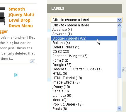
Tagging posts in labels makes navigation so easy for our visitors but soon list becomes big and take over our blog's sidebar and we have to remove other widgets.

Fortunately you can prevent that from happening by converting the widget into a a dropdown (so call Select List) menu.So here we go :

  • Go To Blogger > Template > Edit HTML 
  • Don't mark Expand Widget Templates and search for :
<b:widget id='Label1' locked='false' title='Labels' type='Label'/>

Now replace this code with :

<b:widget id='Label1' locked='false' title='Labels' type='Label'>
<b:includable id='main'>
<b:if cond='data:title'>
<h2><data:title/></h2>
</b:if>
<div class='widget-content'>
<select style='width:100%' onchange='location=this.options[this.selectedIndex].value;'>
<option>Click to choose a label</option>
<b:loop values='data:labels' var='label'>
<option expr:value='data:label.url'><data:label.name/>
(<data:label.count/>)
</option>
</b:loop>
</select>
<b:include name='quickedit'/>
</div>
</b:includable>
</b:widget> 

You can change widget width by changing width:100% . Maybe now you can add more widgets yo your sidebar.

Wednesday 29 August 2012

Social Subscribing Pop Up Widget For Blogger - Version 3.0


Earlier this month i posted two facebook like box pop up widgets and first one with timer and second with cache . Best part about this one is that this one is created by me and i'am the original creator of this widget and it contain more options like subscribe , tweet and social media links.

This one also contain cache so you can control how often it appear to your users and with our widget generator it's too easy to generate this :


 Like this then please post what we should add or remove in next widget of this series..... :)

Monday 27 August 2012

Amazing Email Subscription Form For Blogger


First of all this widget is created by MBT and i'am just posting it all credits goes to those guys Thanks. It's a great widget with a beautiful form and some round social media icons. I was thinking about to add widget generator to make it easy but it would be little crappy so here we go :
  • Go To Blogger > Layout > Add A Gadget > HTML/Java Script
  • Paste following code :
<style>
.tbisubscribe {
border: 1px solid #D3D3D3;
padding: 8px;
width: 300px;
-webkit-transition: all 0.5s ease-in-out;
-moz-transition: all 0.5s ease-in-out;
-ms-transition: all 0.5s ease-in-out;
-o-transition: all 0.5s ease-in-out;
transition: all 0.5s ease-in-out;
}
.tbisubscribe:hover {
-moz-box-shadow: inset 1px 1px 10px 1px rgba(249, 215, 126, 1);
-webkit-box-shadow: inset 1px 1px 10px 1px rgba(249, 215, 126, 1);
box-shadow: inset 1px 1px 10px 1px rgba(249, 215, 126, 1);
}
.tbimailbox {
border: 1px solid #D3D3D3;
-webkit-border-radius: 4px;
border-radius: 4px;
-moz-box-shadow: 1px 1px 1px 1px rgba(255, 172, 84, 0.4) inset;
-webkit-box-shadow: 1px 1px 1px 1px rgba(0, 0, 0, 0.4) inset;
box-shadow: 1px 1px 1px 1px rgba(0, 0, 0, 0.4) inset;
color: #666;
font: 14px "trebuchet ms", sans-serif;
padding: 7px 15px;
width: 160px;
-webkit-transition: all 0.5s ease-in-out;
-moz-transition: all 0.5s ease-in-out;
-ms-transition: all 0.5s ease-in-out;
-o-transition: all 0.5s ease-in-out;
transition: all 0.5s ease-in-out;
}
.tbimailbox:hover {
-webkit-box-shadow: none;
box-shadow: none;
-webkit-transition: all 0.5s ease-in-out;
-moz-transition: all 0.5s ease-in-out;
-ms-transition: all 0.5s ease-in-out;
-o-transition: all 0.5s ease-in-out;
transition: all 0.5s ease-in-out;
}
.tbisubmit {
font: bold 12px Tahoma, Geneva, sans-serif;
font-style: normal;
color: #ffffff;
background: #ff5714;
border: 0px solid #ffffff;
text-shadow: 0px -1px 1px #222222;
box-shadow: 2px 2px 5px #000000;
-moz-box-shadow: 2px 2px 5px #000000;
-webkit-box-shadow: 2px 2px 5px #000000;
border-radius: 10px 10px 10px 10px;
-moz-border-radius: 10px 10px 10px 10px;
-webkit-border-radius: 10px 10px 10px 10px;
padding: 8px 15px;
cursor: pointer;
margin: 0 auto;
}
.tbisubmit:active {
cursor: pointer;
position: relative;
top: 2px;
}
.tbisubmit::-moz-focus-inner {
border: 0;
padding: 0;
margin: 0;
}
</style>
<link href='http://fonts.googleapis.com/css?family=Oswald' rel='stylesheet' type='text/css' />
<div class='tbisubscribe'>
<div style='color: #666666; font-weight: bold; font: 22px Oswald, cursive; margin: 0px 0px 10px 15px;'>Get Free Updates in your Inbox</div>
<div style='margin: 10px 0 0 6px;'>
<form action='http://feedburner.google.com/fb/a/mailverify' class='emailform'
method='post' onsubmit='window.open(&apos;http://feedburner.google.com/fb/a/mailverify?uri=WidgetCraft&apos;, &apos;popupwindow&apos;, &apos;scrollbars=yes,width=550,height=520&apos;);return true'
style='margin: 0pt;' target='popupwindow'>
<input name='uri' type='hidden' value='WidgetCraft' />
<input name='loc' type='hidden' value='en_US' />
<input class='tbimailbox' name='email' onblur='if (this.value == &quot;&quot;) {this.value = &quot;Enter your email...&quot;;}'
onfocus='if (this.value == &quot;Enter your email...&quot;) {this.value = &quot;&quot;}'
type='text' value='Enter your email...' />
<input alt='' class='tbisubmit' title='' type='submit' value='Subscribe'/>
</form>
</div>
<div style='border: none; color: #666666; font: 22px Oswald, cursive; margin: 25px 0 0 5px;'>Follow us on:</div>
<div style='margin: -32px 0 0 120px;'>
<a href='FACEBOOK URL' target='_blank' title='Join us on Facebook'><img src='https://blogger.googleusercontent.com/img/b/R29vZ2xl/AVvXsEjjOQBWK78WHrl-n5RcW_0h2MuzvRcvbbBZ53rPC6rM86qT1nIJRGkp_FTo68KvoGwoSBllhZxSDNQFDRP8LQzUdpR-U3aOXeO5LCGUEkCMt6t5o-agQnICw1sC3-37539xGJW95JgdkZ8/s1600/facebook500.png' alt='facebook'/></a>
<a href='TWITTER URL' rel='nofollow' target='_blank'
title='Follow us on Twitter'><img src='https://blogger.googleusercontent.com/img/b/R29vZ2xl/AVvXsEjafE92u6GZ5Ta6MSo5mwhdTFAYgspbfGJx2OY2l1NEFlx2MN_von46I_-1p5vVX_NTNQuu41v9zSsQy8D7eZ52phyphenhyphennUZGxMS0XAZqouI76M9oIJn8_FlylA3wsa1Tierdyk9eDtktaCDU/s1600/twitter.png' alt='twitter'/></a>
<a href='GOOGLE+ URL' rel='nofollow' target='_blank'
title='Follow us on Google+'><img src='https://blogger.googleusercontent.com/img/b/R29vZ2xl/AVvXsEjZ1e64hzsiraZskW1n0JynKK38RVAP6wA9JQHtCGxgCtoGaq9QLhpp61BC1dwEFBC5OVl13ceQqQxlCc6nib7WeJZZaaALBs25p2IezECaV6EhzOM-J_g9lmKaygzWIlOJpj2pdLviOZA/s1600/googleplus-revised.png' alt='gplus'/></a>
<a href='PINTEREST URL' rel='nofollow' target='_blank'
title='Follow us on Pinterest'><img src='https://blogger.googleusercontent.com/img/b/R29vZ2xl/AVvXsEj4jnLcmh0E4ra49Oc9vos5DpShVRO6N_sOmMGdOuqTdAkoZwERszxmfbOeucp77Unv6lqYwpTWD2DYAIo7X0-iWRNeSCcaSmhbD3jg-LjLFDO904Ds0uU7SR5W0kz-xjDKCoN9I_Ix3bQ/s1600/pinterest.png' alt='pinterest'/></a>
<a href='RSS URL' rel='nofollow' target='_blank'
title='Subscribe to RSS'><img src='https://blogger.googleusercontent.com/img/b/R29vZ2xl/AVvXsEjiwkwyvOFtEZ99HRWJZ92mDt-ir2yLwr2XdacyFiopsCXuZS5Mxg57B4icPzxg_rQ1ca3ORahWp1Gf4On_UlAuC8ykzfb0w2G_f7om2lamCHHLwIZB_Kne7LduyXeAHK4EAXvCleaedSM/s1600/rss.png' alt='rss'/></a>
</div>
</div>
Now just replace WidgetCraft with your feed id and RSS URL and all social media URLs with your profile URLs

Having any problems then leave a comment.....

FaceBox Lightbox For Blogger


FaceBox is a facebook style pop-up for images and some inline content on your blog and html documents. Installing this lightbox in your blog is way to much easy and quick.It's jquery lightbox which works perfectly in blogger and here are instruction to install this :
  • First Go To Blogger > Template > Edit HTML > Search For </head>
  • Post below script just above </head> 
<style>
#facebox {
  position: absolute;
  top: 0;
  left: 0;
  z-index: 100;
  text-align: left;
}
#facebox .popup{
  position:relative;
  border:3px solid rgba(0,0,0,0);
  -webkit-border-radius:5px;
  -moz-border-radius:5px;
  border-radius:5px;
  -webkit-box-shadow:0 0 18px rgba(0,0,0,0.4);
  -moz-box-shadow:0 0 18px rgba(0,0,0,0.4);
  box-shadow:0 0 18px rgba(0,0,0,0.4);
}
#facebox .content {
  display:table;
  padding: 10px;
  background: #fff;
  -webkit-border-radius:4px;
  -moz-border-radius:4px;
  border-radius:4px;
}
#facebox .content > p:first-child{
  margin-top:0;
}
#facebox .content > p:last-child{
  margin-bottom:0;
}
#facebox .close{
  position:absolute;
  top:5px;
  right:5px;
  padding:2px;
  background:#fff;
}
#facebox .close img{
  opacity:0.3;
}
#facebox .close:hover img{
  opacity:1.0;
}
#facebox .loading {
  text-align: center;
}
#facebox .image {
  text-align: center;
}
#facebox img {
  border: 0;
  margin: 0;
}
#facebox_overlay {
  position: fixed;
  top: 0px;
  left: 0px;
  height:100%;
  width:100%;
}
.facebox_hide {
  z-index:-100;
}
.facebox_overlayBG {
  background-color: #000;
  z-index: 99;
}
</style>
  <script src="http://widcraft.googlecode.com/svn/jquery.js" type="text/javascript"></script>
  <script src="http://widcraft.googlecode.com/svn/facebox.js" type="text/javascript"></script>
<script type="text/javascript">
jQuery(document).ready(function($) {
      $('a[rel*=facebox]').facebox({
        loadingImage : 'https://blogger.googleusercontent.com/img/b/R29vZ2xl/AVvXsEhQeKvza3igWmcKrlDF5VrO9MJb60Ha12h4QKGMrOOqRcYnrn1veK7uEH66W6KirZCnYu0LfxwwYflIzYkEwexdzl409-1joyrMuY4UjNqJfqqDx7WY-XLCt6wGBfimTg6p_vLriFsK2pU/s1600/loading.gif',
        closeImage   : 'https://blogger.googleusercontent.com/img/b/R29vZ2xl/AVvXsEgttlfn99dzDFiIp9j_YJbSBGqSjjeEinKlOA2szyvGyNt2LWfFivuMg8zWhukqkjL9o7K57aSQtTadLkn-nSNWyK_8CAxYGxy4EQr4pNSUgKHXhhCaIjbK3FaTaFqjJa4lifr7IGseG4U/s1600/closelabel.png'
      })
    })
</script>
That's all above installing it to blogger now you have to learn above adding this effect to your inline content and images....first start with images

Images :

To add facebox in your images just add rel="facebox" in your image code , example :
<a href="Image URL" rel="facebox"><img src="Image URL"/></a>
Inline Content :

Just like images in inline content just add rel="facebox" in your inline code , example :
<a href="#info" rel="facebox">View the 'info' div in the Facebox</a>
<div id="info" style="display:none;">
    <p> Hey, I'm the 'info' div! </p>
    <p> I look like this: </p>
    <code>
      &lt;div id="info" style="display:none;"&gt; <br>
        &nbsp;&nbsp;text<br>
      &lt;/div&gt;
    </code>
  </div>
I know it was way to much simple so add it and if you like this then please leave a comment.....

Sunday 26 August 2012

FancyBox Lightbox For Blogger


FancyBox is a tool for displaying images, html content and multi-media in a Mac-style "lightbox" that floats overtop of web page.

Features :
  • Can display images, HTML elements, SWF movies, Iframes and also Ajax requests
  • Customizable through settings and CSS
  • Groups related items and adds navigation.
  • Support fancy transitions by using easing plugin
  • Adds a nice drop shadow under the zoomed item
  • Also works in all type of HTML documents
Well you all know that i'am a huge Light Box fan and this one is totally amazing so time to show you how to add this :
  • Go To Blogger > Template > Edit HTML
  • Find </head> and post following script just above it :
<script src="http://widcraft.googlecode.com/svn/jquery.js" type="text/javascript">
 </script>
 <script src="http://widcraft.googlecode.com/svn/jquery.fancybox-1.3.4.js" type="text/javascript">
 </script>
<style>
#fancybox-loading {
 position: fixed;
 top: 50%;
 left: 50%;
 width: 40px;
 height: 40px;
 margin-top: -20px;
 margin-left: -20px;
 cursor: pointer;
 overflow: hidden;
 z-index: 1104;
 display: none;
 }
 #fancybox-loading div {
 position: absolute;
 top: 0;
 left: 0;
 width: 40px;
 height: 480px;
 background-image: url('https://blogger.googleusercontent.com/img/b/R29vZ2xl/AVvXsEihPGPX7dcbPZzndT4ZGqjPqg1ZBP6d4Ai4_tyQxEZ6C6GnUiKRQ1_At2hxkHUJeb3V69kFDiStxIYOolxfsKsq6RQ0TIo_Mj5m_msxgHnaQQfeyEaqS-N4JvEbQZ_N3qjoTweZ58ZPvwk/s1600/fancybox.png');
 }
 #fancybox-overlay {
 position: absolute;
 top: 0;
 left: 0;
 width: 100%;
 z-index: 1100;
 display: none;
 }
 #fancybox-tmp {
 padding: 0;
 margin: 0;
 border: 0;
 overflow: auto;
 display: none;
 }
 #fancybox-wrap {
 position: absolute;
 top: 0;
 left: 0;
 padding: 20px;
 z-index: 1101;
 outline: none;
 display: none;
 }
 #fancybox-outer {
 position: relative;
 width: 100%;
 height: 100%;
 background: #fff;
 }
 #fancybox-content {
 width: 0;
 height: 0;
 padding: 0;
 outline: none;
 position: relative;
 overflow: hidden;
 z-index: 1102;
 border: 0px solid #fff;
 }
 #fancybox-hide-sel-frame {
 position: absolute;
 top: 0;
 left: 0;
 width: 100%;
 height: 100%;
 background: transparent;
 z-index: 1101;
 }
 #fancybox-close {
 position: absolute;
 top: -15px;
 right: -15px;
 width: 30px;
 height: 30px;
 background: transparent url('https://blogger.googleusercontent.com/img/b/R29vZ2xl/AVvXsEihPGPX7dcbPZzndT4ZGqjPqg1ZBP6d4Ai4_tyQxEZ6C6GnUiKRQ1_At2hxkHUJeb3V69kFDiStxIYOolxfsKsq6RQ0TIo_Mj5m_msxgHnaQQfeyEaqS-N4JvEbQZ_N3qjoTweZ58ZPvwk/s1600/fancybox.png') -40px 0px;
 cursor: pointer;
 z-index: 1103;
 display: none;
 }
 #fancybox-error {
 color: #444;
 font: normal 12px/20px Arial;
 padding: 14px;
 margin: 0;
 }
 #fancybox-img {
 width: 100%;
 height: 100%;
 padding: 0;
 margin: 0;
 border: none;
 outline: none;
 line-height: 0;
 vertical-align: top;
 }
 #fancybox-frame {
 width: 100%;
 height: 100%;
 border: none;
 display: block;
 }
 #fancybox-left, #fancybox-right {
 position: absolute;
 bottom: 0px;
 height: 100%;
 width: 35%;
 cursor: pointer;
 outline: none;
 background: transparent url('https://blogger.googleusercontent.com/img/b/R29vZ2xl/AVvXsEigdvfrtMF7oKZ7-wG71yoNBrcJyK_eyd_nIah0avR8yS9Q5AE96FiIcaR94jYWhomzGJPGcHk7rCqAthGHm0S5-sF5S8h2HmQh2Mh0y4mv786bHcJ3cAsrC8kM48qqko6gZU4Menj5GdY/s1600/fancy_blank.gif');
 z-index: 1102;
 display: none;
 }
 #fancybox-left {
 left: 0px;
 }
 #fancybox-right {
 right: 0px;
 }
 #fancybox-left-ico, #fancybox-right-ico {
 position: absolute;
 top: 50%;
 left: -9999px;
 width: 30px;
 height: 30px;
 margin-top: -15px;
 cursor: pointer;
 z-index: 1102;
 display: block;
 }
 #fancybox-left-ico {
 background-image: url('https://blogger.googleusercontent.com/img/b/R29vZ2xl/AVvXsEihPGPX7dcbPZzndT4ZGqjPqg1ZBP6d4Ai4_tyQxEZ6C6GnUiKRQ1_At2hxkHUJeb3V69kFDiStxIYOolxfsKsq6RQ0TIo_Mj5m_msxgHnaQQfeyEaqS-N4JvEbQZ_N3qjoTweZ58ZPvwk/s1600/fancybox.png');
 background-position: -40px -30px;
 }
 #fancybox-right-ico {
 background-image: url('https://blogger.googleusercontent.com/img/b/R29vZ2xl/AVvXsEihPGPX7dcbPZzndT4ZGqjPqg1ZBP6d4Ai4_tyQxEZ6C6GnUiKRQ1_At2hxkHUJeb3V69kFDiStxIYOolxfsKsq6RQ0TIo_Mj5m_msxgHnaQQfeyEaqS-N4JvEbQZ_N3qjoTweZ58ZPvwk/s1600/fancybox.png');
 background-position: -40px -60px;
 }
 #fancybox-left:hover, #fancybox-right:hover {
 visibility: visible; /* IE6 */
 }
 #fancybox-left:hover span {
 left: 20px;
 }
 #fancybox-right:hover span {
 left: auto;
 right: 20px;
 }
 .fancybox-bg {
 position: absolute;
 padding: 0;
 margin: 0;
 border: 0;
 width: 20px;
 height: 20px;
 z-index: 1001;
 }
 #fancybox-bg-n {
 top: -20px;
 left: 0;
 width: 100%;
 background-image: url('https://blogger.googleusercontent.com/img/b/R29vZ2xl/AVvXsEiVo42w-pqNiylHeVhxcc8SZyaRlbzHIi4gTJtv7RCH5INV8PsxANlle0Bwmy96VFS2tbiwul7QViqiboDr00nEPLIRhbB28ZorLS-4h6ZgbiXMIcg7oo-piL2dhXNOhdWFOwbwxigq35k/s1600/fancybox-x.png');
 }
 #fancybox-bg-ne {
 top: -20px;
 right: -20px;
 background-image: url('https://blogger.googleusercontent.com/img/b/R29vZ2xl/AVvXsEihPGPX7dcbPZzndT4ZGqjPqg1ZBP6d4Ai4_tyQxEZ6C6GnUiKRQ1_At2hxkHUJeb3V69kFDiStxIYOolxfsKsq6RQ0TIo_Mj5m_msxgHnaQQfeyEaqS-N4JvEbQZ_N3qjoTweZ58ZPvwk/s1600/fancybox.png');
 background-position: -40px -162px;
 }
 #fancybox-bg-e {
 top: 0;
 right: -20px;
 height: 100%;
 background-image: url('https://blogger.googleusercontent.com/img/b/R29vZ2xl/AVvXsEhDtZFAUlVJ2UVzCfW7QPGIlNRqdk8iRpaB66QAmpby-MbWhZGxBuH34zHsjhdfcmUOj4KfuFklUons4jHsjK9WEMH_HjmmMP_xrDvJkLJm323vKZcqVl9kNvWO0MirPh2OX4y-6hTOR30/s1600/fancybox-y.png');
 background-position: -20px 0px;
 }
 #fancybox-bg-se {
 bottom: -20px;
 right: -20px;
 background-image: url('https://blogger.googleusercontent.com/img/b/R29vZ2xl/AVvXsEihPGPX7dcbPZzndT4ZGqjPqg1ZBP6d4Ai4_tyQxEZ6C6GnUiKRQ1_At2hxkHUJeb3V69kFDiStxIYOolxfsKsq6RQ0TIo_Mj5m_msxgHnaQQfeyEaqS-N4JvEbQZ_N3qjoTweZ58ZPvwk/s1600/fancybox.png');
 background-position: -40px -182px;
 }
 #fancybox-bg-s {
 bottom: -20px;
 left: 0;
 width: 100%;
 background-image: url('https://blogger.googleusercontent.com/img/b/R29vZ2xl/AVvXsEiVo42w-pqNiylHeVhxcc8SZyaRlbzHIi4gTJtv7RCH5INV8PsxANlle0Bwmy96VFS2tbiwul7QViqiboDr00nEPLIRhbB28ZorLS-4h6ZgbiXMIcg7oo-piL2dhXNOhdWFOwbwxigq35k/s1600/fancybox-x.png');
 background-position: 0px -20px;
 }
 #fancybox-bg-sw {
 bottom: -20px;
 left: -20px;
 background-image: url('https://blogger.googleusercontent.com/img/b/R29vZ2xl/AVvXsEihPGPX7dcbPZzndT4ZGqjPqg1ZBP6d4Ai4_tyQxEZ6C6GnUiKRQ1_At2hxkHUJeb3V69kFDiStxIYOolxfsKsq6RQ0TIo_Mj5m_msxgHnaQQfeyEaqS-N4JvEbQZ_N3qjoTweZ58ZPvwk/s1600/fancybox.png');
 background-position: -40px -142px;
 }
 #fancybox-bg-w {
 top: 0;
 left: -20px;
 height: 100%;
 background-image: url('https://blogger.googleusercontent.com/img/b/R29vZ2xl/AVvXsEhDtZFAUlVJ2UVzCfW7QPGIlNRqdk8iRpaB66QAmpby-MbWhZGxBuH34zHsjhdfcmUOj4KfuFklUons4jHsjK9WEMH_HjmmMP_xrDvJkLJm323vKZcqVl9kNvWO0MirPh2OX4y-6hTOR30/s1600/fancybox-y.png');
 }
 #fancybox-bg-nw {
 top: -20px;
 left: -20px;
 background-image: url('https://blogger.googleusercontent.com/img/b/R29vZ2xl/AVvXsEihPGPX7dcbPZzndT4ZGqjPqg1ZBP6d4Ai4_tyQxEZ6C6GnUiKRQ1_At2hxkHUJeb3V69kFDiStxIYOolxfsKsq6RQ0TIo_Mj5m_msxgHnaQQfeyEaqS-N4JvEbQZ_N3qjoTweZ58ZPvwk/s1600/fancybox.png');
 background-position: -40px -122px;
 }
 #fancybox-title {
 font-family: Helvetica;
 font-size: 12px;
 z-index: 1102;
 }
 .fancybox-title-inside {
 padding-bottom: 10px;
 text-align: center;
 color: #333;
 background: #fff;
 position: relative;
 }
 .fancybox-title-outside {
 padding-top: 10px;
 color: #fff;
 }
 .fancybox-title-over {
 position: absolute;
 bottom: 0;
 left: 0;
 color: #FFF;
 text-align: left;
 }
 #fancybox-title-over {
 padding: 10px;
 background-image: url('https://blogger.googleusercontent.com/img/b/R29vZ2xl/AVvXsEil-JzZ7TtsvRD3JPoR-TE4k_DSw8wcCsRlAhNd0qNNG5StLWCi11c41MYDadrM2WoG_eEMQ7ijSUvvSjZqjUpcEdqBzE5lJVdcqpg0kfmO-WBLnk1kwCbe7dsDhbLUiRvGCq9b1xmFDDo/s1600/fancy_title_over.png');
 display: block;
 }
 .fancybox-title-float {
 position: absolute;
 left: 0;
 bottom: -20px;
 height: 32px;
 }
 #fancybox-title-float-wrap {
 border: none;
 border-collapse: collapse;
 width: auto;
 }
 #fancybox-title-float-wrap td {
 border: none;
 white-space: nowrap;
 }
 #fancybox-title-float-left {
 padding: 0 0 0 15px;
 background: url('https://blogger.googleusercontent.com/img/b/R29vZ2xl/AVvXsEihPGPX7dcbPZzndT4ZGqjPqg1ZBP6d4Ai4_tyQxEZ6C6GnUiKRQ1_At2hxkHUJeb3V69kFDiStxIYOolxfsKsq6RQ0TIo_Mj5m_msxgHnaQQfeyEaqS-N4JvEbQZ_N3qjoTweZ58ZPvwk/s1600/fancybox.png') -40px -90px no-repeat;
 }
 #fancybox-title-float-main {
 color: #FFF;
 line-height: 29px;
 font-weight: bold;
 padding: 0 0 3px 0;
 background: url('https://blogger.googleusercontent.com/img/b/R29vZ2xl/AVvXsEiVo42w-pqNiylHeVhxcc8SZyaRlbzHIi4gTJtv7RCH5INV8PsxANlle0Bwmy96VFS2tbiwul7QViqiboDr00nEPLIRhbB28ZorLS-4h6ZgbiXMIcg7oo-piL2dhXNOhdWFOwbwxigq35k/s1600/fancybox-x.png') 0px -40px;
 }
 #fancybox-title-float-right {
 padding: 0 0 0 15px;
 background: url('https://blogger.googleusercontent.com/img/b/R29vZ2xl/AVvXsEihPGPX7dcbPZzndT4ZGqjPqg1ZBP6d4Ai4_tyQxEZ6C6GnUiKRQ1_At2hxkHUJeb3V69kFDiStxIYOolxfsKsq6RQ0TIo_Mj5m_msxgHnaQQfeyEaqS-N4JvEbQZ_N3qjoTweZ58ZPvwk/s1600/fancybox.png') -55px -90px no-repeat;
 }
 /* IE6 */
 .fancybox-ie6 #fancybox-close { background: transparent; filter: progid:DXImageTransform.Microsoft.AlphaImageLoader(src='https://blogger.googleusercontent.com/img/b/R29vZ2xl/AVvXsEgZMTXg-rnAXbtL8EPrgrjD1ynAprxYyXQCMA-FPDd2SciYZIQw80t21rjqn-JJiBzEY906u1jJ7SCfpUXPZtEk5dq5UGbGvtgh5LyQeFZMx4i4QqJWGwdTOuHxf5V8Q-ZwjF1xt8fWbJ8/s1600/fancy_close.png', sizingMethod='scale'); }
 .fancybox-ie6 #fancybox-left-ico { background: transparent; filter: progid:DXImageTransform.Microsoft.AlphaImageLoader(src='https://blogger.googleusercontent.com/img/b/R29vZ2xl/AVvXsEgJHtoT0sQAiKeTIY_08F4tPmq5_YIBKpGK21IEV2b8gKH0HSdj7oAVL58OcvJaVWEi5Ndze3zzL7scNmsrwANfV1c_I8lsmFcBbCgTUIId2H88fZJFV9ZFg5T-vQ8nRc7yxG326Os2TT4/s1600/fancy_nav_left.png', sizingMethod='scale'); }
 .fancybox-ie6 #fancybox-right-ico { background: transparent; filter: progid:DXImageTransform.Microsoft.AlphaImageLoader(src='https://blogger.googleusercontent.com/img/b/R29vZ2xl/AVvXsEjWPsgqa6CQ4pXjqiynpCJUAY72a4ZMLYxl970Ce7Nyh98LIxbgKwSYbPu3j1der3QF2_0UurDp-ujQJP4VWgYgMvzMZaoeFdmT6BdutFXZMLrSle43aEanAaWdzScxfxbvEElMuQwIDZU/s1600/fancy_nav_right.png', sizingMethod='scale'); }
 .fancybox-ie6 #fancybox-title-over { background: transparent; filter: progid:DXImageTransform.Microsoft.AlphaImageLoader(src='https://blogger.googleusercontent.com/img/b/R29vZ2xl/AVvXsEil-JzZ7TtsvRD3JPoR-TE4k_DSw8wcCsRlAhNd0qNNG5StLWCi11c41MYDadrM2WoG_eEMQ7ijSUvvSjZqjUpcEdqBzE5lJVdcqpg0kfmO-WBLnk1kwCbe7dsDhbLUiRvGCq9b1xmFDDo/s1600/fancy_title_over.png', sizingMethod='scale'); zoom: 1; }
 .fancybox-ie6 #fancybox-title-float-left { background: transparent; filter: progid:DXImageTransform.Microsoft.AlphaImageLoader(src='https://blogger.googleusercontent.com/img/b/R29vZ2xl/AVvXsEgZnP9XifKyV38tgYx20kasA4i95cLMnxkfOusm8iuou-a0b9HDLbSrfvZNM00YU785a85o58qIDMx57T1wkHYDvgCa0bPcPBWT0iC2FQ0QhCmU2skerG1th0UN7zrRJe3iQiI9I76KhWY/s1600/fancy_title_left.png', sizingMethod='scale'); }
 .fancybox-ie6 #fancybox-title-float-main { background: transparent; filter: progid:DXImageTransform.Microsoft.AlphaImageLoader(src='https://blogger.googleusercontent.com/img/b/R29vZ2xl/AVvXsEjCEWV3dVQc8e0uj3kgZBl55vZsUkcidHw8aiEY-OJMQWA1A_hDElXg_i73SfFV7Sv1BZQmL3jbgxTqpDiHx9aFcsA_R_4wCgA_Rcr2Mo6uO7YZ62r_zyESsokAhiYFZZ_95Zq_8LU7GQo/s1600/fancy_title_main.png', sizingMethod='scale'); }
 .fancybox-ie6 #fancybox-title-float-right { background: transparent; filter: progid:DXImageTransform.Microsoft.AlphaImageLoader(src='https://blogger.googleusercontent.com/img/b/R29vZ2xl/AVvXsEhFvlXFO71lz9ZsfNrMmwCEMNl9v6j9EasyPlAVQyuCRAiPcFx4s11pPN33h2d06WQ2NgUMsmhNY0ZmRVlC-c_RVhPkRmx8ax0Tl0aav9lJaqjM3Z0BUAfZ0ncfTfZ_v-33YLTaqmaNN_0/s1600/fancy_title_right.png', sizingMethod='scale'); }
 .fancybox-ie6 #fancybox-bg-w, .fancybox-ie6 #fancybox-bg-e, .fancybox-ie6 #fancybox-left, .fancybox-ie6 #fancybox-right, #fancybox-hide-sel-frame {
 height: expression(this.parentNode.clientHeight   "px");
 }
 #fancybox-loading.fancybox-ie6 {
 position: absolute; margin-top: 0;
 top: expression( (-20   (document.documentElement.clientHeight ? document.documentElement.clientHeight/2 : document.body.clientHeight/2 )   ( ignoreMe = document.documentElement.scrollTop ? document.documentElement.scrollTop : document.body.scrollTop ))   'px');
 }
 #fancybox-loading.fancybox-ie6 div { background: transparent; filter: progid:DXImageTransform.Microsoft.AlphaImageLoader(src='https://blogger.googleusercontent.com/img/b/R29vZ2xl/AVvXsEgZB3u9lGqGaQGqJctWz7XcZVX3FgvahK9YAWcqexe3N6Z4A1EugbFLGXLmjBnNzcaB9UoYBKQR0_htz-FO7sWx-wHI0L8lyLn1GZ6WqVsDyCDO-xezFQ97x5jlqWtLs1b7V37Fj7CgfdU/s1600/fancy_loading.png', sizingMethod='scale'); }
 /* IE6, IE7, IE8 */
 .fancybox-ie .fancybox-bg { background: transparent !important; }
 .fancybox-ie #fancybox-bg-n { filter: progid:DXImageTransform.Microsoft.AlphaImageLoader(src='https://blogger.googleusercontent.com/img/b/R29vZ2xl/AVvXsEjSUVXH1QFVZZW91QPXFSJr_L7I8rAa8WgtMGPla4HfZmcuG0K4oOH_AbEYPI0UBFM_vZ24bn2KSr8hjAADr5RfkR168qUMo8DszI69K9jRAGCAL-91S5UShILMboqMOc882sIsk8GUr3w/s1600/fancy_shadow_n.png', sizingMethod='scale'); }
 .fancybox-ie #fancybox-bg-ne { filter: progid:DXImageTransform.Microsoft.AlphaImageLoader(src='https://blogger.googleusercontent.com/img/b/R29vZ2xl/AVvXsEiUaOvbfxYstMV4reKBlFsYefP31sBREExEK157-yOYmOcqS0PZK275K_5W0By48E6_qu9UlnPETkAfZmXNLiGYSkpmdt9wbVX18bA-2YoKiZQaaCOnTLzlNlZ5DEe2xI7Enynhz5s_SR8/s1600/fancy_shadow_ne.png', sizingMethod='scale'); }
 .fancybox-ie #fancybox-bg-e { filter: progid:DXImageTransform.Microsoft.AlphaImageLoader(src='https://blogger.googleusercontent.com/img/b/R29vZ2xl/AVvXsEiviPis7TVA2SJ2PU_-RxsGDFwd403vUfXbeE3eVfLZ297w4FoPpybKs6LA0_oaUjRi8fADsdpjbzqh3ZKYnouEjf5bzq8gI6PBDb2uXURJWe70dm5cB_LScDGDTAFlrbXV7n63Xiggwfc/s1600/fancy_shadow_e.png', sizingMethod='scale'); }
 .fancybox-ie #fancybox-bg-se { filter: progid:DXImageTransform.Microsoft.AlphaImageLoader(src='https://blogger.googleusercontent.com/img/b/R29vZ2xl/AVvXsEgeG6xEBJwWa1-IhGG2RRbAdx3pZqJkNQB3E0owkAenfM6aNlrGO5si7iWXQvzPp2mle5RmfKKjt4Z42LboAprQMACPPnoi1Vk-3vewjBmNfQaQznhB0Yb-Ch69KrozEokLwsa5wCxjmi8/s1600/fancy_shadow_se.png', sizingMethod='scale'); }
 .fancybox-ie #fancybox-bg-s { filter: progid:DXImageTransform.Microsoft.AlphaImageLoader(src='https://blogger.googleusercontent.com/img/b/R29vZ2xl/AVvXsEgIzGfbI8Al-ynSc92UtI-5zP50f_NHpjILB6SaQhSU5Z08zqlBlZN6Cqh7huDPyRwJjOaoohvXc_OunFX5ozsYDRmEQXb3nwj5KQXH12gZgaHhSUUfVBi4OLiT6cnMFAfCNbKLq9QKU44/s1600/fancy_shadow_s.png', sizingMethod='scale'); }
 .fancybox-ie #fancybox-bg-sw { filter: progid:DXImageTransform.Microsoft.AlphaImageLoader(src='https://blogger.googleusercontent.com/img/b/R29vZ2xl/AVvXsEgjuiRYColI4x3q_0UJDmcIM3ICBDidPeV8AZNzAJViyGfBNZsj2N16dmGZPUxYaSNvSBbAvAGqNajxczPORFivrl7OjEJ18qV3vGI5RrT-VIHybV0W-QRkJrmEh1FfRZG-GCVpTL6orGc/s1600/fancy_shadow_sw.png', sizingMethod='scale'); }
 .fancybox-ie #fancybox-bg-w { filter: progid:DXImageTransform.Microsoft.AlphaImageLoader(src='https://blogger.googleusercontent.com/img/b/R29vZ2xl/AVvXsEjeAgZNfAgz9RBimEGO0kgZwf9UcChEbsCAVAEzOGD61FBXre5YaAVgIBmutzT-QVZdNywwgzMfY9O3LsdI6FGPzPPgv4TdlVEI3qp9euuNSAzb9GR7kL4tWM75s5EDvbJXi-j1-tSaCsU/s1600/fancy_shadow_w.png', sizingMethod='scale'); }
 .fancybox-ie #fancybox-bg-nw { filter: progid:DXImageTransform.Microsoft.AlphaImageLoader(src='https://blogger.googleusercontent.com/img/b/R29vZ2xl/AVvXsEirity5WPk3gBja2j09kXHNTUy16s5mbNu_EB7gI41fYAufZDbvcJ-uStTyfPQScgdJcNcnNbwuy2Uc15hVexspYgR6KT2Y4vjPePUhgOZbgs1-zToEXXhvla3sZTh47yMDtLVWPDKTkKo/s1600/fancy_shadow_nw.png', sizingMethod='scale'); }
</style>
  • Now post below script above </body>
<script type="text/javascript">
$(document).ready(function() {
/* This is basic - uses default settings */
$("a#single_image").fancybox();
/* Using custom settings */
$("a#inline").fancybox({
                'hideOnOverlayClick': false
});
/* Apply fancybox to multiple items */
$("a.group").fancybox({
'transitionIn' : 'elastic',
'transitionOut' : 'elastic',
'speedIn' : 600,
'speedOut' : 200,
'overlayShow' : false
});
$("#iframe").fancybox({'width': '70%','height': '100%','autoScale': true,'type':'iframe', });
$("#swf").fancybox({'width': '680','height': '495','autoScale': true,'type':'swf', });
});
 </script> 
Done with all script now time to show how to add this on your content :

Image :
 <a id="single_image" href="Image URL"><img src="Image URL" alt="Some Text"/></a>

 Image Group :
<a class="group" rel="group1" href="Image URL"><img src="Image URL" alt="Some Text"/></a>

 Inline Content :
<a id="inline" href="#data">This shows content of element who has id="data"</a>
<div style="display:none"><div id="data">Lorem ipsum dolor sit amet, consectetur adipiscing elit.</div></div>

iFrame  :
<a href="http://google.com/" title="Google" id="iframe">some link text</a>

Flash :
<a href="SWF File Source/" title="Flash" id="swf">Flash</a>

In Second script which you posted above </body> you can change your iframe width and height and create more actions of iframes/groups and all content.

Now it was bit difficult but if you need any help then please comment and if this lightbox doesn't work then try to posting all script in your post instead of template. 

Facebook Like Box Pop Up Widget For Blogger - Version 2.0


Last week i posted another FB Like Pop-Up which was cool and got a timer but only problem with that was it appears on every page load. You can control appear timing of this widget which makes it amazingly awesome and also just wanna inform you this widget is originally created by MBT go check out their blog.

This widget  is based on Color Box and with our widget generator it's too easy to add this to your blog (Just click on Add To Blogger to generate code)

On Username field you have to put your FB Page username....Need a username visit here , you need minimum 25 Likes.

Friday 24 August 2012

Amazing CSS3 Search Box For Blogger


In last article i posted about creating a custom search box for blogger and now i'am posting this totally amazing search box which is 99% CSS3 and 1% image.


So i'am going to show you how to create this and also if you just wanna add this then there is also a Add To Blogger option and you can all this search box in all type of HTML documents.

HTML :
<form action="/search" style="display:inline;" method="get">
<input id="s" name="q" type="search" placeholder="Search Me">
</form>
<style>
CSS :
#s {
    margin: 0 auto;
    -webkit-appearance: none;
    -moz-appearance: none;
    padding: 12px 48px 12px 12px;
    -webkit-border-radius: 200px;
    -moz-border-radius: 200px;
    border-radius: 200px;
width: 300px;
    height: 16px;
    color: #3a4449;
    border: none;
    outline: none;
    -webkit-box-shadow: 0 0 0 1px rgba(0,0,0,.3), 0 2px 0 rgba(255,255,255,.3), inset 0 1px 2px rgba(0,0,0,.2);
    -moz-box-shadow: 0 0 0 1px rgba(0,0,0,.3), 0 2px 0 rgba(255,255,255,.3), inset 0 1px 2px rgba(0,0,0,.2);
    box-shadow: 0 0 0 1px rgba(0,0,0,.3), 0 2px 0 rgba(255,255,255,.3), inset 0 1px 2px rgba(0,0,0,.2);
position: relative;
    z-index: 2;
    background: #fff url(https://blogger.googleusercontent.com/img/b/R29vZ2xl/AVvXsEh1HvEj2bNMWqo3mf6237cc1hUIj4MfX3gaRfb8fw1K2JQJm_XkoNpx1Gyt0MeLDJQDhLdjmBLRXcSZV-7wD2BII6JHo-R-dZrPAo1YRlLKvJ6j9lqjKb6iTrYepuuuV0GYhoUa2BCy5Y0/s1600/Search.png) center right no-repeat;
}
#s::-webkit-input-placeholder, #s:-moz-placeholder {
    color: #607078;
}
So if you just wanna add this widget then just click on Add To Blogger

Show Page Loading Time On Blogger


It's time to show visitors how fast or slow your blog page loads with this script as you can see this widget will show your blog's loading time in each page which is a very important for every blog to load fast and this is so easy to add so here we go :
  • Go To Blogger > Template > Edit HTML > Mark 'Expand Widget Templates'
  • Paste below script just below <head>
<!-- page load timer -->
<script type='text/javascript'>
var d = new Date();
var starttime = d.getTime();  //Get the start time
</script>
  •  Now just above </body> paste following script :
<!-- page load timer start -->
<script type='text/javascript'>
var d2 = new Date();
var endtime = d2.getTime(); //Get the end time
//Find the difference between the start and end times
var totaltime = (endtime - starttime)/1000;
//Round 2 decimal places
var result = Math.round(totaltime*100)/100;
//Output results to a &quot;P&quot; element
document.getElementById(&quot;loadtime&quot;).innerHTML = &quot;Page loaded in: &quot;+ result +&quot; seconds&quot;;
</script>
<!-- page load timer end -->
  • Save your template
Now we have added all script now it's time to place this widget in your template
  • Go To Blogger > Layout > Add A Gadget > > HTML/Javascript
  • Paste following script and save it: 
<p id="loadtime">Write your custom message here</p>
All done now just go to your blog and see this working and you can also use some CSS in this widget to make it look better.....Don't forget to leave a comment

Thursday 23 August 2012

Twitter Timeline Widget For Blogger


Twitter is a great website to connect with your favorite celebrities and promote your content and so many of twitter users wants to show our recent tweets on our blog but we really hate twitter timeline widget provided by twitter , are you one of us ?

If yes then below widget is perfect for your twitter addiction which is stylish and also easy to install in your blog with our widget generator. To generate this widget for your blogger click on Add To Blogger button below.


Having any issues or like this widget then please leave a comment and follow me on twitter @HardeepAsrani.

Create Free Newsletter For Blogger


Newsletter connects you with your visitors and give them best and new content and share some new features with your visitors. First of all it's a newsletter not some sort of feed widget.


First Part : 


Now we will create our newsletter form :
  • Create a form just like shown in the image below only with one field "Email" and save it.

After completing above step save your form and grab your form url , which will look something like this 

https://docs.google.com/spreadsheet/viewform?formkey=dEkwQ3Q5d1FTMXNFc1JzWDhwOV91ZHc6MQ

Now copy formkey from your form code(not from our code) :

https://docs.google.com/spreadsheet/viewform?formkey=dEkwQ3Q5d1FTMXNFc1JzWDhwOV91ZHc6MQ

Second Part :
  • Go To Blogger > Create New Page > HTML > Paste below script 

<div id="content">
<h1> Subscribe To Our Newsletter! </h1>
<script type="text/javascript">var submitted=false;</script>
<iframe name="hidden_iframe" id="hidden_iframe"
style="display:none;" onload="if(submitted)
{window.location='After Form Is Submitted';}"></iframe>
<form action="https://docs.google.com/spreadsheet/formResponse?formkey=YourFormKey&amp;ifq" method="post"
target="hidden_iframe" onsubmit="submitted=true;">
<p> <label for="usermail" class="iconic mail-alt"> E-mail address : </label> <input type="email" name="entry.0.single" class="ss-q-short" id="entry_0" placeholder="I promise I hate spam as much as you do" required="required"  />
<input type="hidden" name="pageNumber" value="0">
<input type="hidden" name="backupCache" value="">
</p>
<input type="submit" name="submit" value="Subscribe !" />  
</form>
<a href="http://widcraft.blogspot.com/2012/08/create-free-newsletter-for-blogger.html"> Create Free Newsletter </a>                        
</div>
<style>
/** Created And Converted For Blogger By - WidCraft.blogspot.com **/
#container {width:465px; margin:20px auto 0;}
a, a:visited {color:#fff; text-decoration:none; font-size:12px;}
a:hover {text-decoration:underline;}
h1 {
font-family: 'Questrial', Verdana, sans-serif;
text-align:center;
font-size:25px;
padding:0;
margin:0 0 20px 0;
position:relative;
color:#8C8C8C;
}
/** have a nice ampersand **/
h1:after {
font-size:25px;
color:#D6CFCB;
content: '&';
text-align:center;
display:block;
width:100%;
font-family: 'Alice', Verdana, serif;
text-shadow: 0px 1px 0px #fff;
}
/** create the gradient bottom **/
h1:before {
position:absolute;
bottom:15px;
 content: ' ';
 text-align:center;
 display:block;
 height:2px;
 width:100%;
background: -moz-linear-gradient(left,  rgba(255,255,255,0) 0%, rgba(182,180,180,0.7) 42%, rgba(180,178,178,0) 43%, rgba(168,166,166,0) 50%, rgba(180,178,178,0) 57%, rgba(182,180,180,0.7) 58%, rgba(238,237,237,0.3) 90%, rgba(255,255,255,0) 100%); /* FF3.6+ */
background: -webkit-gradient(linear, left top, right top, color-stop(0%,rgba(255,255,255,0)), color-stop(42%,rgba(182,180,180,0.7)), color-stop(43%,rgba(180,178,178,0)), color-stop(50%,rgba(168,166,166,0)), color-stop(57%,rgba(180,178,178,0)), color-stop(58%,rgba(182,180,180,0.7)), color-stop(90%,rgba(238,237,237,0.3)), color-stop(100%,rgba(255,255,255,0))); /* Chrome,Safari4+ */
background: -webkit-linear-gradient(left,  rgba(255,255,255,0) 0%,rgba(182,180,180,0.7) 42%,rgba(180,178,178,0) 43%,rgba(168,166,166,0) 50%,rgba(180,178,178,0) 57%,rgba(182,180,180,0.7) 58%,rgba(238,237,237,0.3) 90%,rgba(255,255,255,0) 100%); /* Chrome10+,Safari5.1+ */
background: -o-linear-gradient(left,  rgba(255,255,255,0) 0%,rgba(182,180,180,0.7) 42%,rgba(180,178,178,0) 43%,rgba(168,166,166,0) 50%,rgba(180,178,178,0) 57%,rgba(182,180,180,0.7) 58%,rgba(238,237,237,0.3) 90%,rgba(255,255,255,0) 100%); /* Opera 11.10+ */
background: -ms-linear-gradient(left,  rgba(255,255,255,0) 0%,rgba(182,180,180,0.7) 42%,rgba(180,178,178,0) 43%,rgba(168,166,166,0) 50%,rgba(180,178,178,0) 57%,rgba(182,180,180,0.7) 58%,rgba(238,237,237,0.3) 90%,rgba(255,255,255,0) 100%); /* IE10+ */
background: linear-gradient(left,  rgba(255,255,255,0) 0%,rgba(182,180,180,0.7) 42%,rgba(180,178,178,0) 43%,rgba(168,166,166,0) 50%,rgba(180,178,178,0) 57%,rgba(182,180,180,0.7) 58%,rgba(238,237,237,0.3) 90%,rgba(255,255,255,0) 100%); /* W3C */
}
/* Here comes to good stuff : content styling */
#content{
position:relative;
width:400px;
min-height:200px;
z-index:100;
padding:30px;
border:1px solid #383838;
/* My stipped background */
background: #D1D1D1; /* Old browsers */
background: -moz-repeating-linear-gradient(-45deg, #EFC1CB , #EFC1CB 30px, #F2F2F2 30px, #F2F2F2 40px, #C2E8F5 40px, #C2E8F5 70px,#F2F2F2 70px, #F2F2F2 80px); /* FF3.6+ */
    background: -webkit-repeating-linear-gradient(-45deg, #EFC1CB , #EFC1CB 30px, #F2F2F2 30px, #F2F2F2 40px, #C2E8F5 40px, #C2E8F5 70px,#F2F2F2 70px, #F2F2F2 80px); /* FF3.6+ */
    background: -o-repeating-linear-gradient(-45deg, #EFC1CB , #EFC1CB 30px, #F2F2F2 30px, #F2F2F2 40px, #C2E8F5 40px, #C2E8F5 70px,#F2F2F2 70px, #F2F2F2 80px); /* FF3.6+ */
    background: repeating-linear-gradient(-45deg, #EFC1CB , #EFC1CB 30px, #F2F2F2 30px, #F2F2F2 40px, #C2E8F5 40px, #C2E8F5 70px,#F2F2F2 70px, #F2F2F2 80px); /* FF3.6+ */
/*border-radius*/
-webkit-border-radius:8px;
   -moz-border-radius:8px;
        border-radius:8px;
/*box-shadow*/
-webkit-box-shadow:0px 1px 6px #3F3F3F;
   -moz-box-shadow:0px 1px 6px #3F3F3F;
        box-shadow:0px 1px 6px #3F3F3F;
}
/** my "fake" background that will hover the stripes **/
#content:after{
background:#F9F9F9;
margin:10px;
position: absolute;
content : " ";
bottom: 0;
left: 0;
right: 0;
top: 0;
z-index: -1;
border:1px #E5E5E5 solid;  
/*border-radius*/
-webkit-border-radius:8px;
   -moz-border-radius:8px;
        border-radius:8px;
}
/*** form styling **/
/** we remove the red glow around required fields since we are already using the red star */
input:required, textarea:required {
    -moz-box-shadow:none;
    -webkit-box-shadow:none;
    -o-box-shadow:none;
    box-shadow:none;
}
/** inputs and textarea**/
input:not([type="submit"]), textarea{
outline:none;
display:block;
width:380px;
padding:4px 8px;
border:1px dashed #DBDBDB;
color:#3F3F3F;
font-family:'Droid Sans',Tahoma,Arial,Verdana sans-serif;
font-size:14px;
/*border-radius*/
-webkit-border-radius:2px;
   -moz-border-radius:2px;
        border-radius:2px;
/*transition*/
-webkit-transition:background 0.2s linear,
       box-shadow 0.6s linear;
   -moz-transition:background 0.2s linear,
       box-shadow 0.6s linear;
     -o-transition:background 0.2s linear,
       box-shadow 0.6s linear;
        transition:background 0.2s linear,
       box-shadow 0.6s linear;
}
input:not([type="submit"]):active,
textarea:active,
input:not([type="submit"]):focus,
textarea:focus{
background:#F7F7F7;
border:dashed 1px #969696;
/*box-shadow*/
-webkit-box-shadow:2px 2px 7px #E8E8E8 inset;
   -moz-box-shadow:2px 2px 7px #E8E8E8 inset;
        box-shadow:2px 2px 7px #E8E8E8 inset;
}
input:not([type="submit"]){
height: 20px;
}
/* placeholder */
::-webkit-input-placeholder  {
color:#BABABA;
font-style:italic;
}
input:-moz-placeholder,
textarea:-moz-placeholder{
color:#BABABA;
font-style:italic;
}
textarea{
min-height:150px;
resize:vertical
}
label{
color:#7F7E7E;
-webkit-transition: color 1s ease;
   -moz-transition: color 1s ease;
     transition: color 1s ease;
}
label:hover{
color:#191919;
}
label:before{
color:#C1BFBD;
-webkit-transition: color 1s ease;
   -moz-transition: color 1s ease;
     transition: color 1s ease;
}
label:hover:before{
color:#969696;
-webkit-transition: color 1s ease;
   -moz-transition: color 1s ease;
     transition: color 1s ease;
}
p{
margin-bottom:20px;
}
.indication{
color:#878787;
font-size:12px;
font-style:italic;
text-align:right;
padding-right:10px;
}
.required{
color:#E5224C;
}
/** Styling the send button **/
input[type=submit]{
margin-left:235px;
cursor:pointer;
background:none;
border:none;
font-family: 'Alice',serif;
color:#767676;
font-size:18px;
padding:10px 4px;
border:1px solid #E0E0E0;
text-shadow: 0px 1px  1px #E8E8E8;
background: rgb(247,247,247);
background: -moz-linear-gradient(top,  rgba(247,247,247,1) 1%, rgba(242,242,242,1) 100%);
background: -webkit-gradient(linear, left top, left bottom, color-stop(1%,rgba(247,247,247,1)), color-stop(100%,rgba(242,242,242,1)));
background: -webkit-linear-gradient(top,  rgba(247,247,247,1) 1%,rgba(242,242,242,1) 100%);
background: -o-linear-gradient(top,  rgba(247,247,247,1) 1%,rgba(242,242,242,1) 100%);
background: -ms-linear-gradient(top,  rgba(247,247,247,1) 1%,rgba(242,242,242,1) 100%);
background: linear-gradient(top,  rgba(247,247,247,1) 1%,rgba(242,242,242,1) 100%);
/*border-radius*/
-webkit-border-radius:5px;
   -moz-border-radius:5px;
        border-radius:5px;
/*box-shadow*/
-webkit-box-shadow:0px 1px 1px #FFF inset,0 0 0px 5px #EAEAEA;
-moz-box-shadow:0px 1px 1px #FFF inset,0 0 0px 5px #EAEAEA;
  box-shadow:0px 1px 1px #FFF inset,0 0 0px 5px #EAEAEA;
/*transition*/
-webkit-transition:all 0.2s linear;
   -moz-transition:all 0.2s linear;
     -o-transition:all 0.2s linear;
        transition:all 0.2s linear;
}
input[type=submit]:hover{
color:#686868;
border-color: #CECECE;
background: rgb(244,244,244);
background: -moz-linear-gradient(top,  rgba(244,244,244,1) 0%, rgba(242,242,242,1) 100%);
background: -webkit-gradient(linear, left top, left bottom, color-stop(0%,rgba(244,244,244,1)), color-stop(100%,rgba(242,242,242,1)));
background: -webkit-linear-gradient(top,  rgba(244,244,244,1) 0%,rgba(242,242,242,1) 100%);
background: -o-linear-gradient(top,  rgba(244,244,244,1) 0%,rgba(242,242,242,1) 100%);
background: -ms-linear-gradient(top,  rgba(244,244,244,1) 0%,rgba(242,242,242,1) 100%);
background: linear-gradient(top,  rgba(244,244,244,1) 0%,rgba(242,242,242,1) 100%);
/*box-shadow*/
-webkit-box-shadow:0px 1px 1px #FFF inset,0 0 0px 5px #E0E0E0;
-moz-box-shadow:0px 1px 1px #FFF inset,0 0 0px 5px #E0E0E0;
box-shadow:0px 1px 1px #FFF inset,0 0 0px 5px #E0E0E0;  
}
input[type=submit]:active,
input[type=submit]:focus{
position:relative;
top:1px;
color:#515151;
background: rgb(234,234,234);
background: -moz-linear-gradient(top,  rgba(234,234,234,1) 0%, rgba(242,242,242,1) 100%);
background: -webkit-gradient(linear, left top, left bottom, color-stop(0%,rgba(234,234,234,1)), color-stop(100%,rgba(242,242,242,1)));
background: -webkit-linear-gradient(top,  rgba(234,234,234,1) 0%,rgba(242,242,242,1) 100%);
background: -o-linear-gradient(top,  rgba(234,234,234,1) 0%,rgba(242,242,242,1) 100%);
background: -ms-linear-gradient(top,  rgba(234,234,234,1) 0%,rgba(242,242,242,1) 100%);
background: linear-gradient(top,  rgba(234,234,234,1) 0%,rgba(242,242,242,1) 100%);
/*box-shadow*/
-webkit-box-shadow:0px -1px 1px #FFF inset,0 0 0px 5px #E0E0E0;
-moz-box-shadow:0px -1px 1px #FFF inset,0 0 0px 5px #E0E0E0;
box-shadow:0px -1px 1px #FFF inset,0 0 0px 5px #E0E0E0;
}
</style>

  • In above script replace  YourFormKey  with your FormKey (From Step One) and replace  After Form Is Submitted with url you want visitor to redirect after subscribing your news letter.
Now when a user will enter his email and click on subscribe his email will be send to your google docs account now whenever you have to send your visitor your monthly/daily/yearly email just go to Google Docs click on your form and copy all email and send your newsletter via your gmail account.

That's the best way to send newsletter to your visitors and it's totally free. If you're copying this article then please give us credits and also tell us..... facing any sort of problems then leave it in comment section below.

Popular Posts

 
Powered by Blogger.